Branding · Web design
De Kloek Fitness
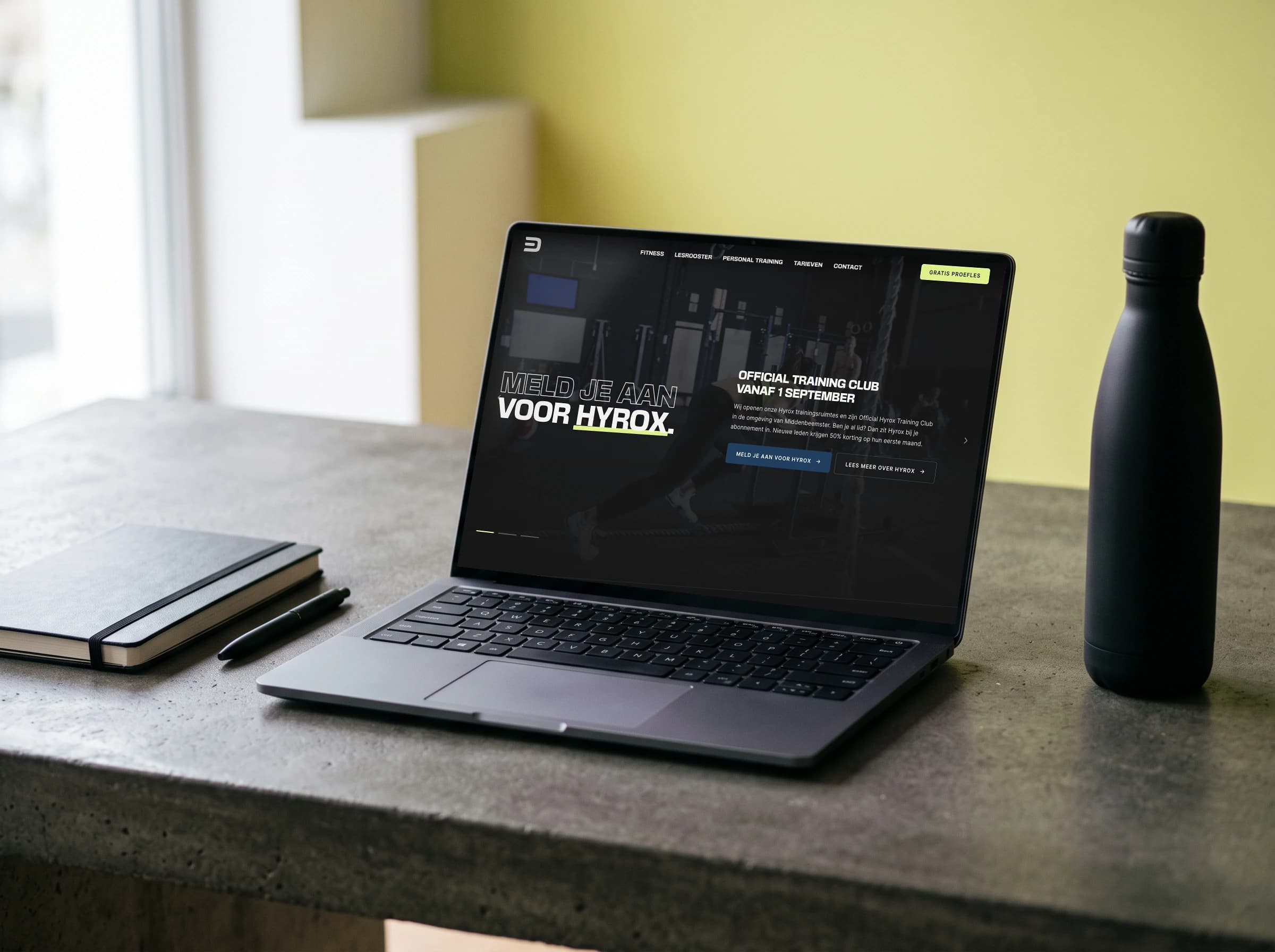
Logo, visual identity and website for the fitness branch of De Kloek. Tough and sporty, but also light, because health, community and wellbeing come first there.
Overview
De Kloek Fitness is the gym branch of a sports business with several branches under one roof. The brand had to belong there recognisably and still have a character of its own, because someone heading to the gym is after something different from someone booking a court.
- Client
- De Kloek Fitness
- What I did
- LogoVisual identityColour paletteWeb designGenerative AI
- Year
- 2026
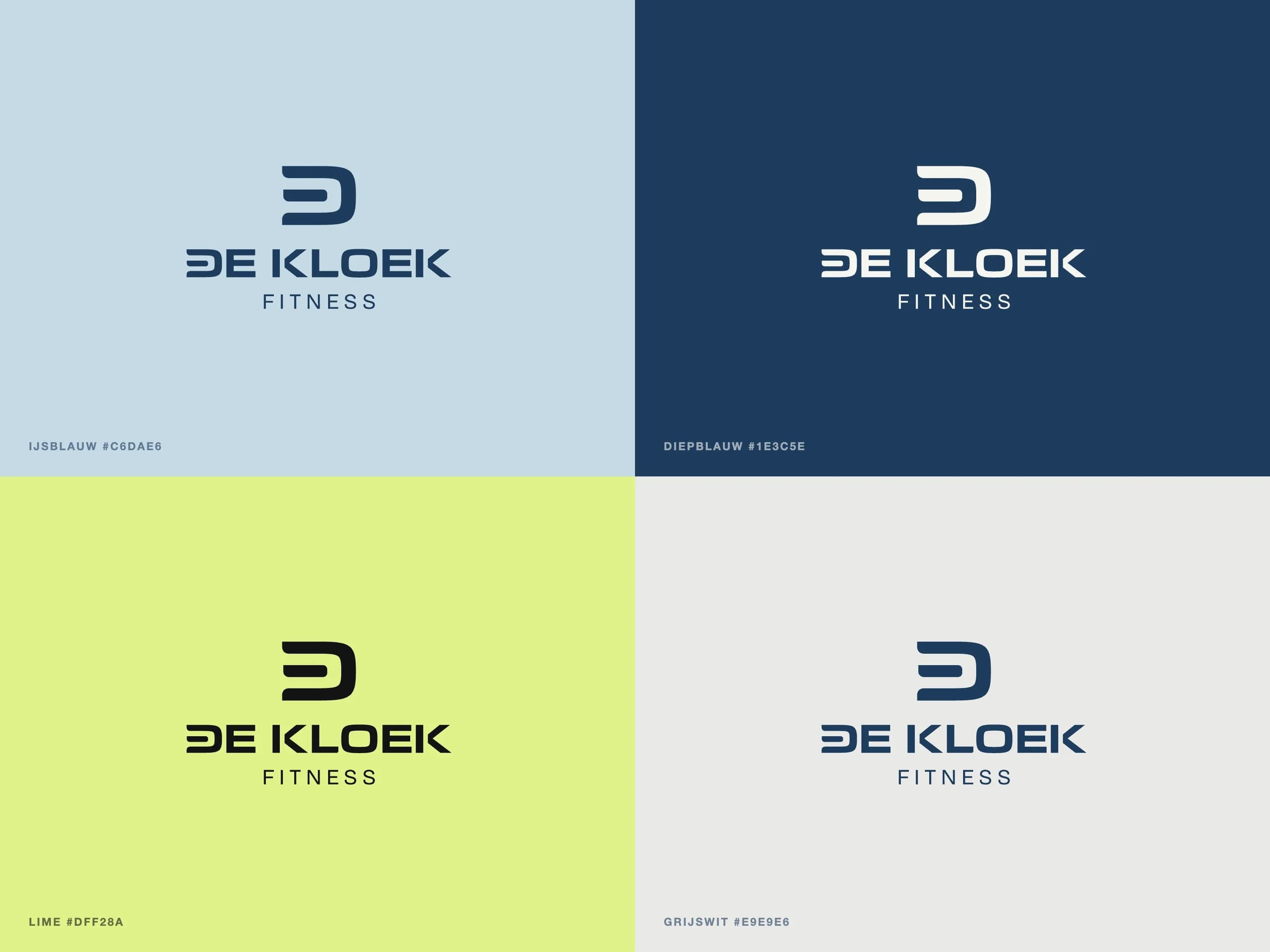
I developed the logo, the visual identity and the branding together with the owner.
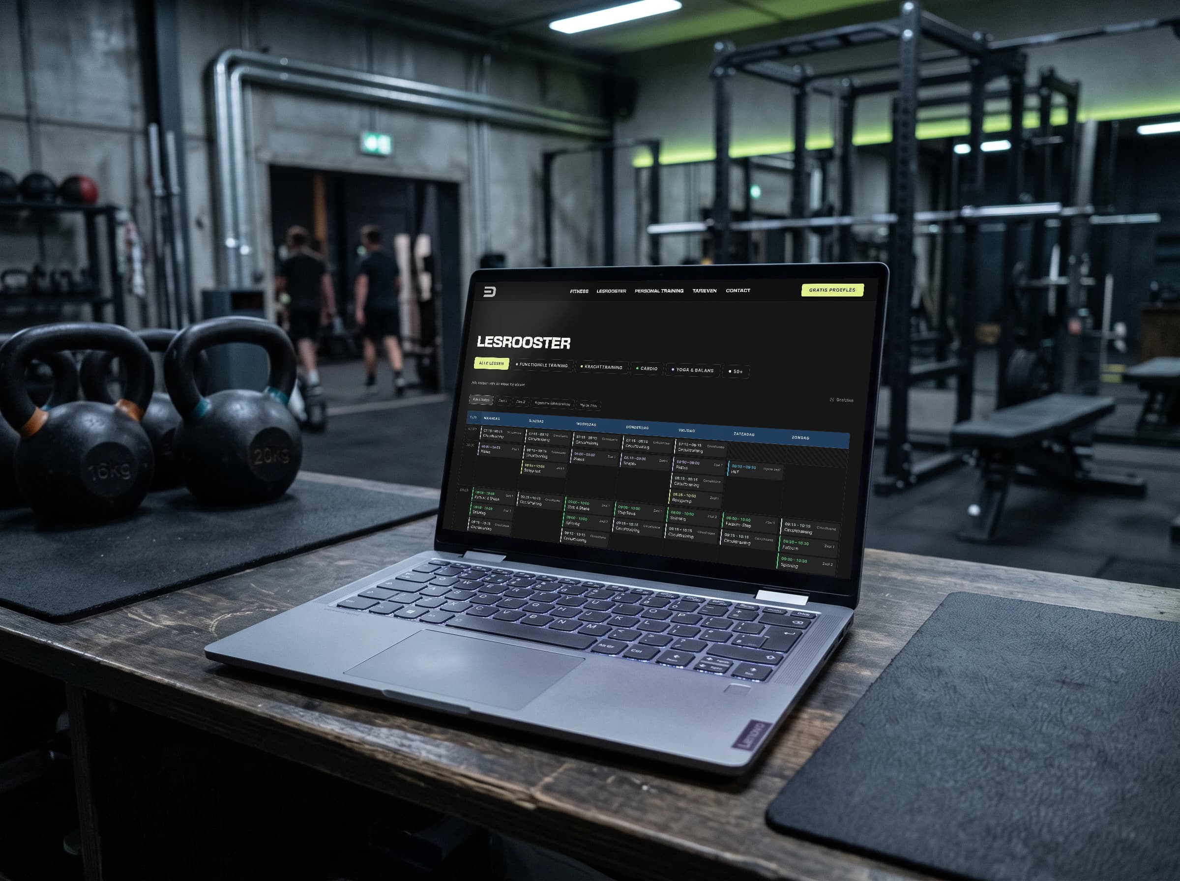
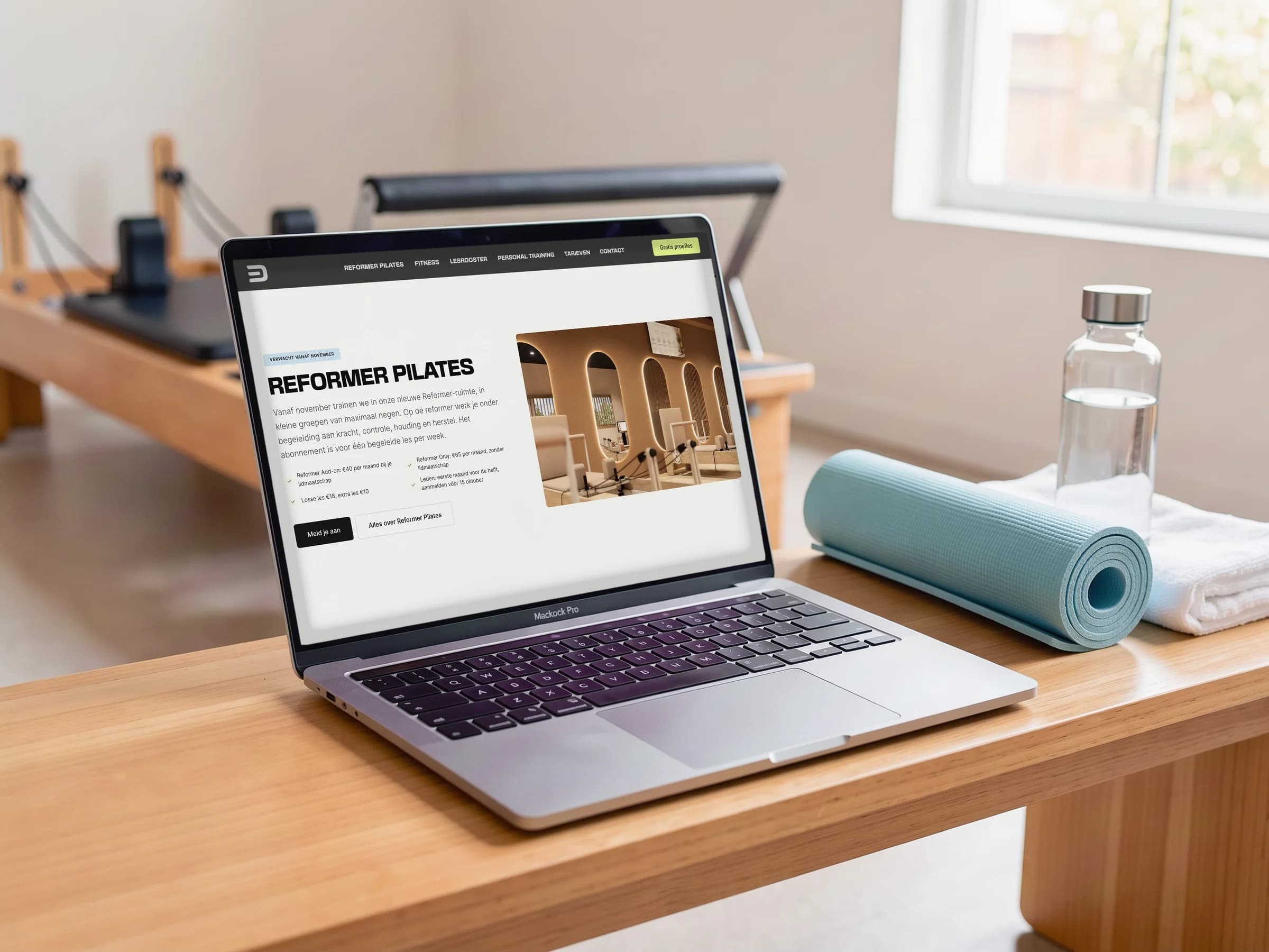
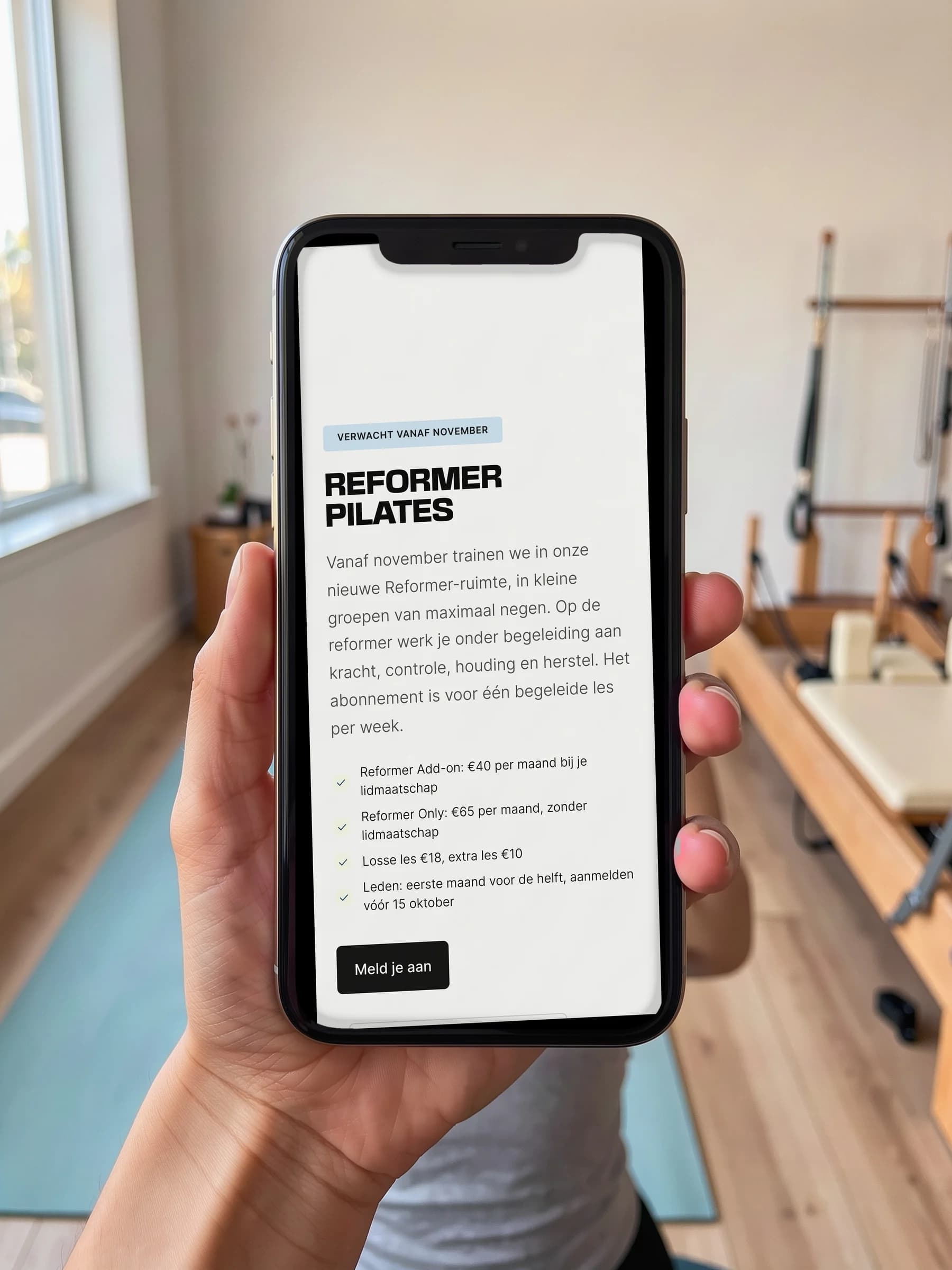
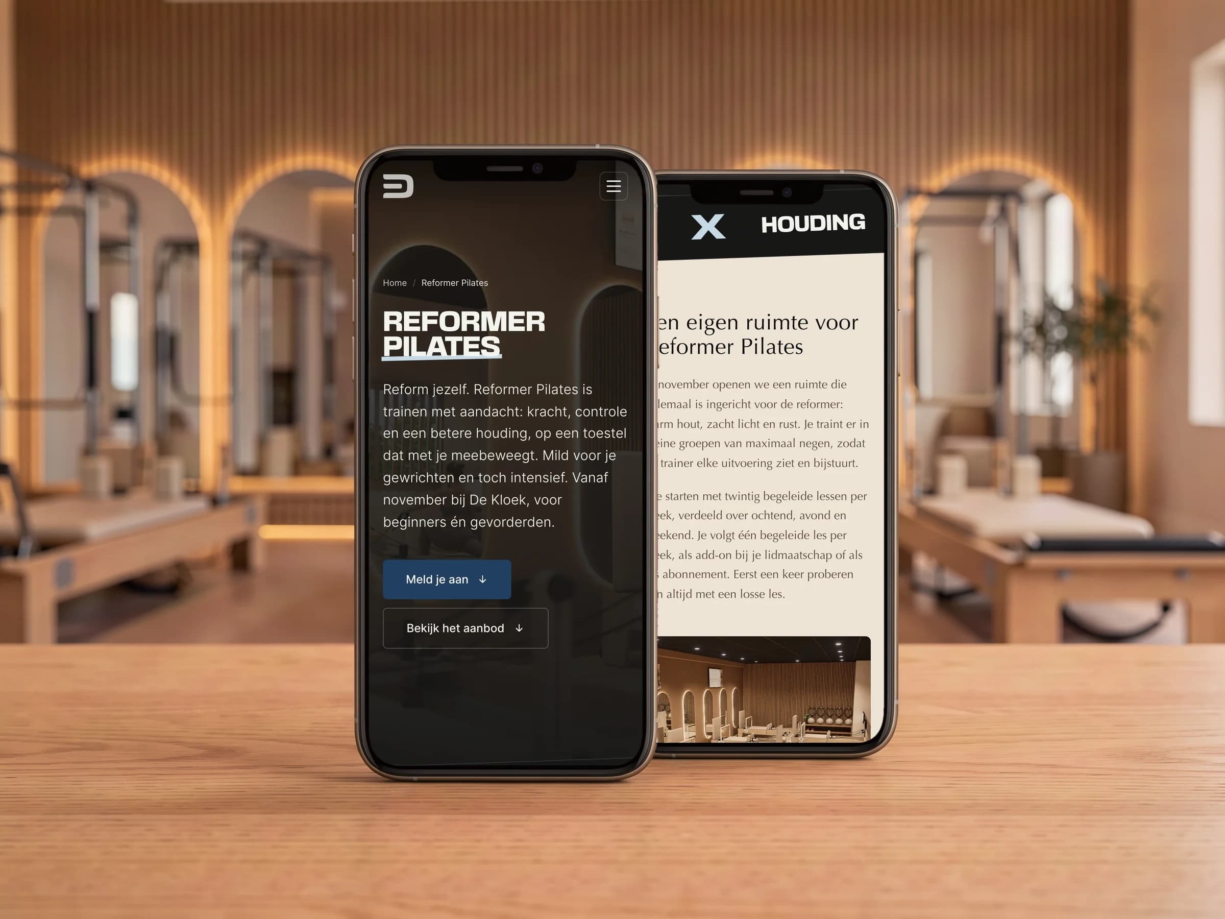
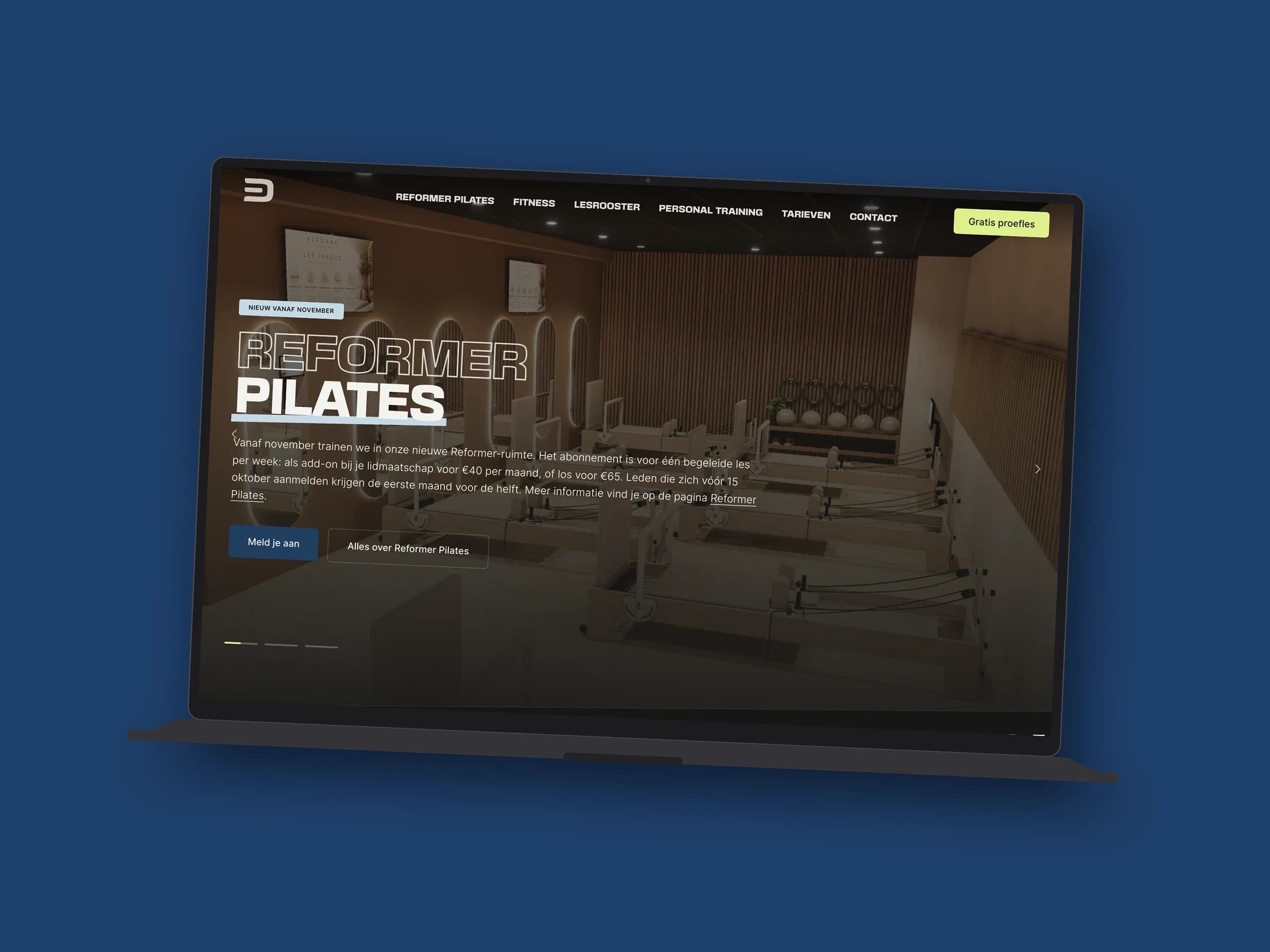
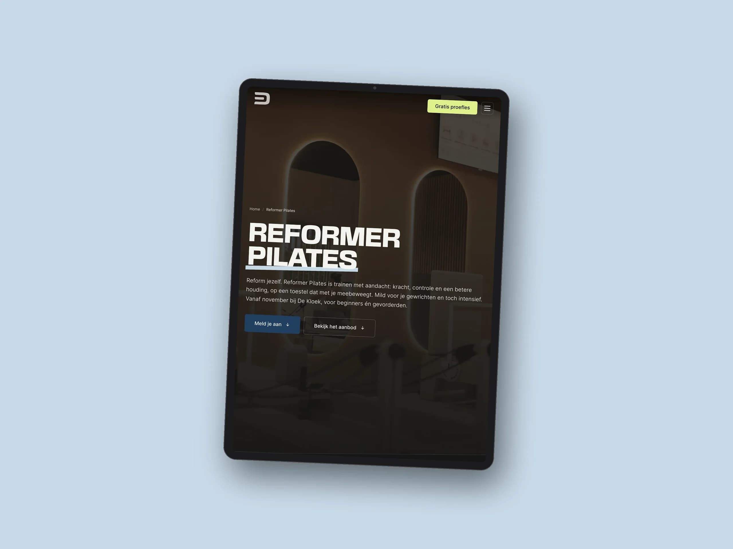
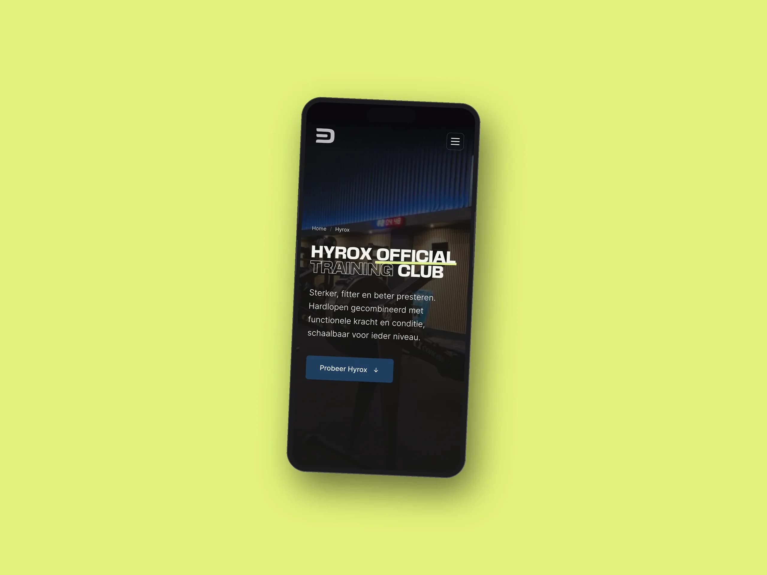
Then I developed the website. It is tough and sporty, with dark areas and big headings. In between there are plenty of light areas and calm elements, because De Kloek is more than a gym: it is a healthy sports centre where health, community and wellbeing matter just as much as training.
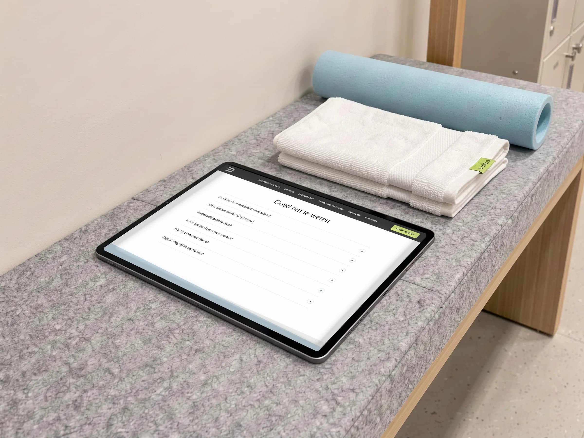
The class timetable, rates and personal training are right at hand, and you book a trial session in two taps.
Something like this for your brand?
Tell me where you are now. The first call is free, no strings attached.
 Next casePGS Housing