Branding · App · Web design
TypTalk
TypTalk is a dictation app for the Mac. You talk, and the text is there. My own project: the name, logo, app and website all come from me.
Overview
TypTalk is my own dictation app for the Mac. Hold a key, talk, and the text is there. Because everything comes from me, from the name to the website, it feels like the same brand everywhere.
- Client
- TypTalk
- What I did
- Name and logoVisual identityApp designWebsitePosters and merchandise
- Year
- 2026
- Built with
- SwiftSwiftUIAstro
The mark
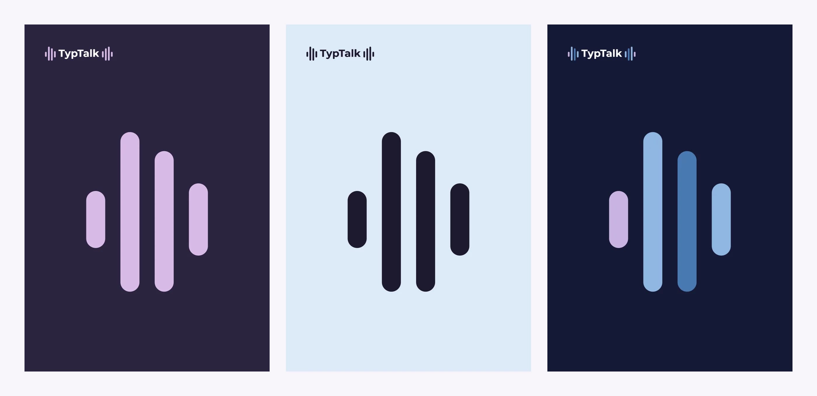
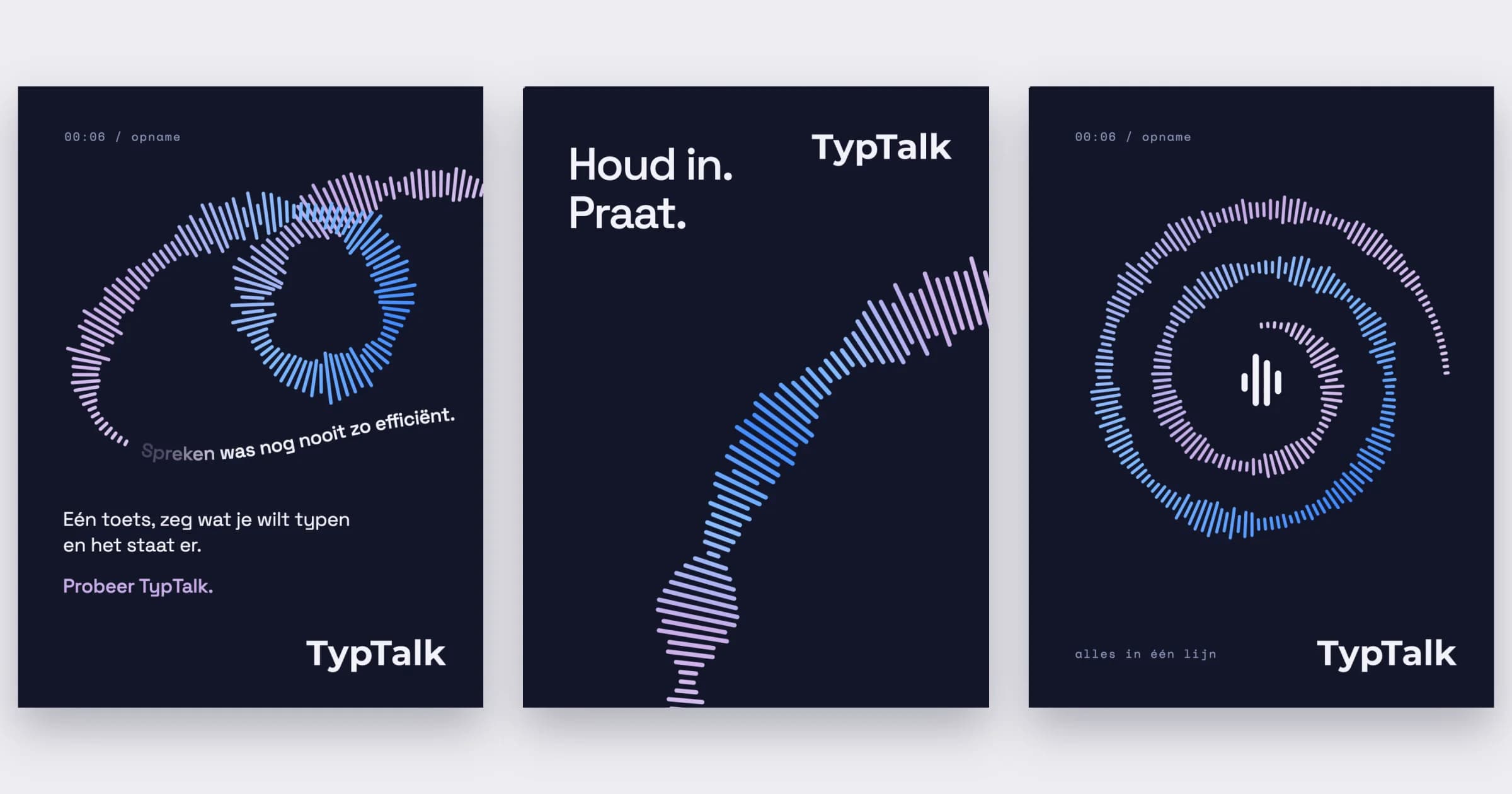
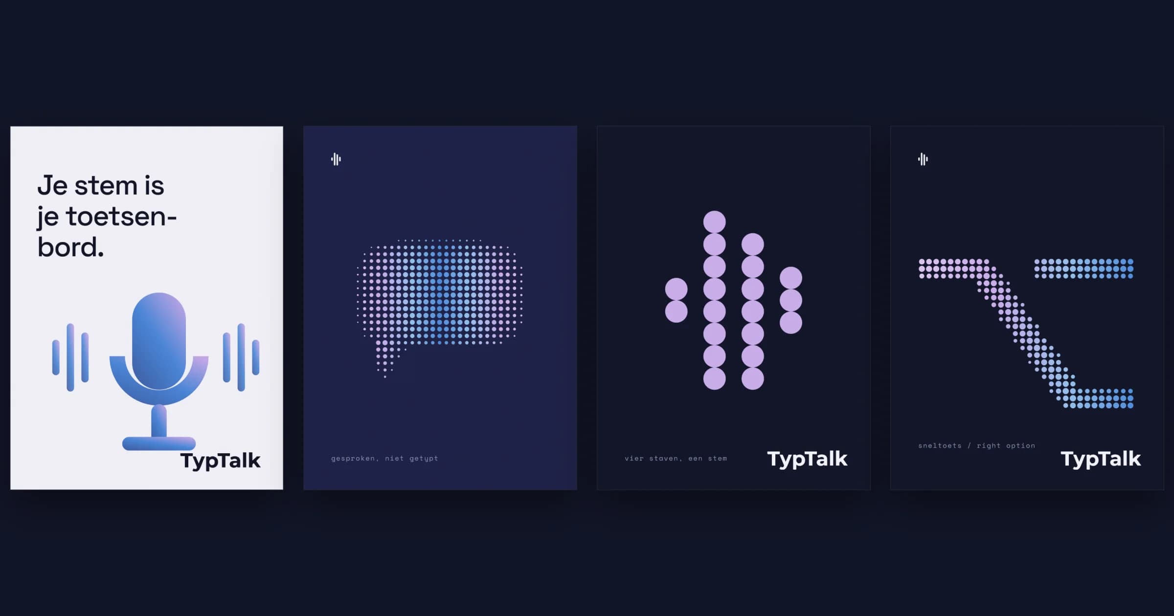
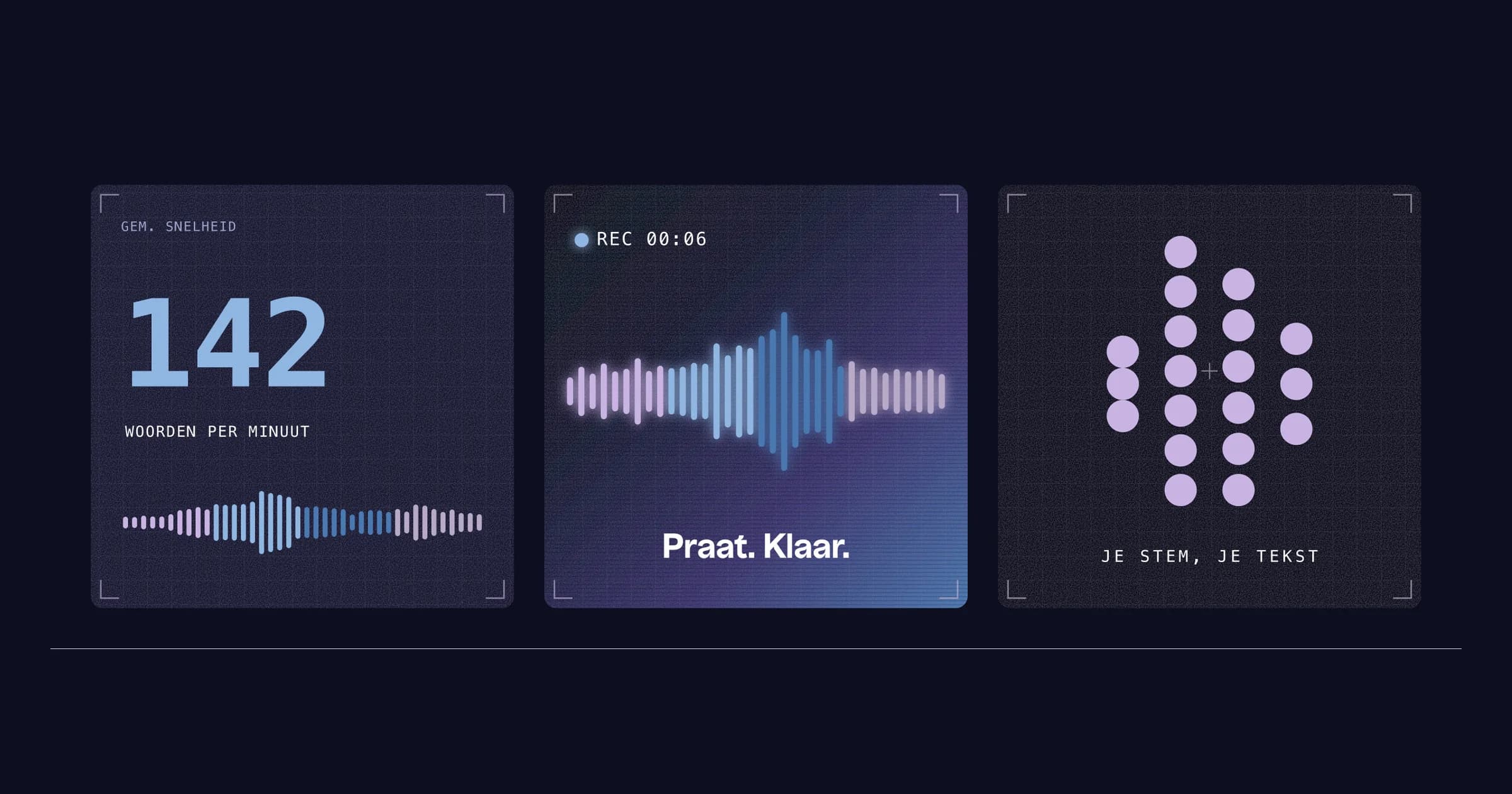
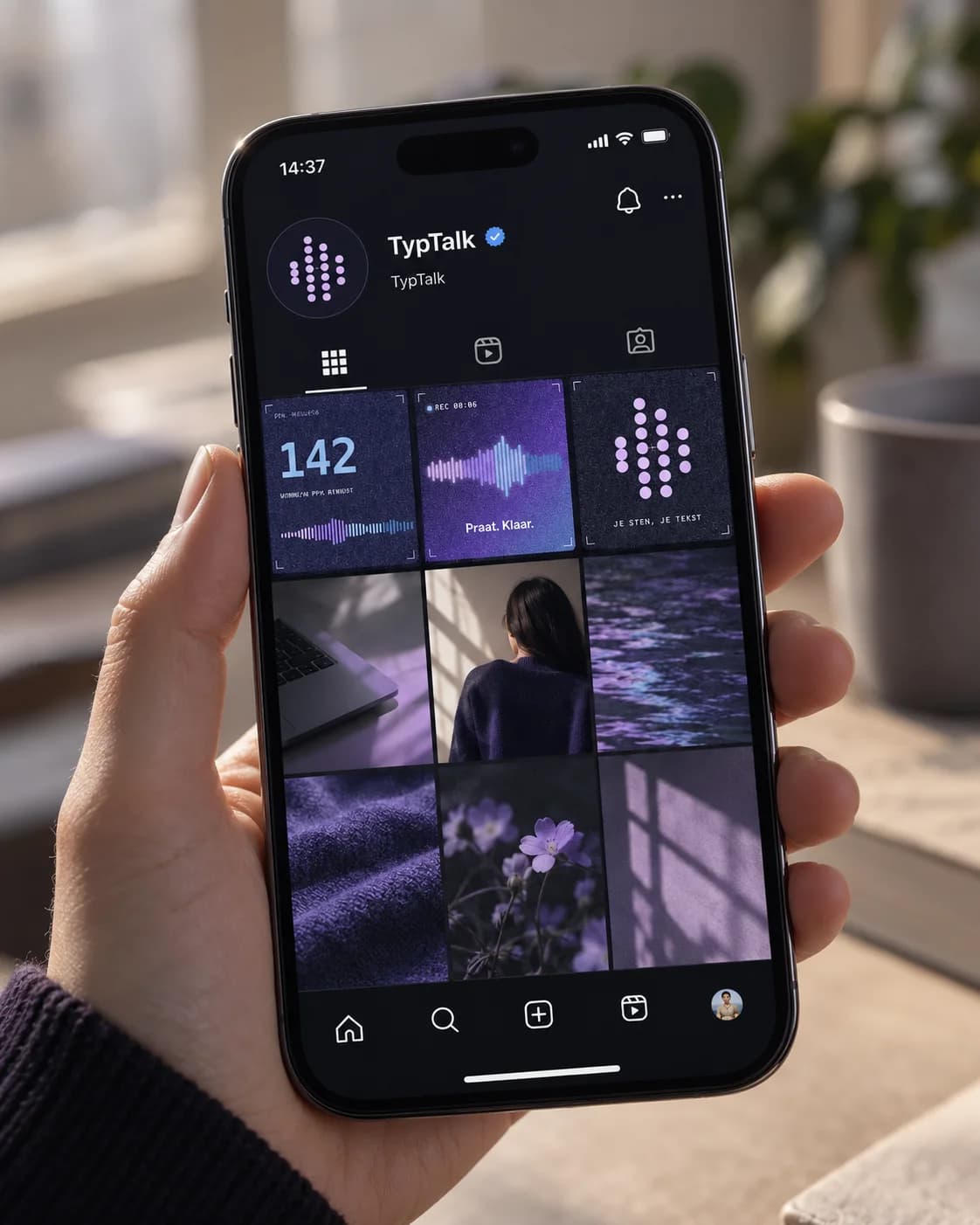
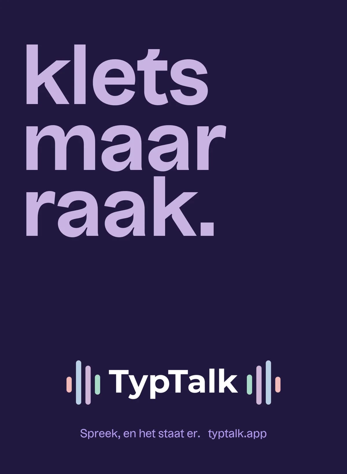
The name says what the app does: you talk, it types. Your voice is the product, so the mark is a sound wave of four bars. It started as a sketch in my sketchbook. Those four bars come back everywhere: as dots, as a wave and as a ribbon that turns into text. In the app they move while you talk, so you can see TypTalk is listening.
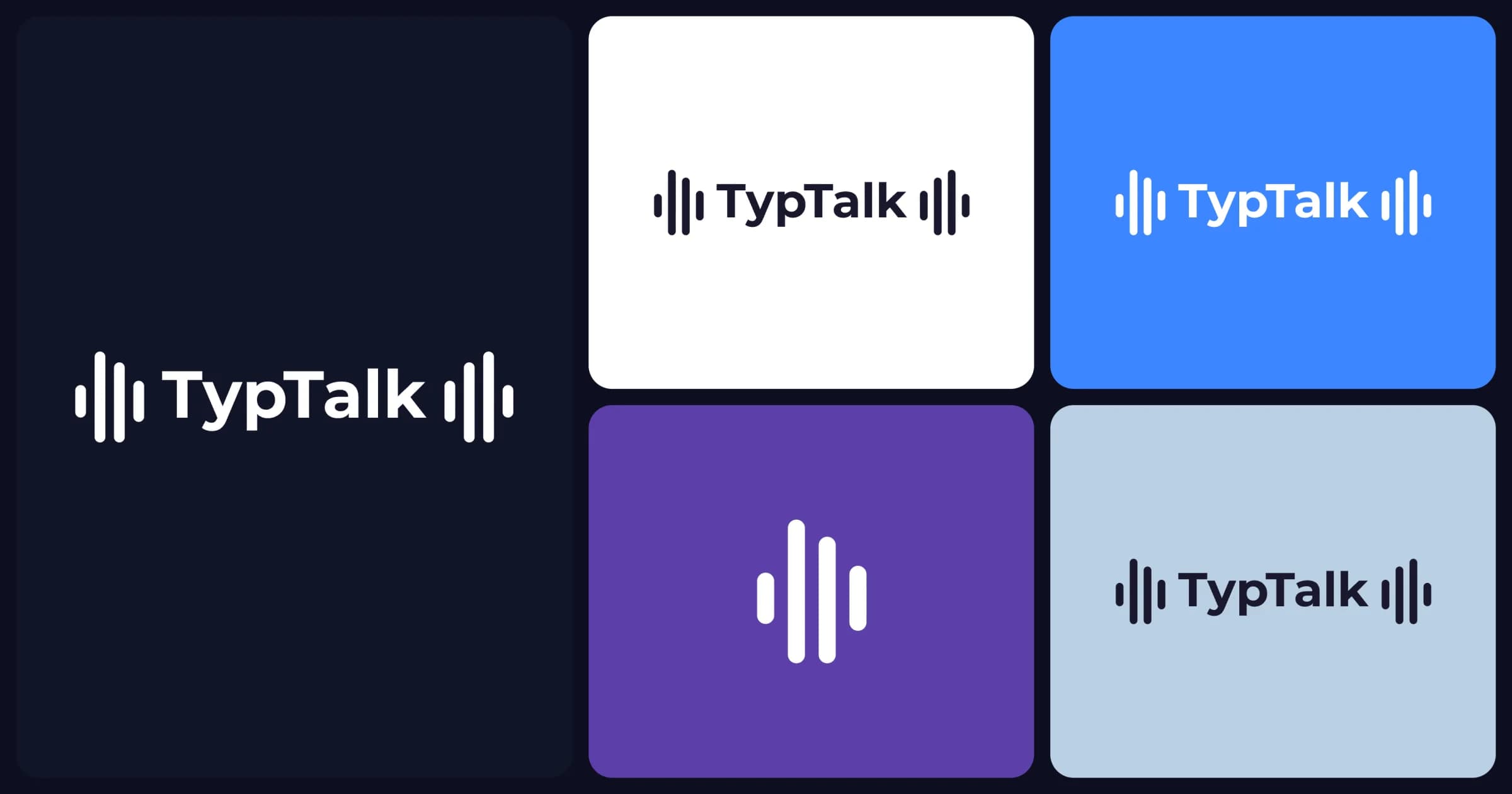
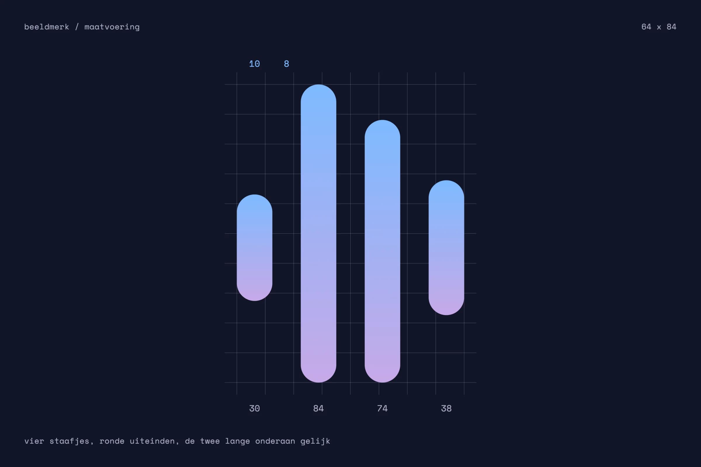
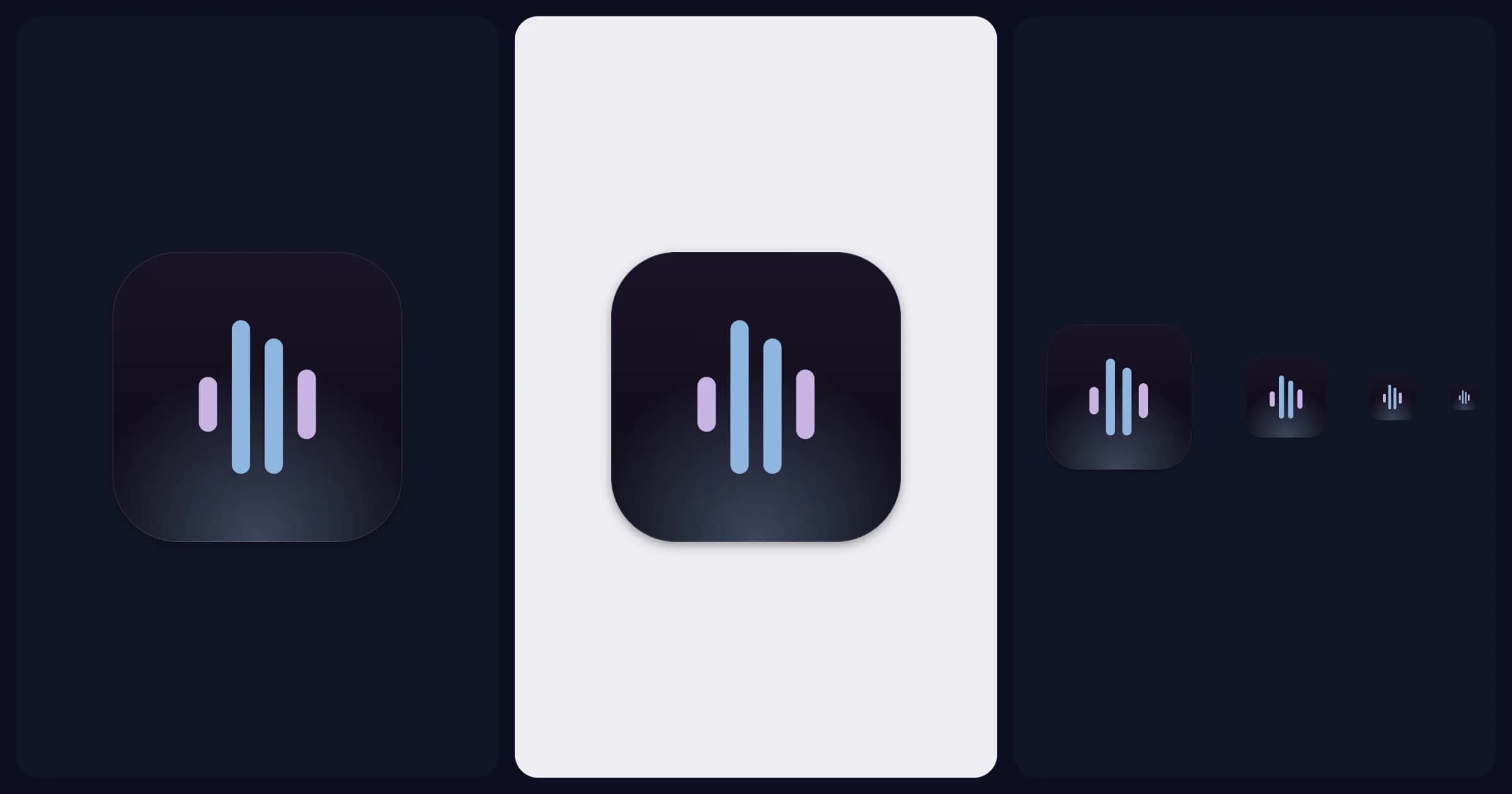
Colour
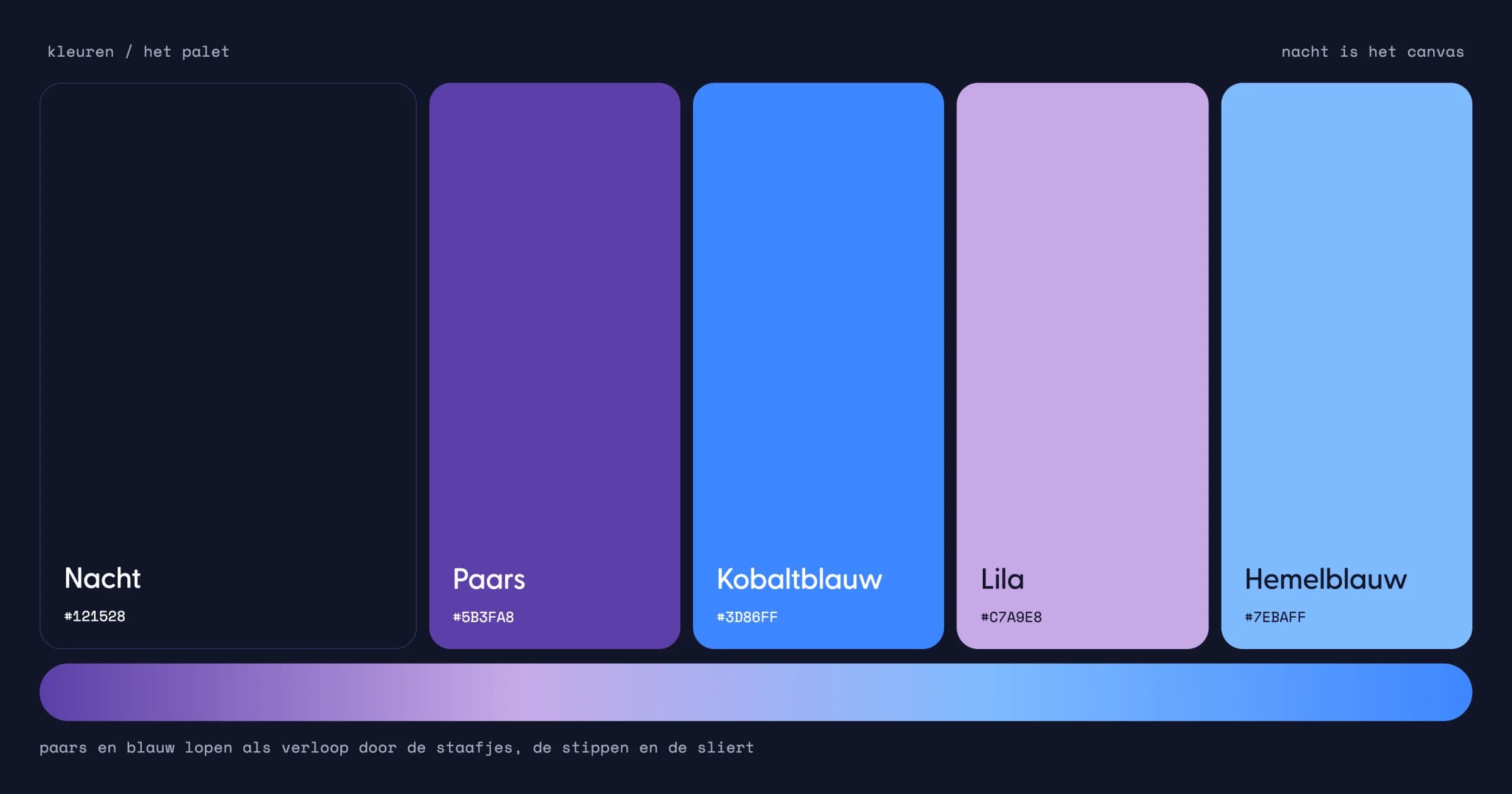
I chose a small palette: night, purple, cobalt blue, lilac and sky blue. Night is the background, a deep blue purple that never turns harsh black. Purple is the brand, blue is the voice. They flow into each other, just like your voice turns into text. The site and the app also use softer pastels, so it stays light and inviting.
Typography
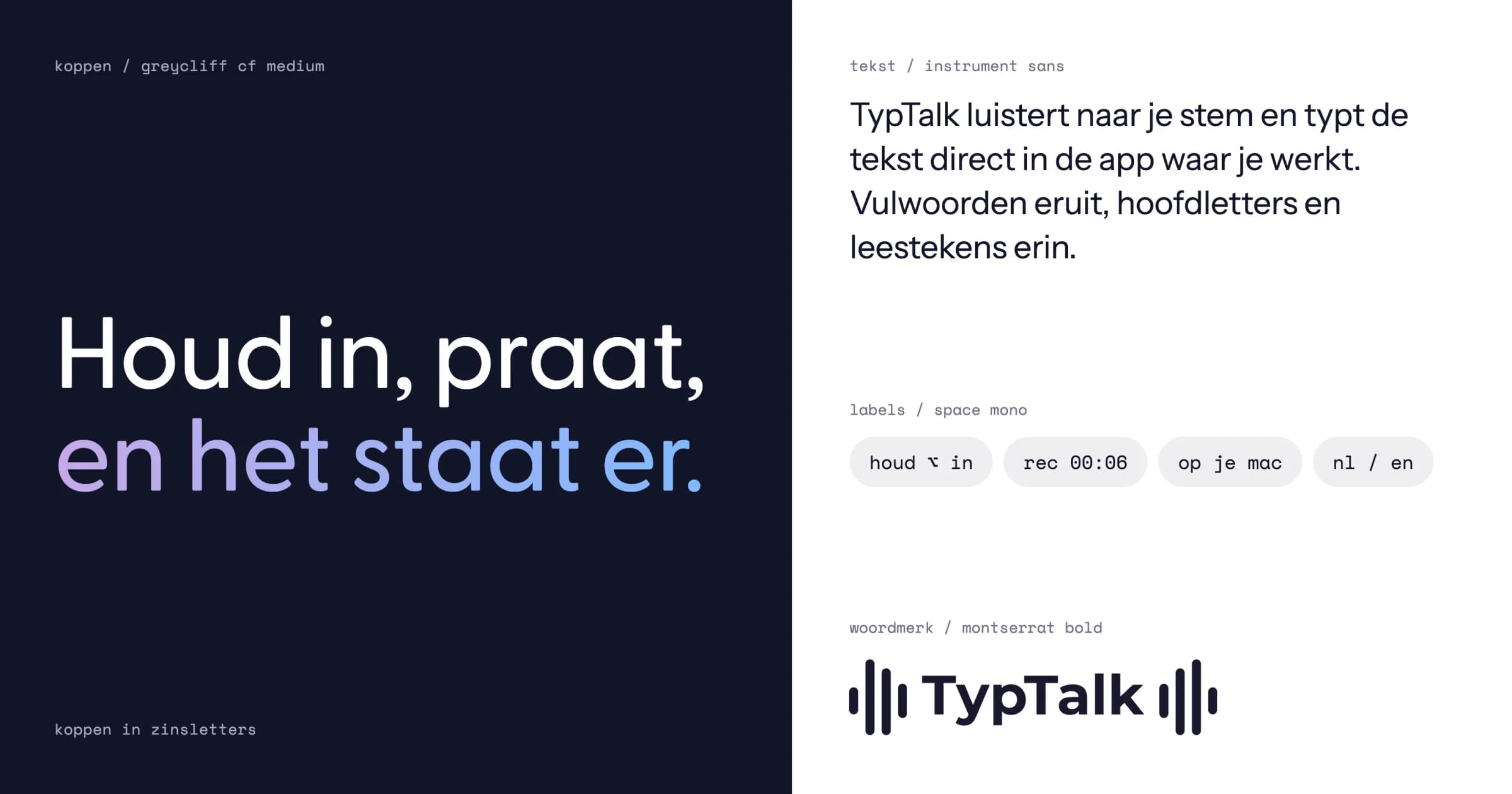
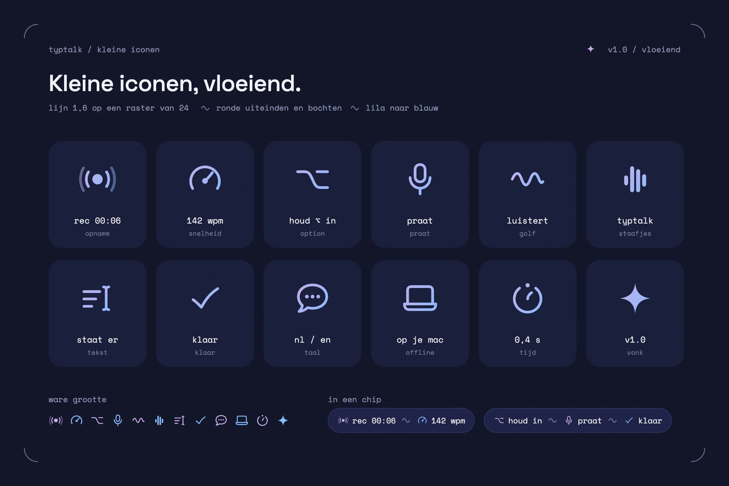
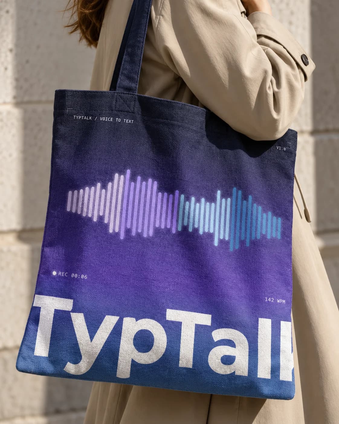
For the headings I chose Greycliff CF, an open and friendly typeface. I set them in sentence case, the way you talk, not in capitals that shout. Body text is in Instrument Sans, calm and easy to read. Small labels in a computer-style typeface, such as rec 00:06, recall a recording screen and give the brand a technical edge. The icons have flowing lines too, just like the sound wave.
The app
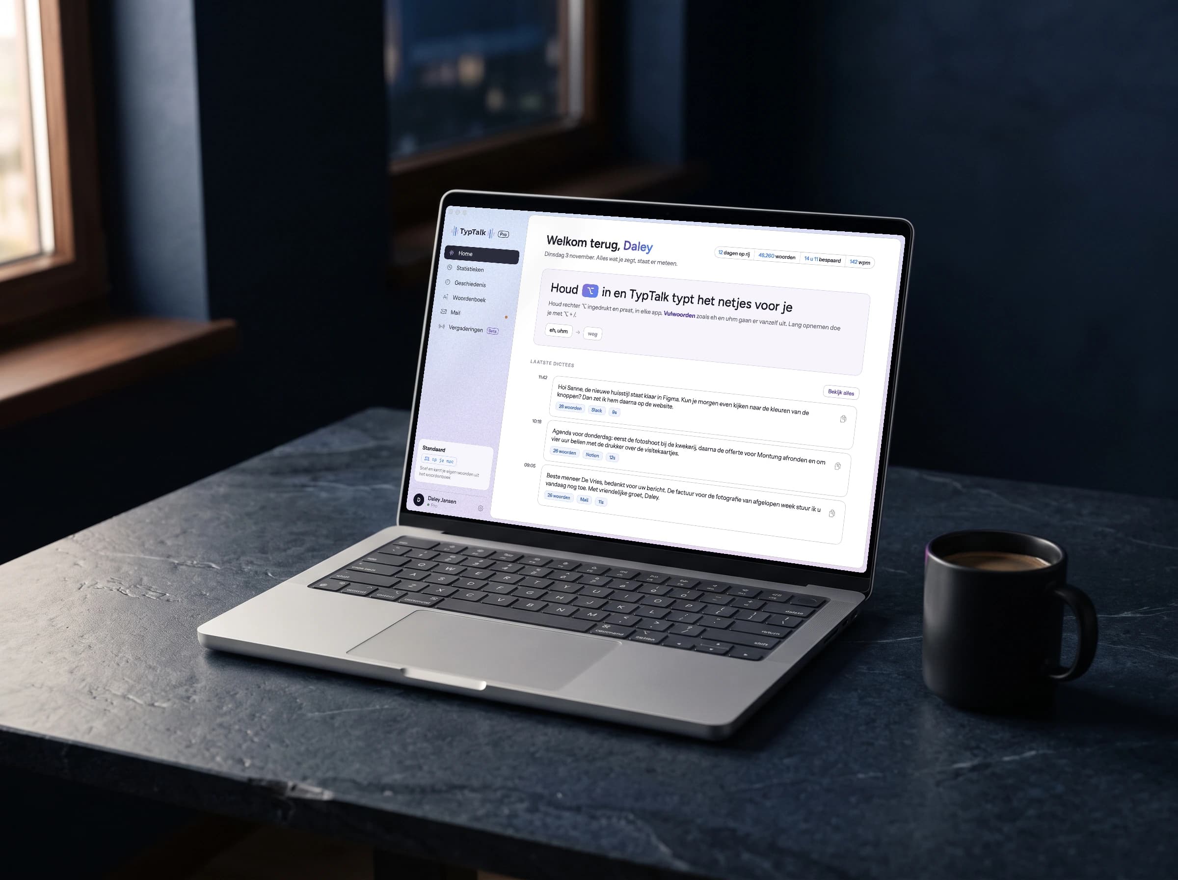
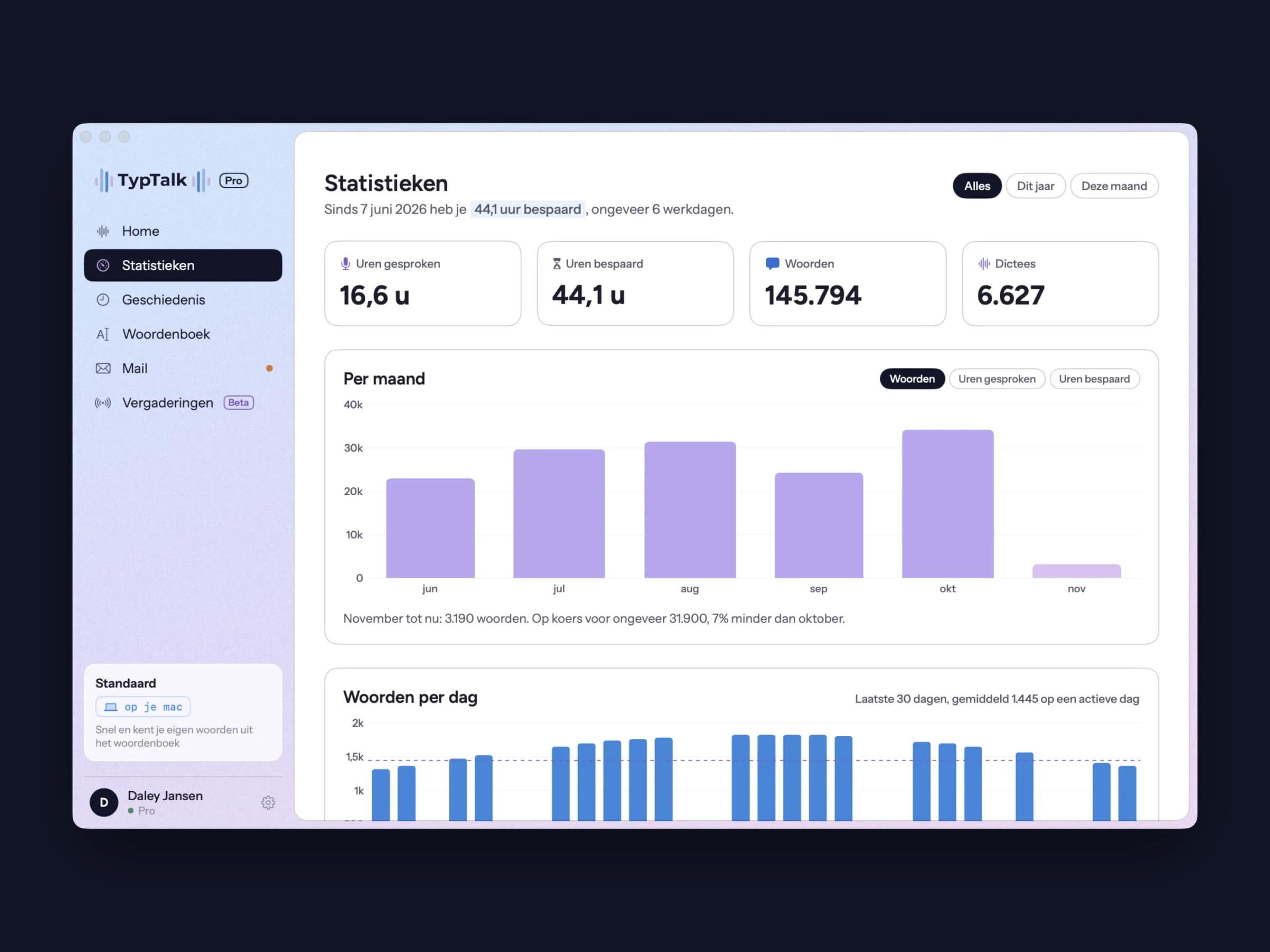
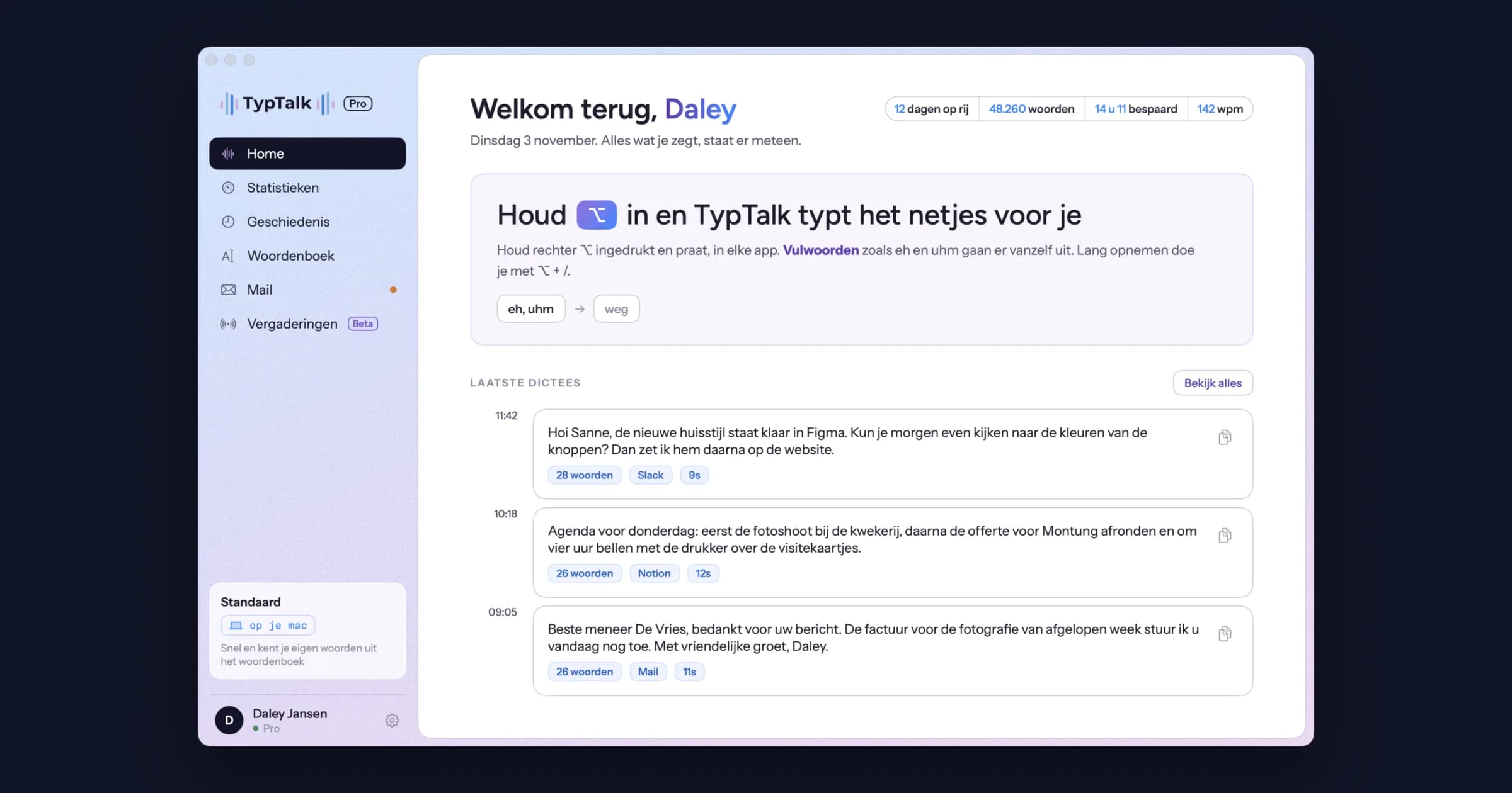
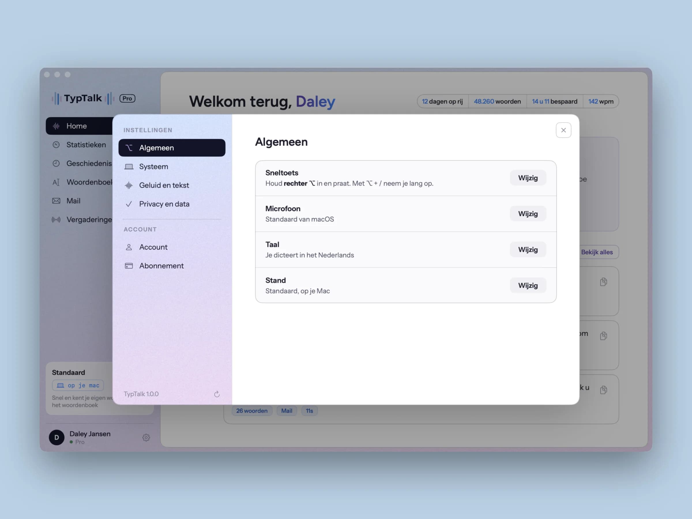
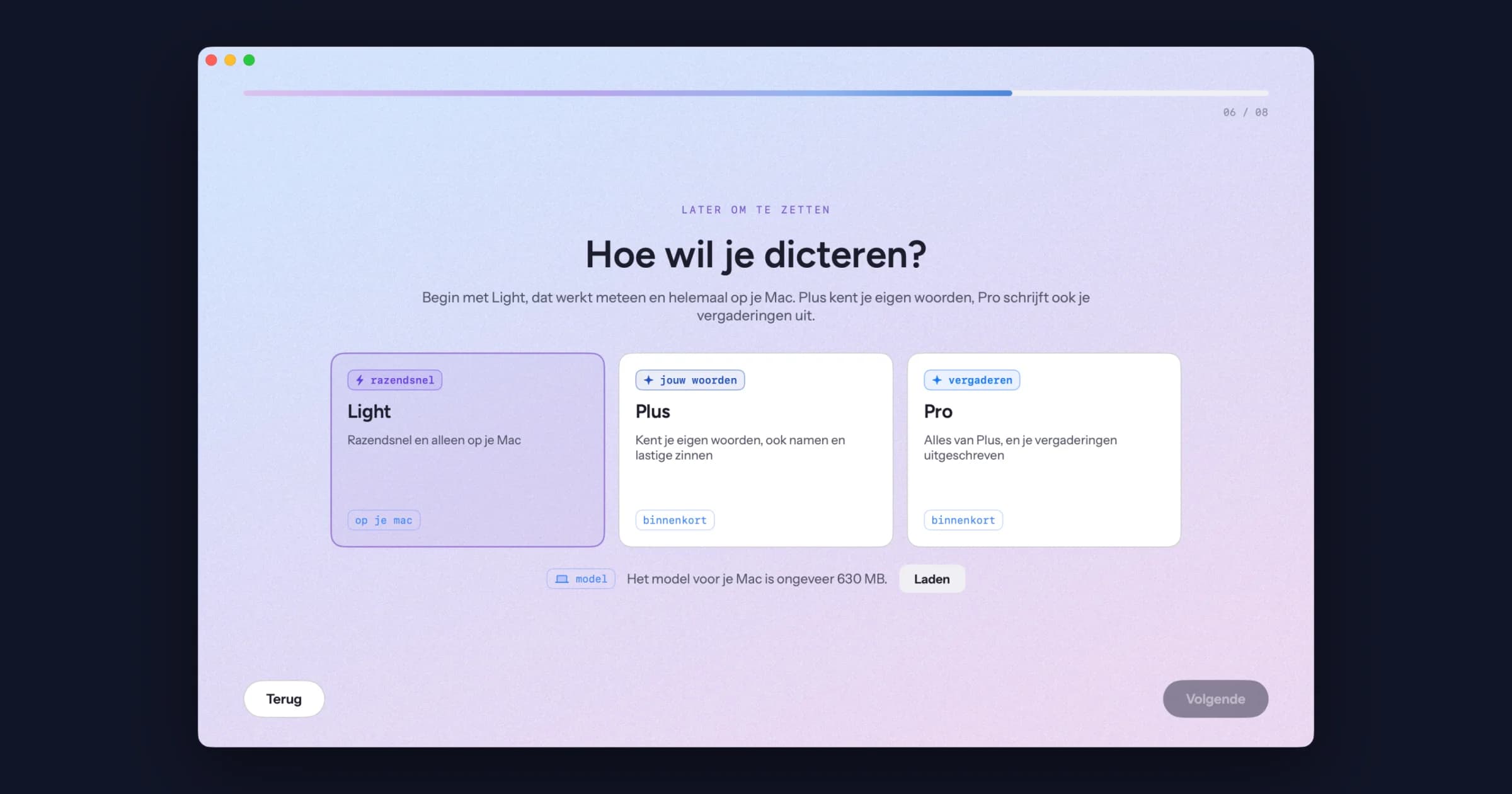
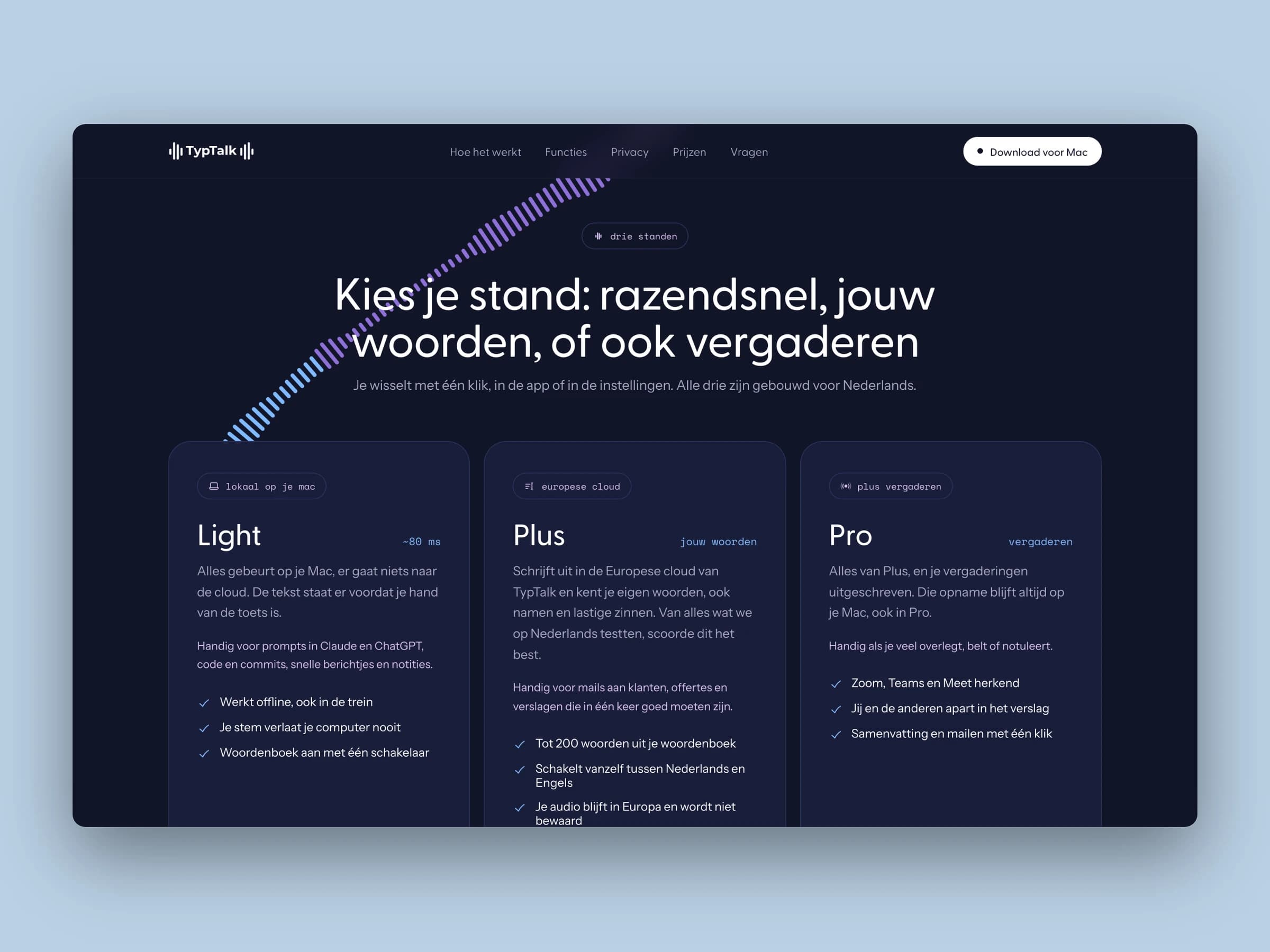
The app itself is light and calm: a soft gradient from ice blue to lilac, with white cards and thin lines. The brand colours return in the details, such as your name and the buttons. There are three modes, because sometimes you want speed and sometimes precision. Light works entirely on your own Mac, Plus goes through the European cloud and knows your own words, and Pro also transcribes your meetings. A personal dictionary learns names and jargon, so you have less to correct.
The website
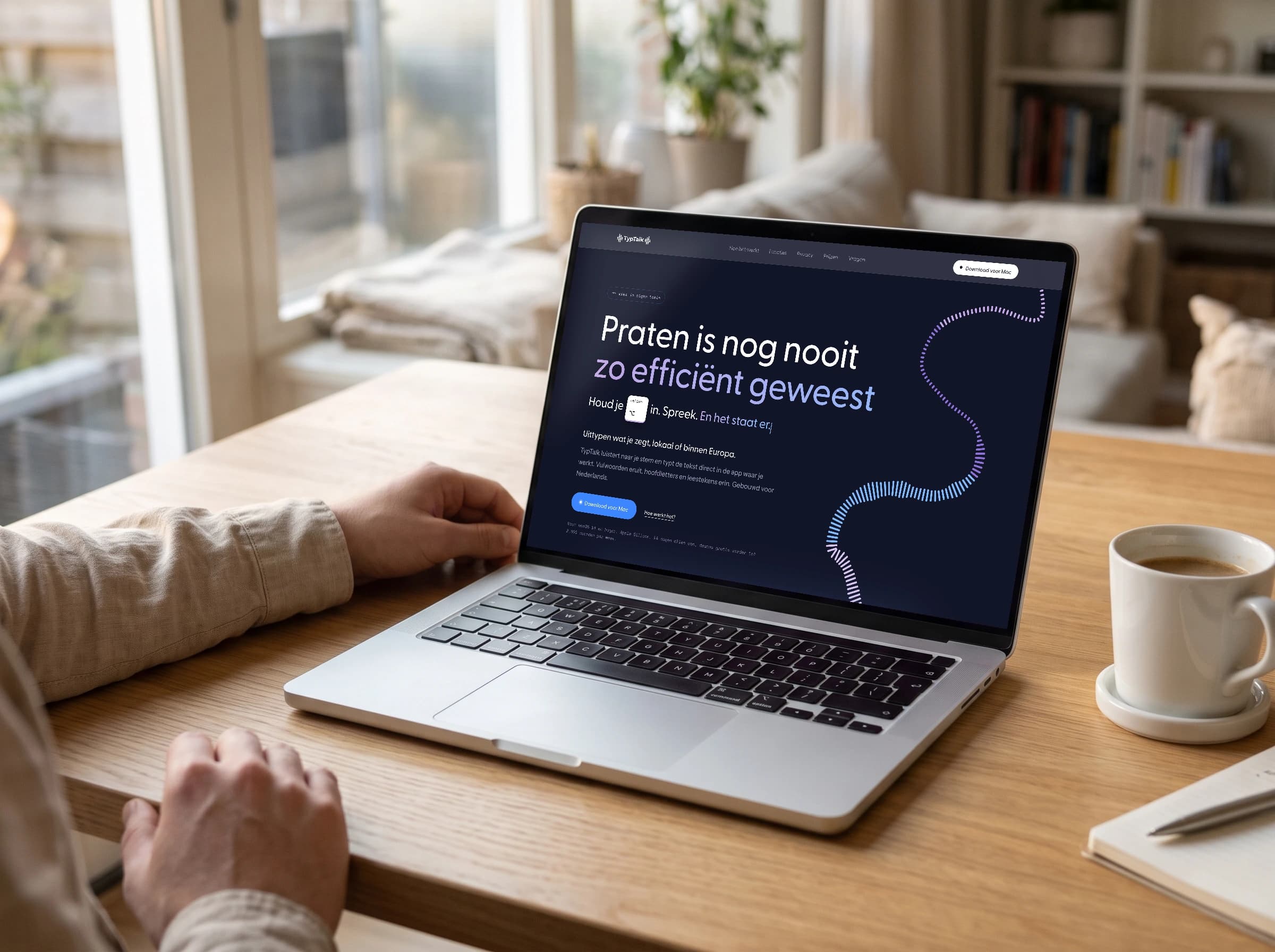
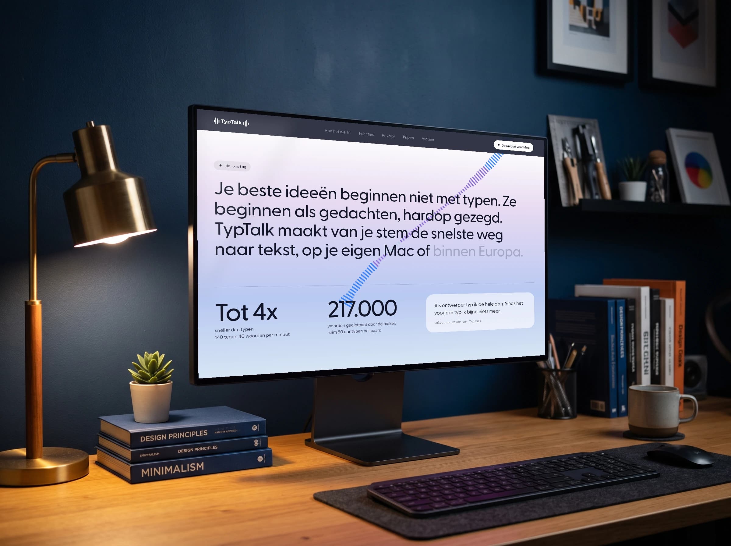
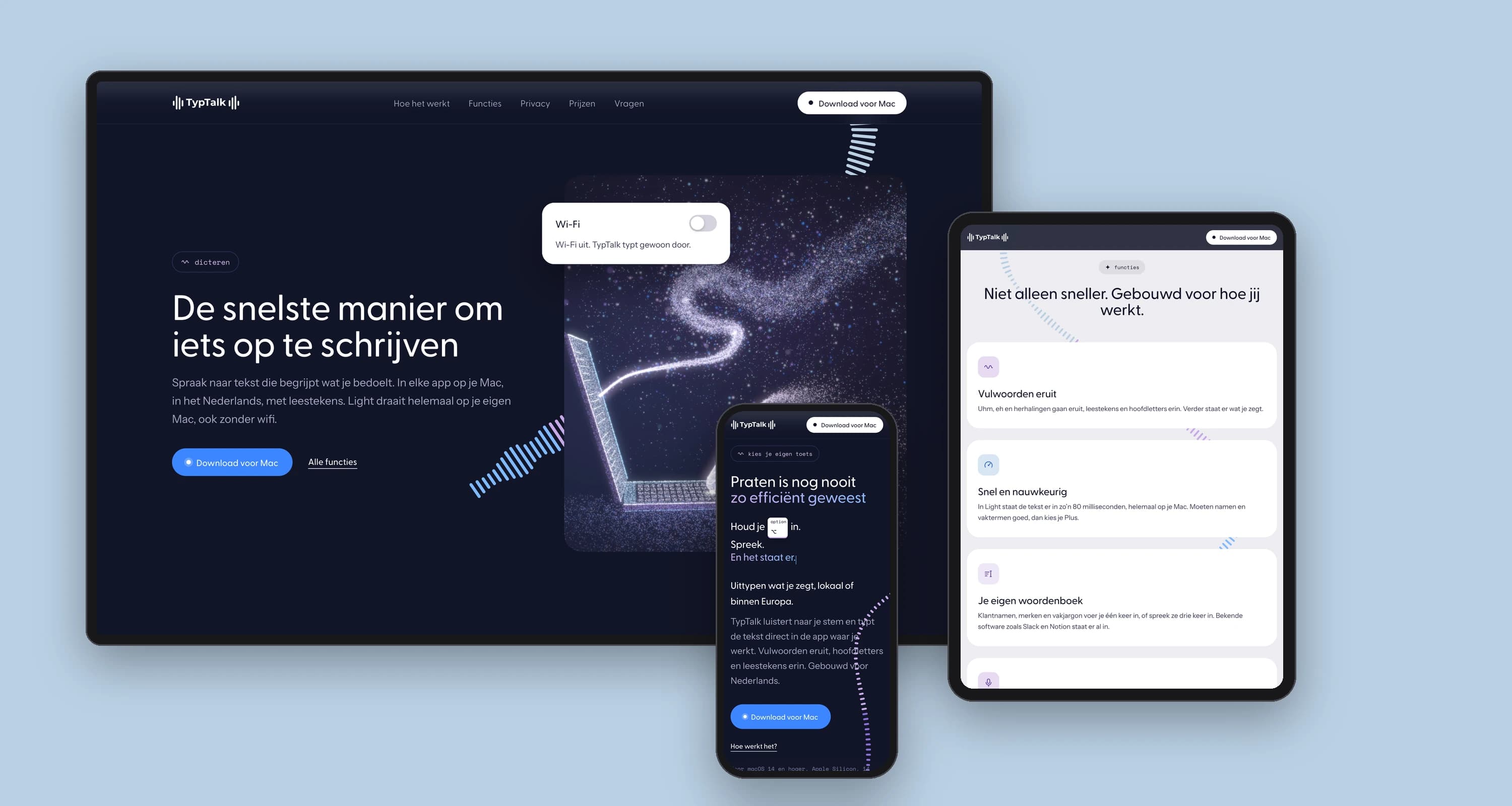
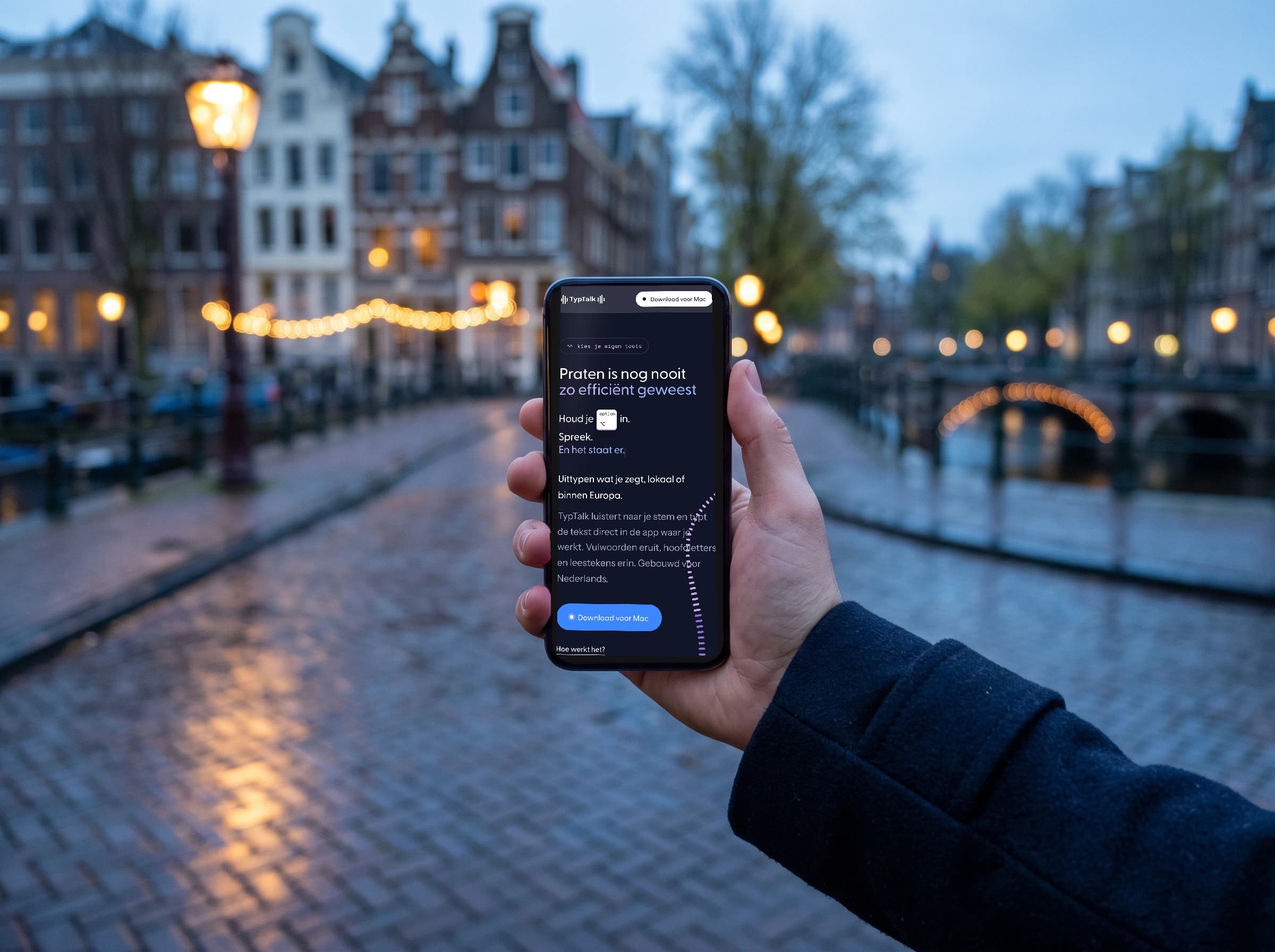
The site looks like the app, so you recognise right away what you are downloading. A ribbon of audio bars runs across the page, and moving examples show how it works.
The brand in use
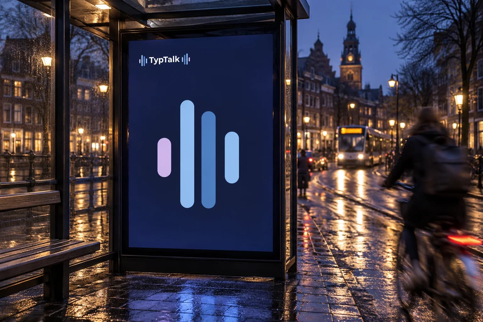
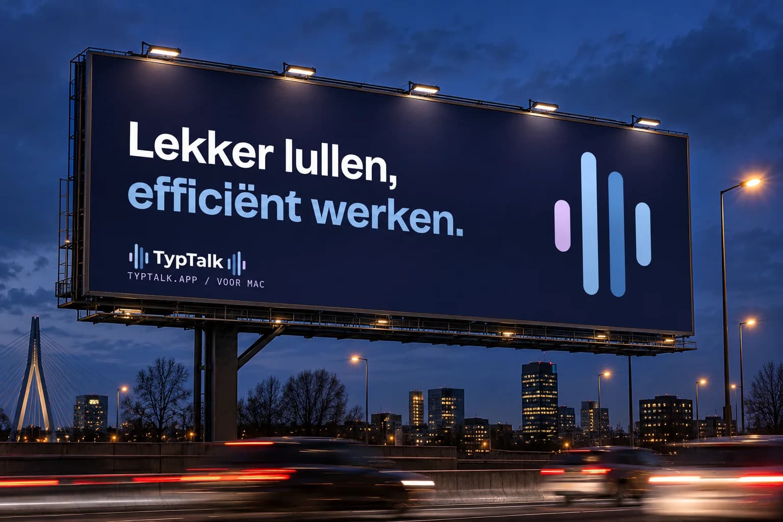
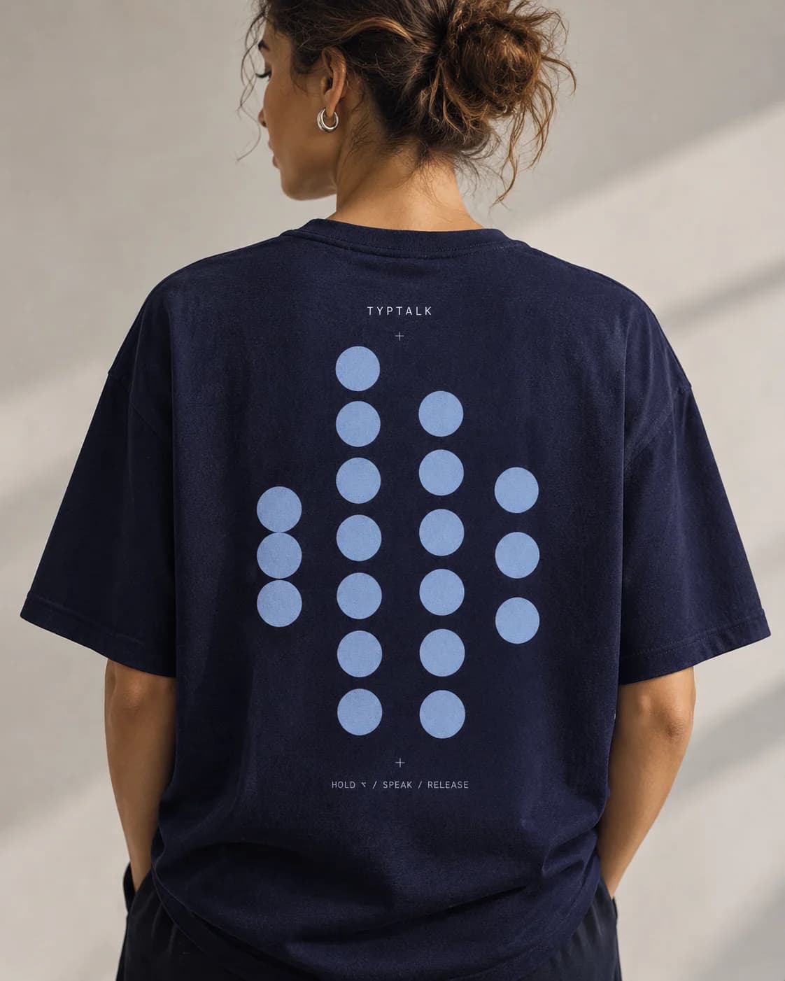
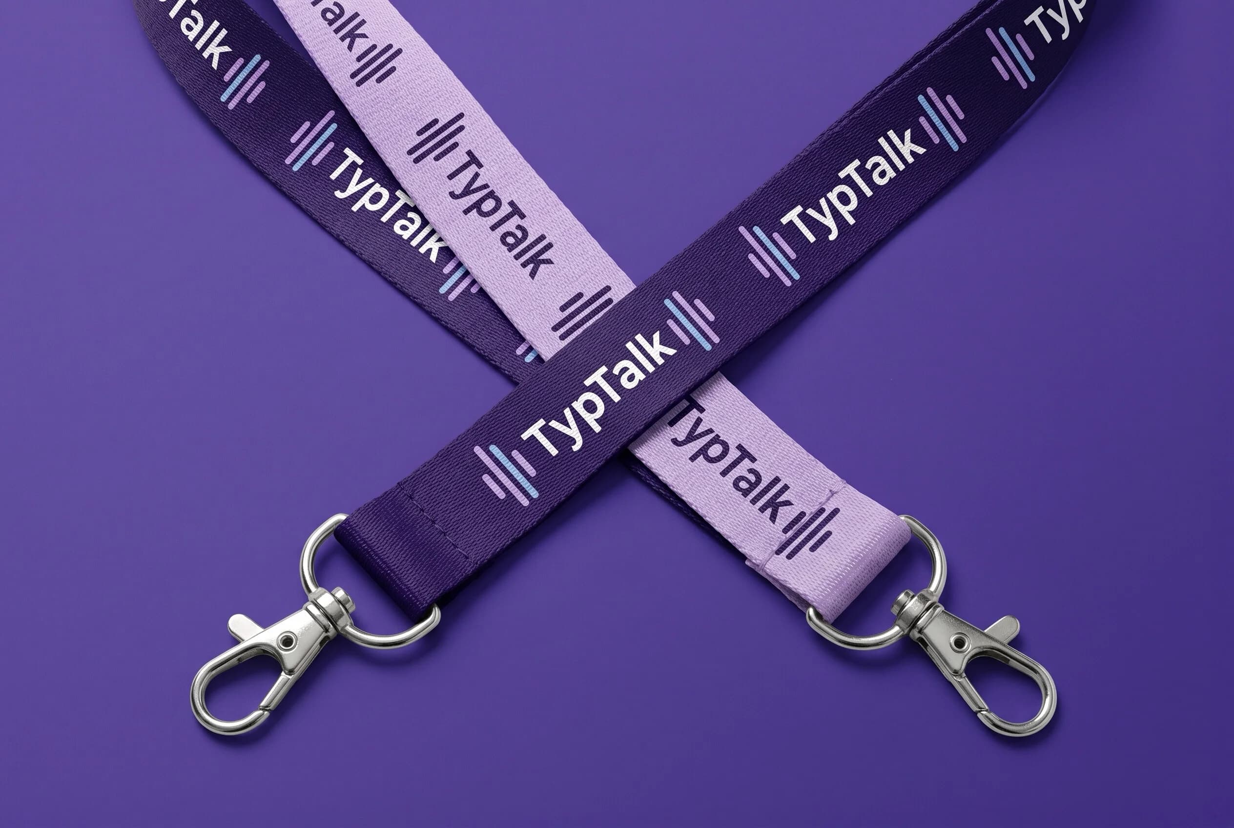
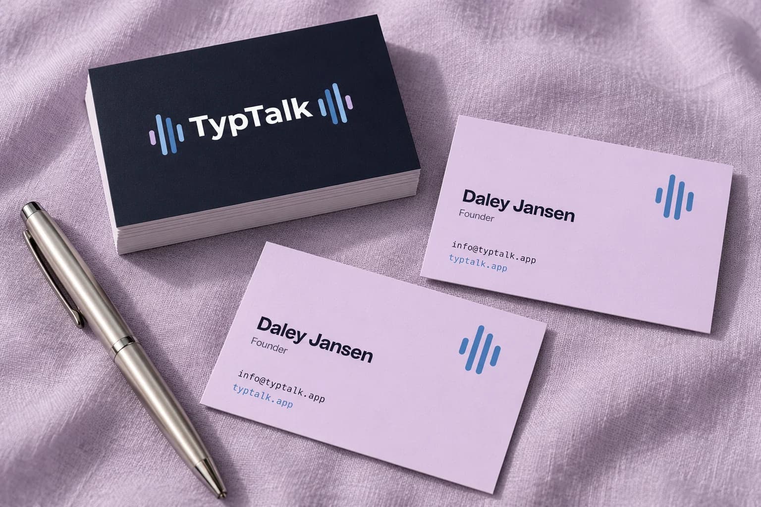
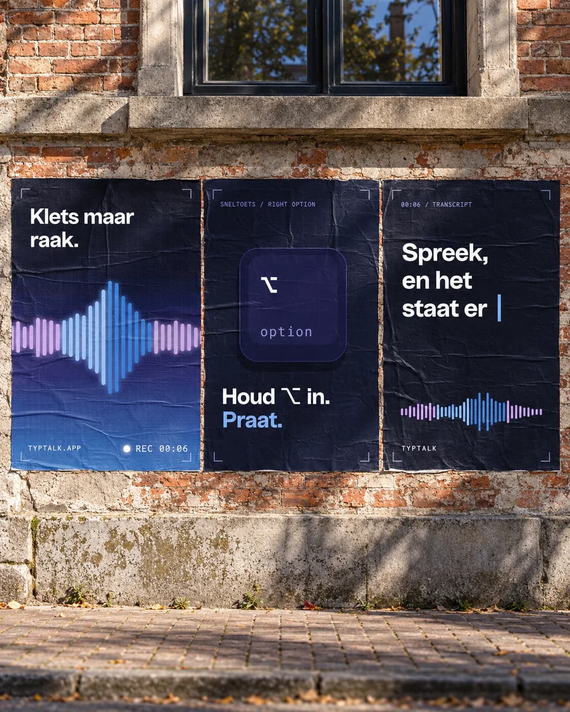
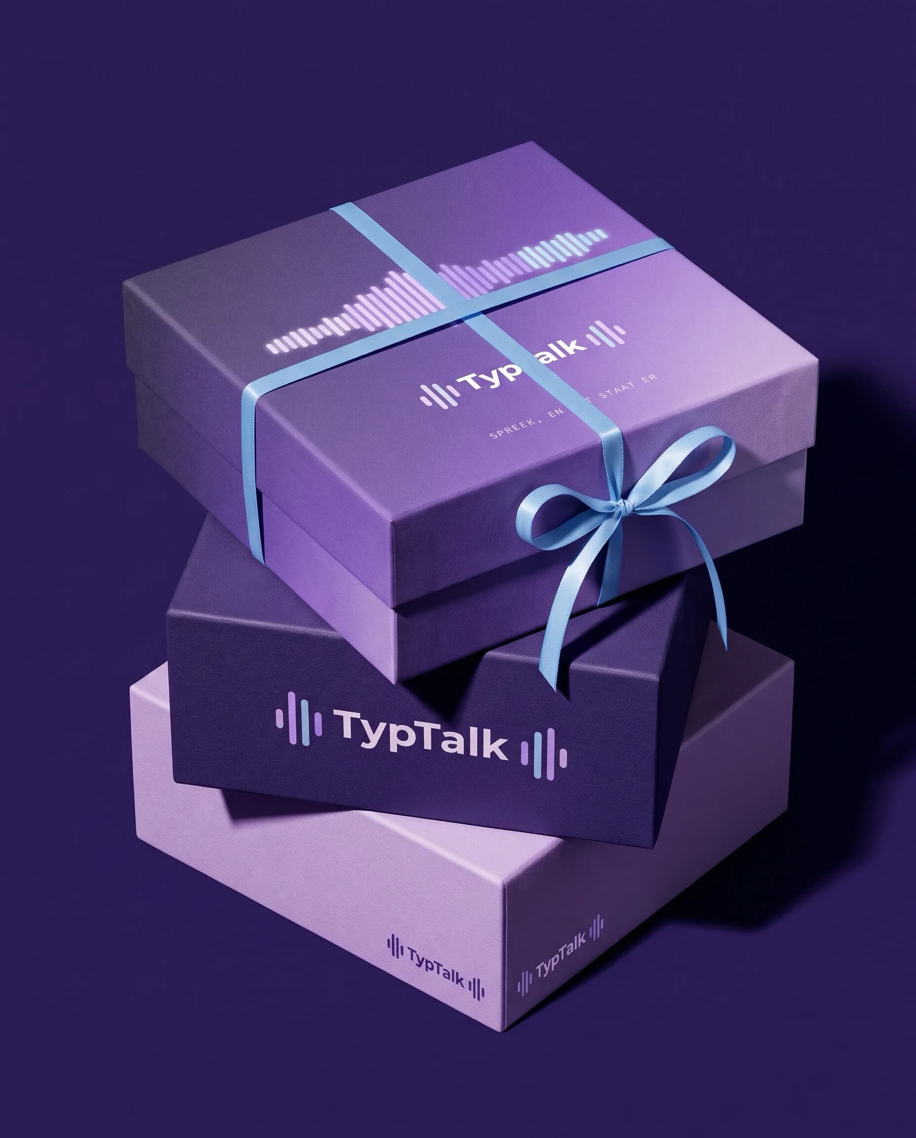
A brand only really comes to life when you see it out in the world. So I made mockups of everything TypTalk could appear on: a billboard, a bus shelter, posters, a newspaper ad, business cards, a tote bag, a shirt and social media. Always that one large motif on night, so you recognise the brand everywhere.
Something like this for your brand?
01How does a project like this start?
With a message. We plan a meddling session, where you tell me where you stand and I honestly say what I see. After that you get a proposal with a fixed price, and once you approve, we get going.
02What does a project like this cost?
That depends on what you need: just a brand identity, a website too, or the whole package with imagery. You hear a fixed price up front. Message or email me briefly what you're looking for, and you'll have an indication within one working day.
03My industry looks nothing like this. Does that matter?
No. I work for very different businesses, from a gym to garden pots. Before I design anything, I dig into your industry and your customers, so it fits you and not the neighbours.
04Can I have just one part of this done?
Yes, you step in where you are now. If you already have a logo, I first take a quick look at whether the foundation is right, and then we move on to the website or the imagery. It doesn't all have to happen at once.
Something like this for your brand?
Tell me where you are now. The first call is free, no strings attached.
 Next caseSales Spark