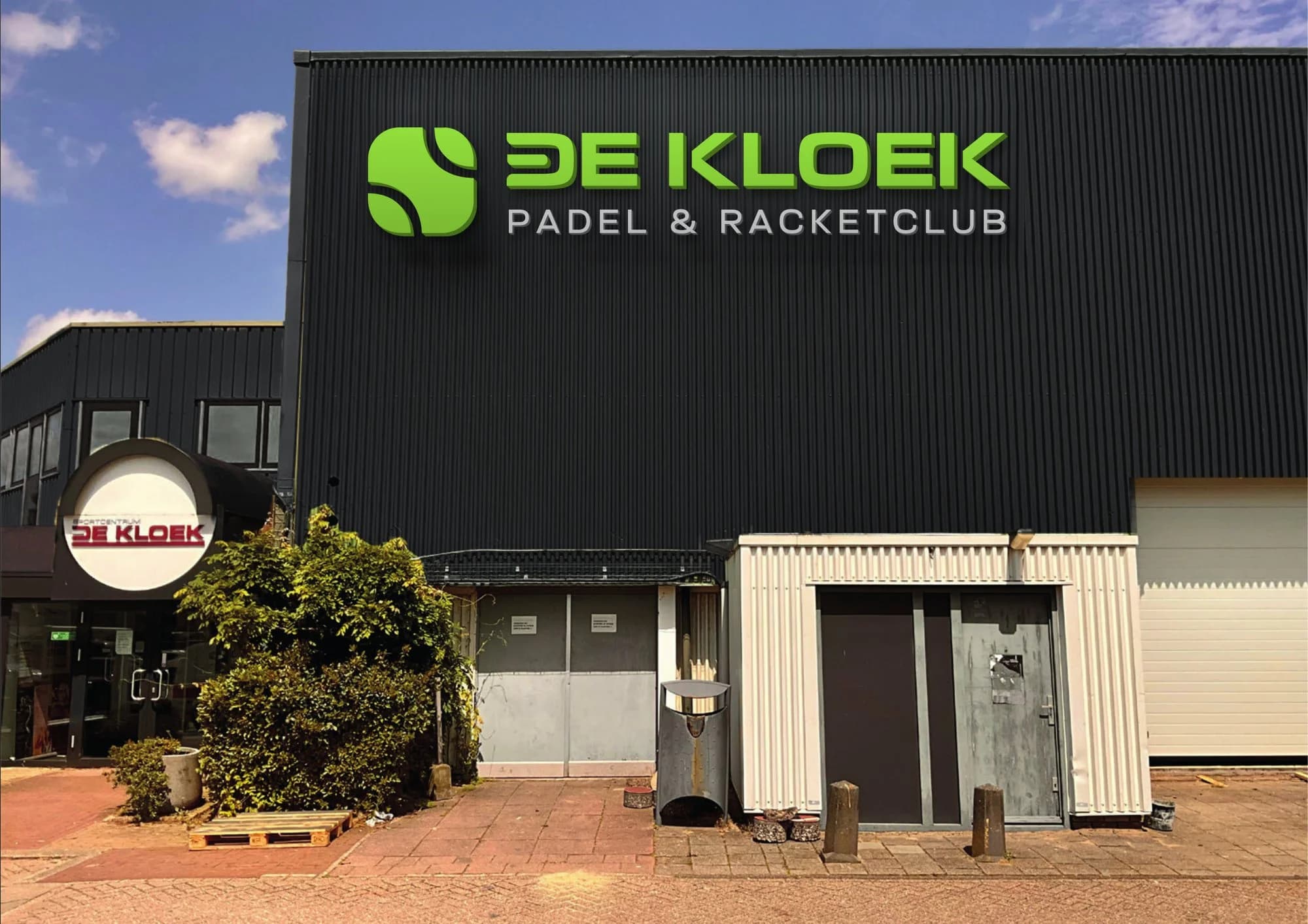
De Kloek Padel
Platform 5 became De Kloek Padel. A new logo, an updated visual identity and the website for the padel club of Sportcentrum De Kloek in Middenbeemster.
Overview
The padel courts of Sportcentrum De Kloek in Middenbeemster opened in 2024 as Platform 5, for which I designed the visual identity at the time. Since July 2026 the club has been called De Kloek Padel, so padel and the other branches share one name.
- Client
- De Kloek Padel
- What I did
- WebsiteVisual identityLogo
- Year
- 2026
The new logo
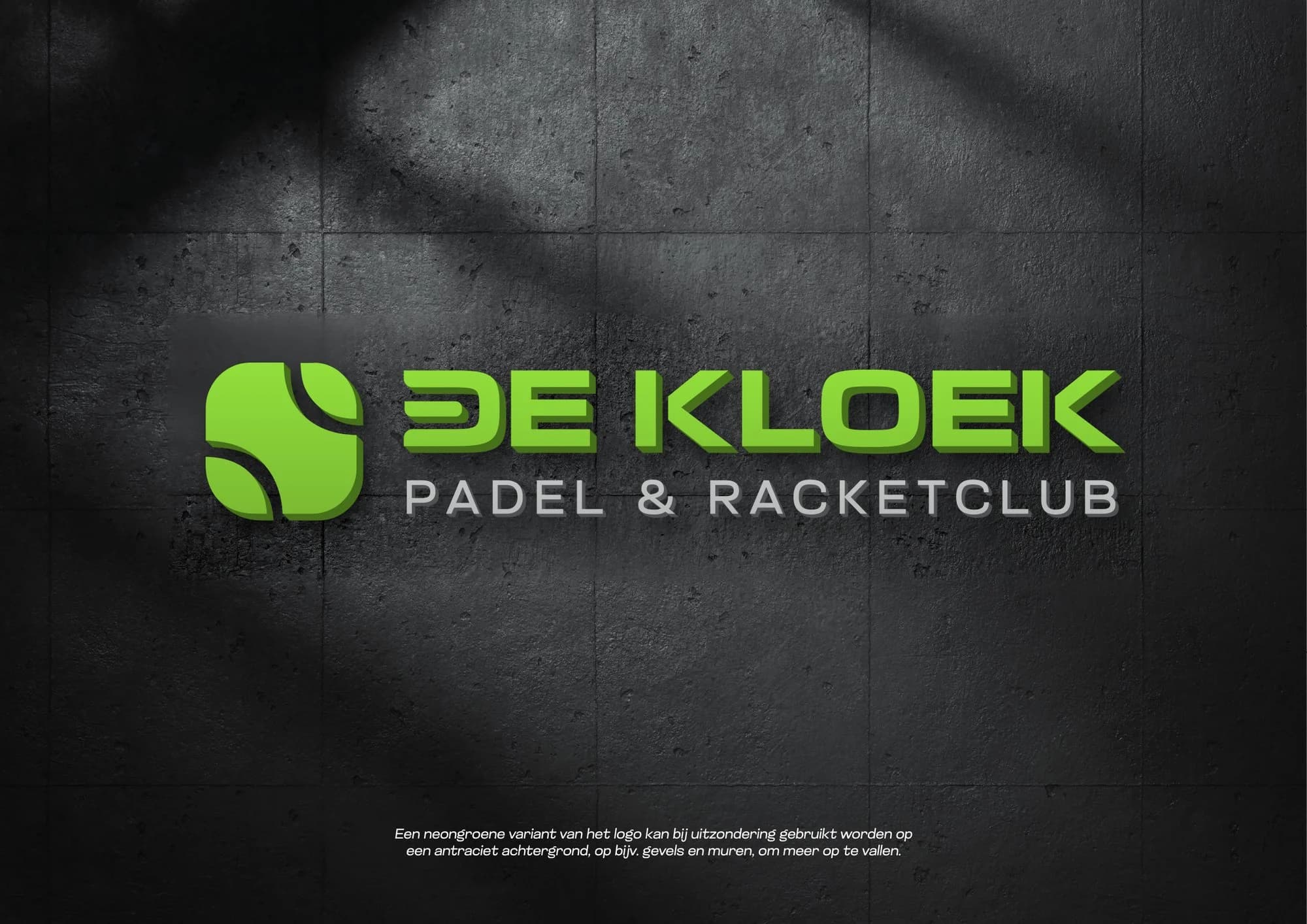
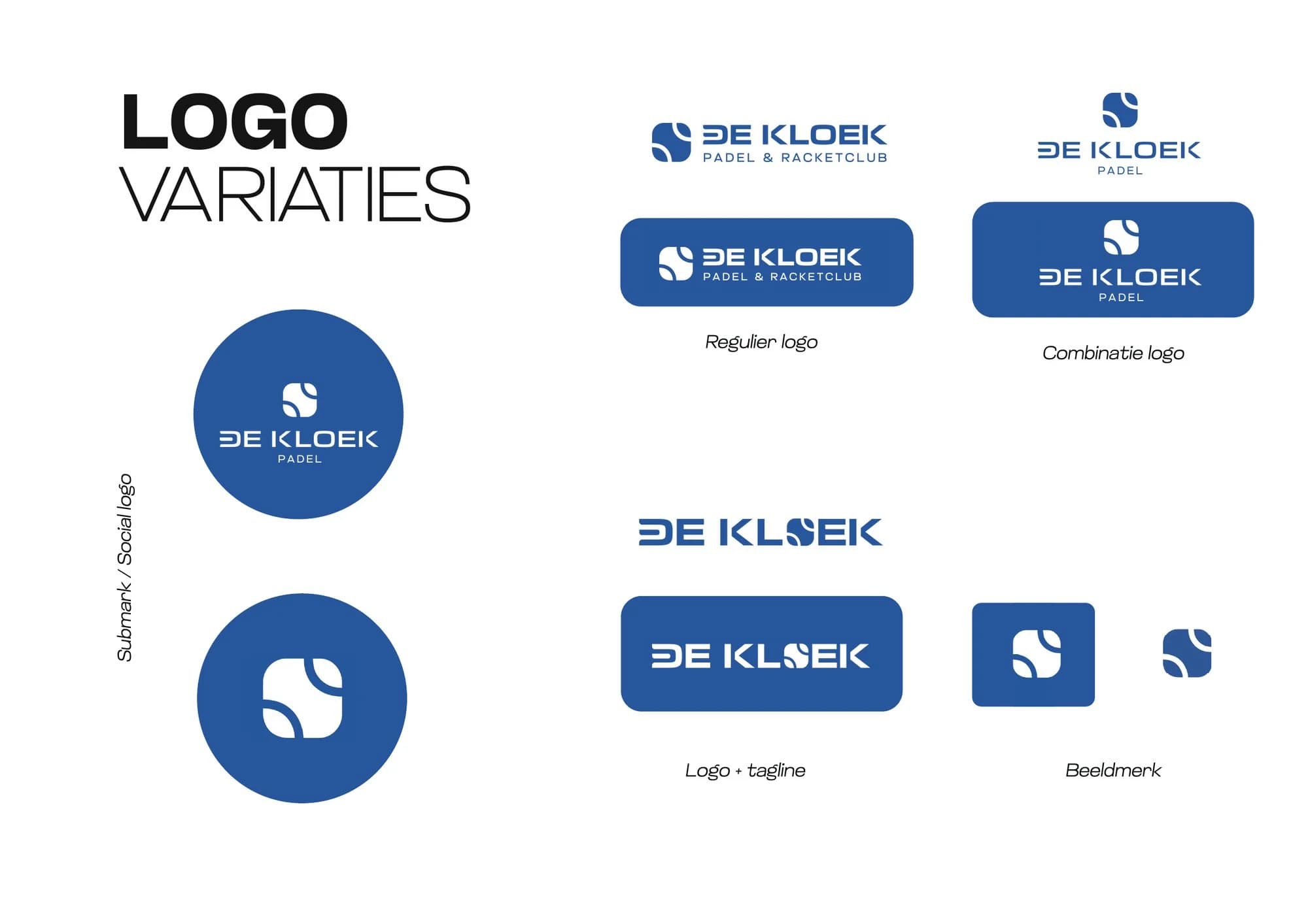
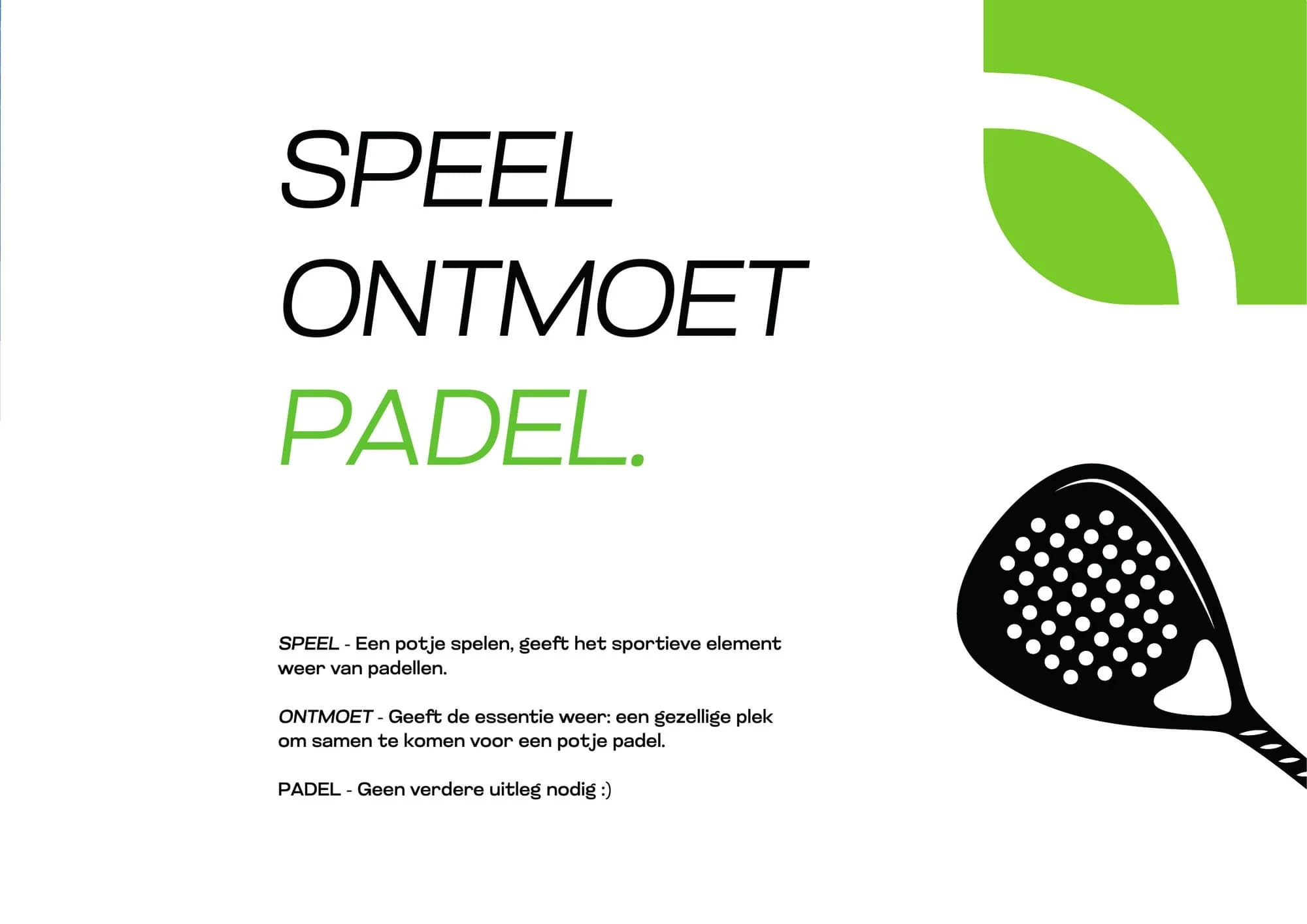
The new mark is a ball, the most recognisable thing in the sport. There are variants for every place: round, horizontal, with and without Padel & Racketclub, and the ball on its own. So it works small as an app icon and large on the facade.
Colour
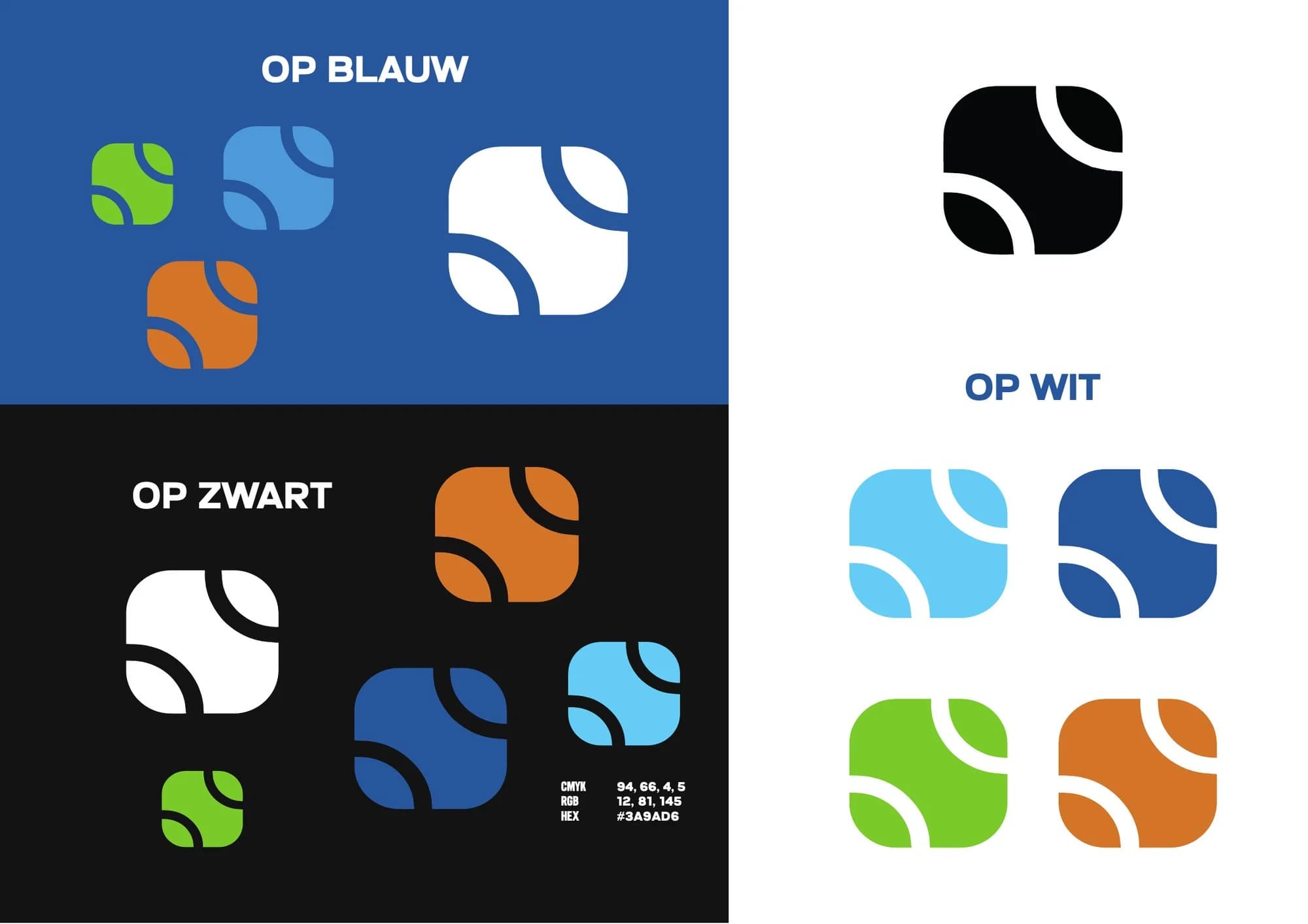
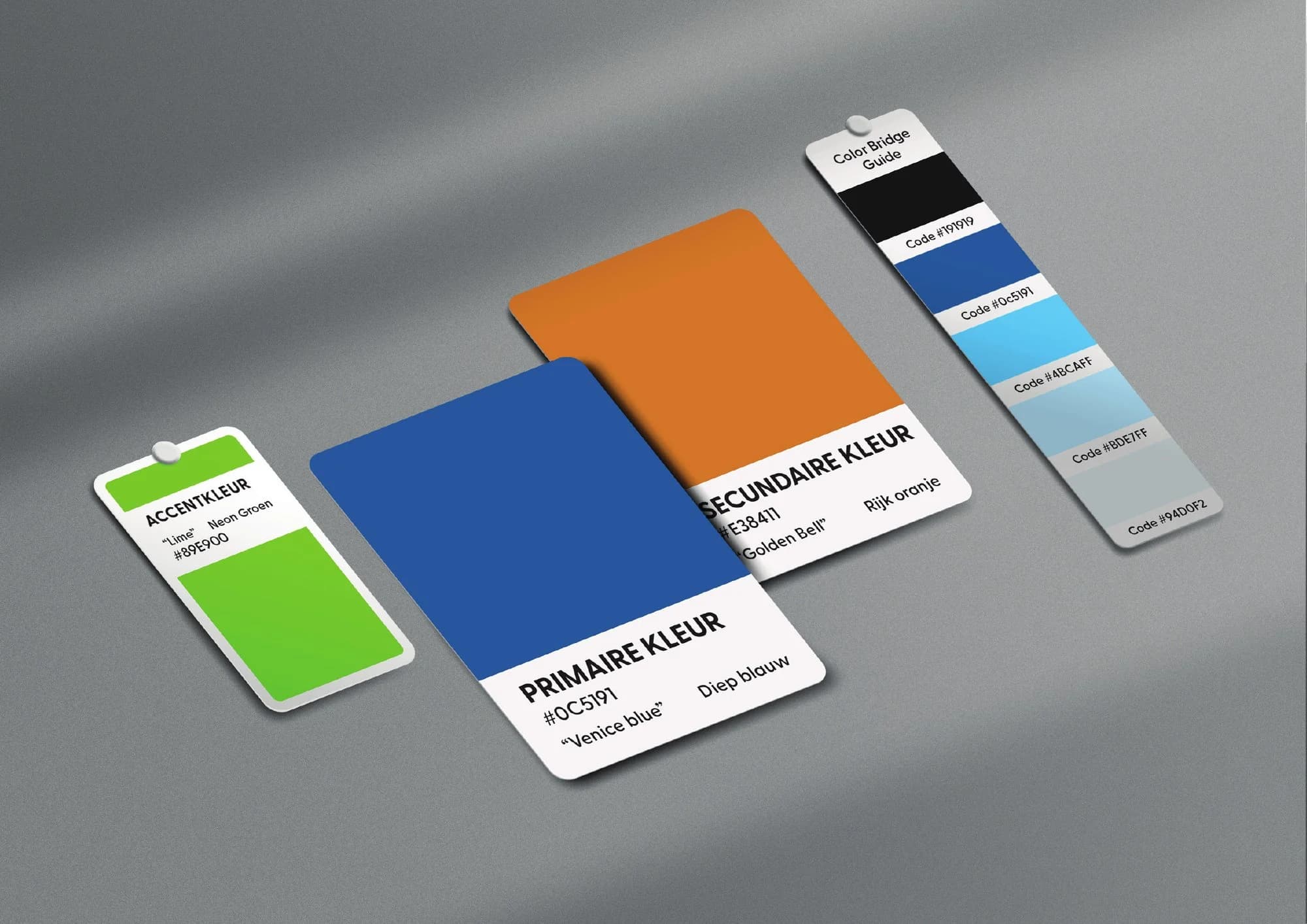
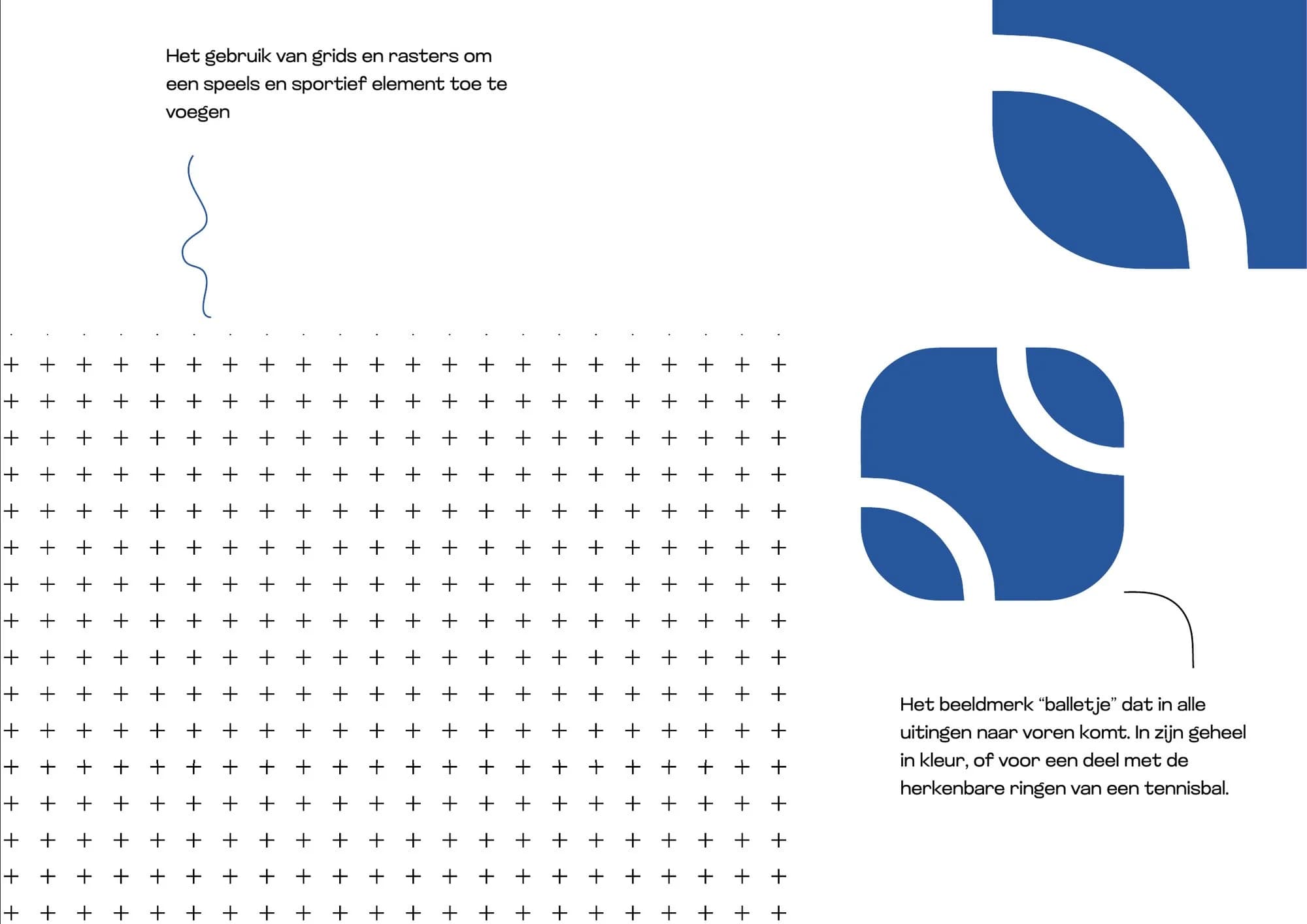
The colours stayed from Platform 5, so members keep recognising their club. Deep blue is the main colour, the colour of the court. Orange is the second colour and neon green the accent, bright like the ball and the lines. A grid of small crosses and the ball come back everywhere.
Typography
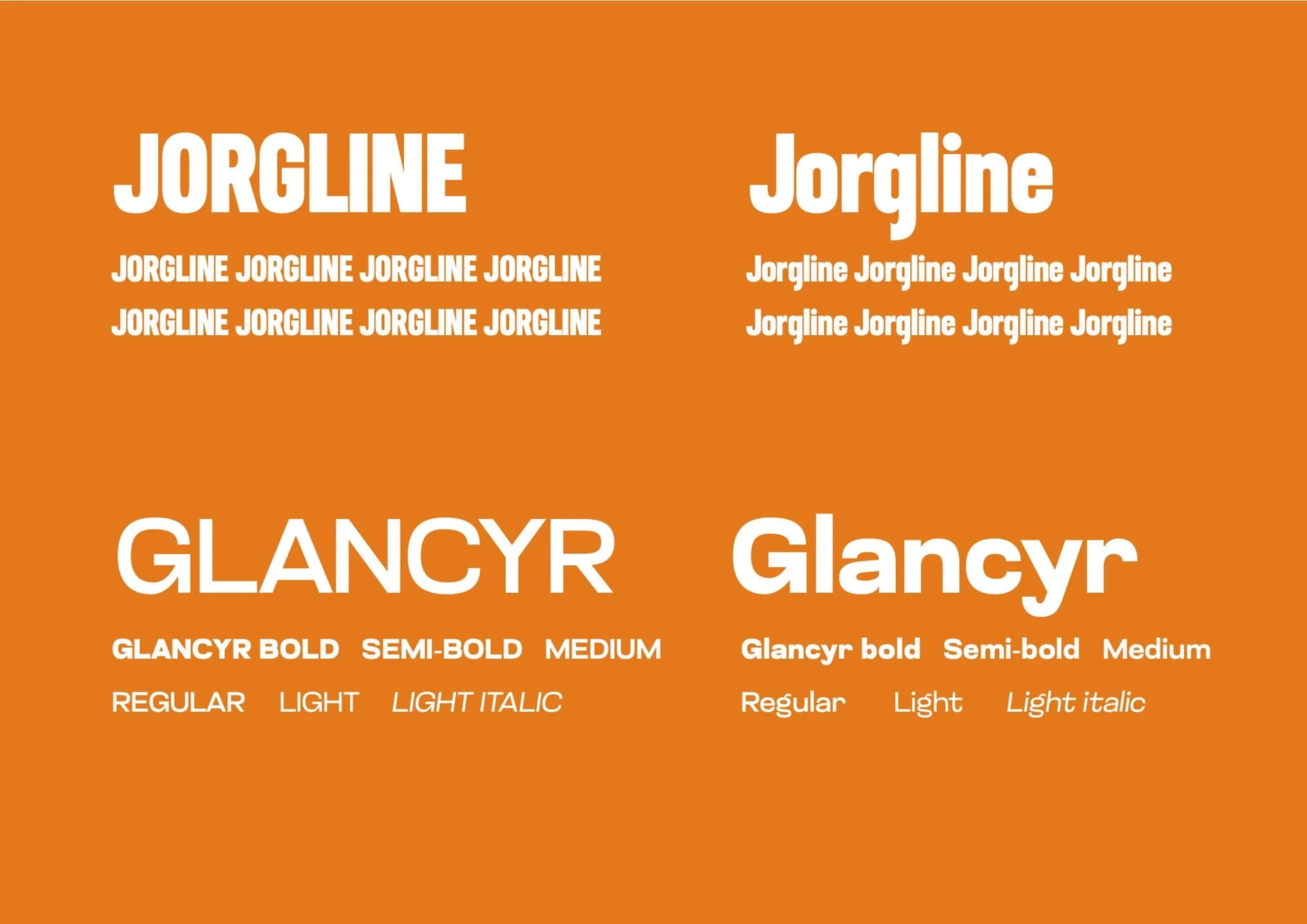
Headings are set in Jorgline, narrow and bold, so they read fast and sporty, just like the game. Glancyr is calmer, for everything you want to read easily, such as class schedules and prices.
The brand in use
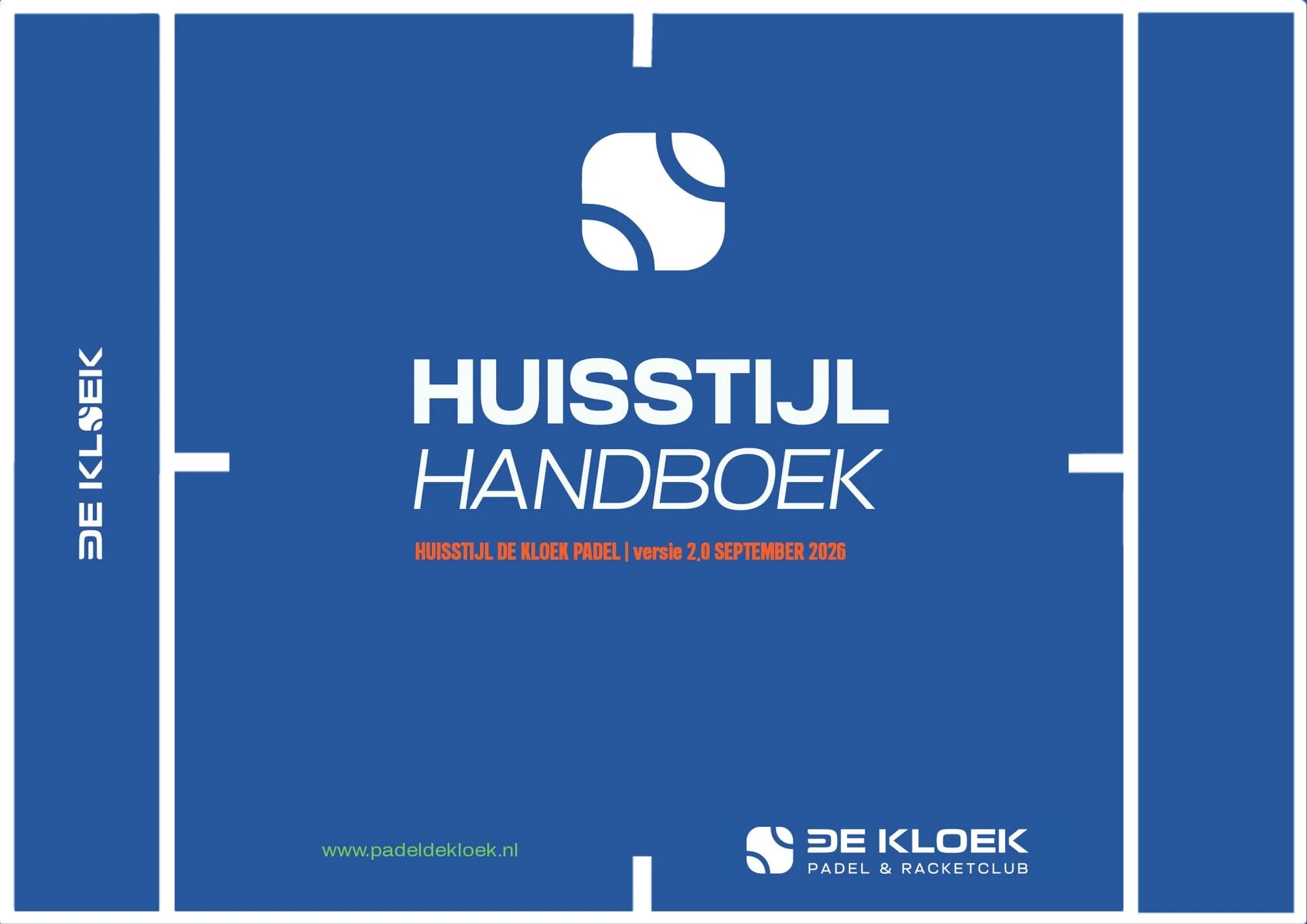
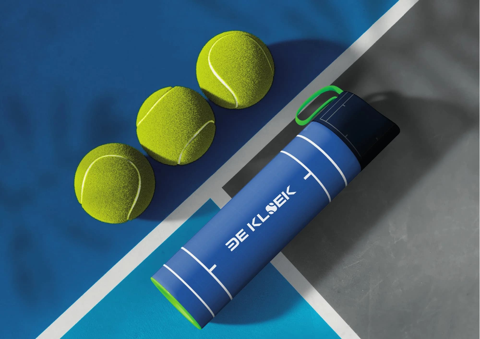
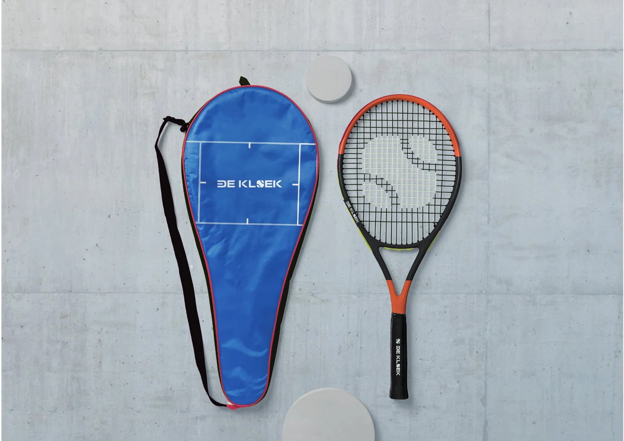
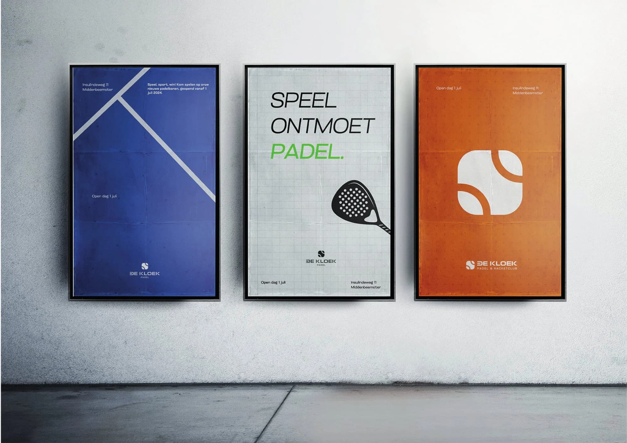
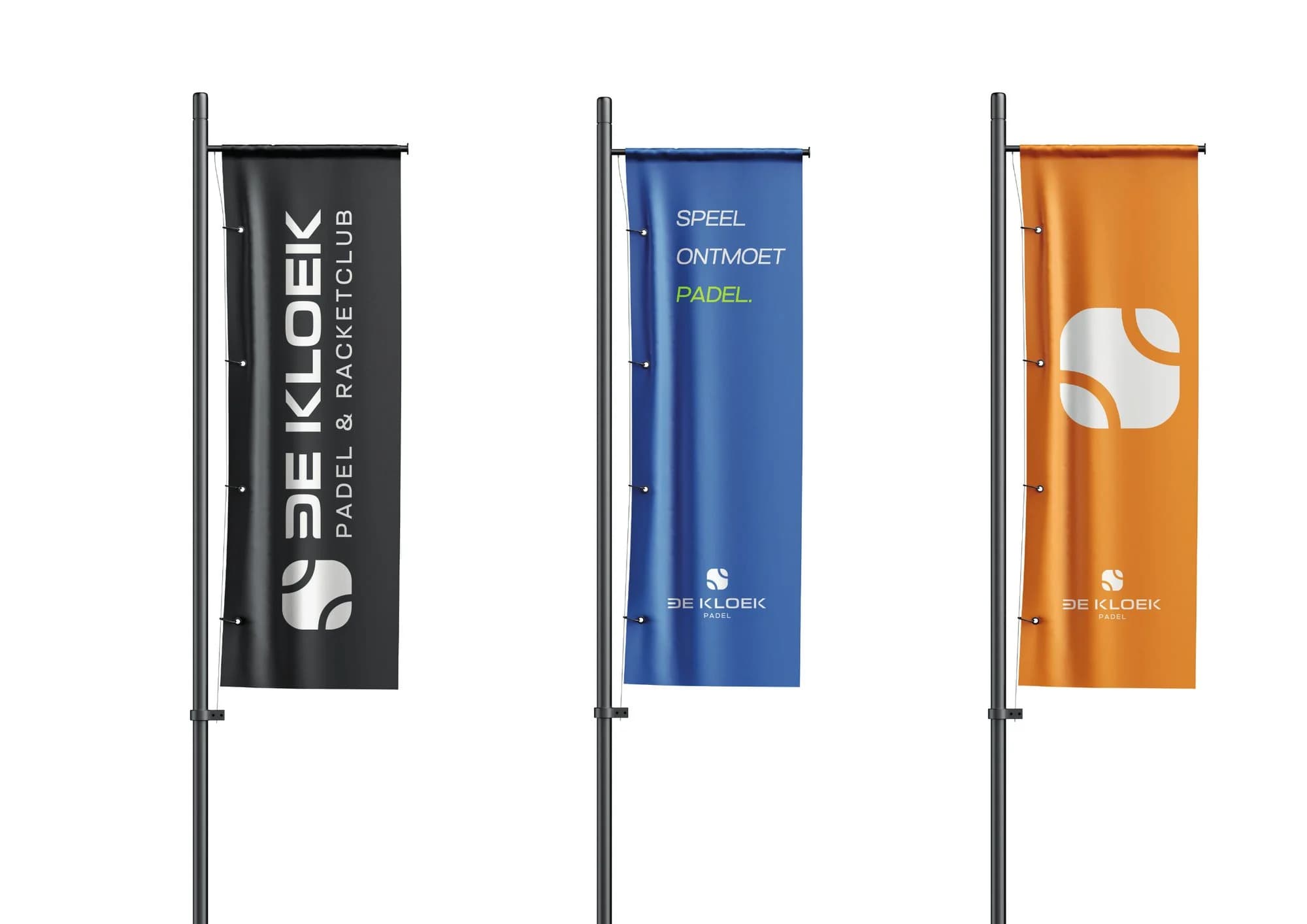
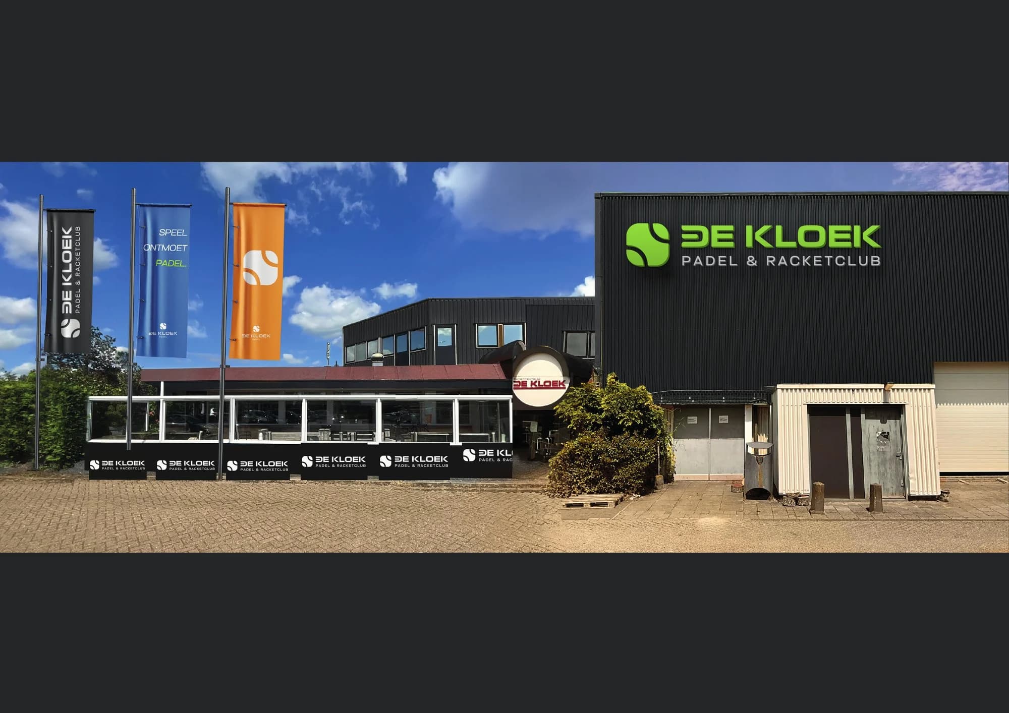
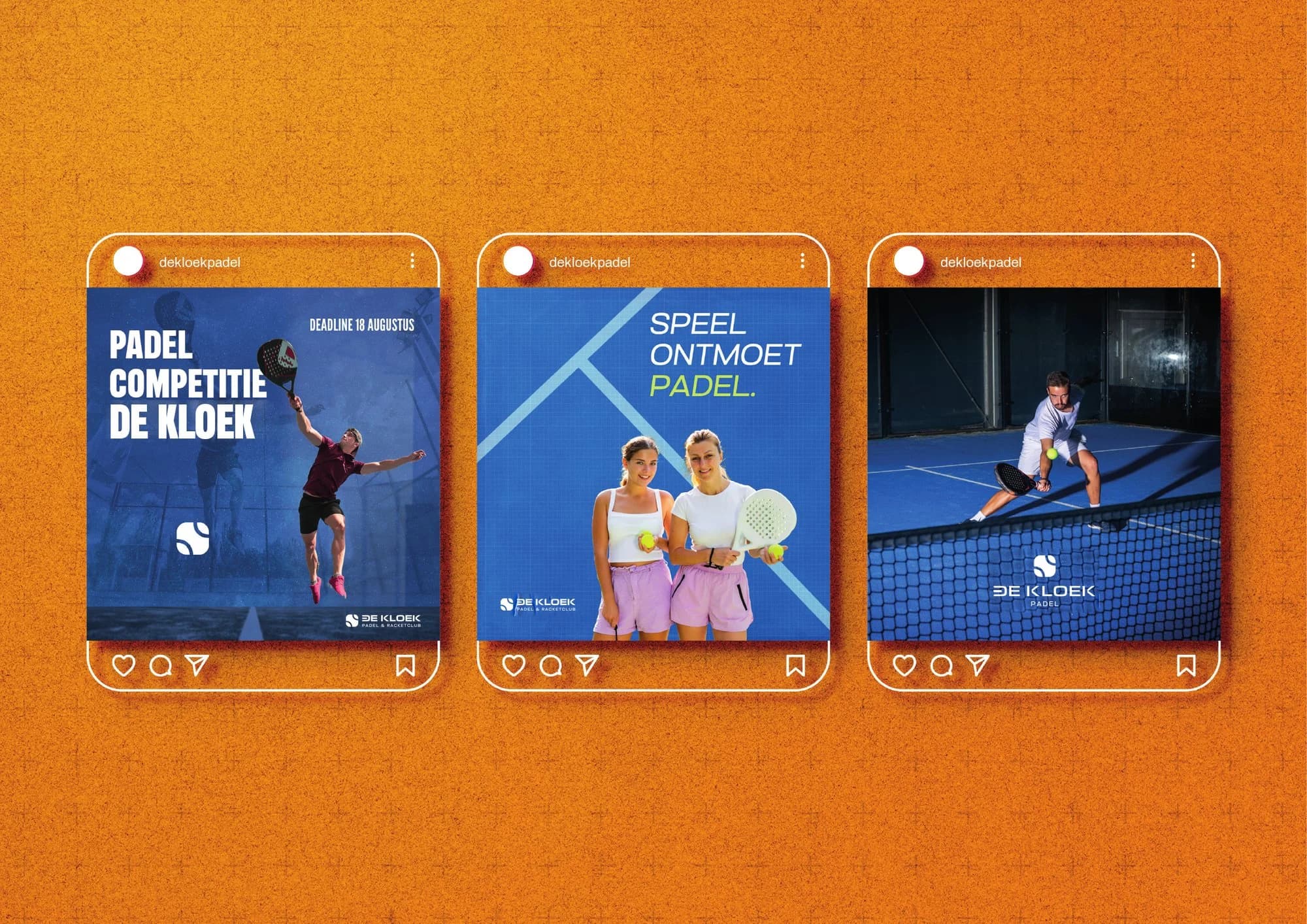
I updated the brand book with the new name and logo. With mockups I showed how the club will look: the facade, flags, posters, a water bottle, a racket cover and Instagram.
The website
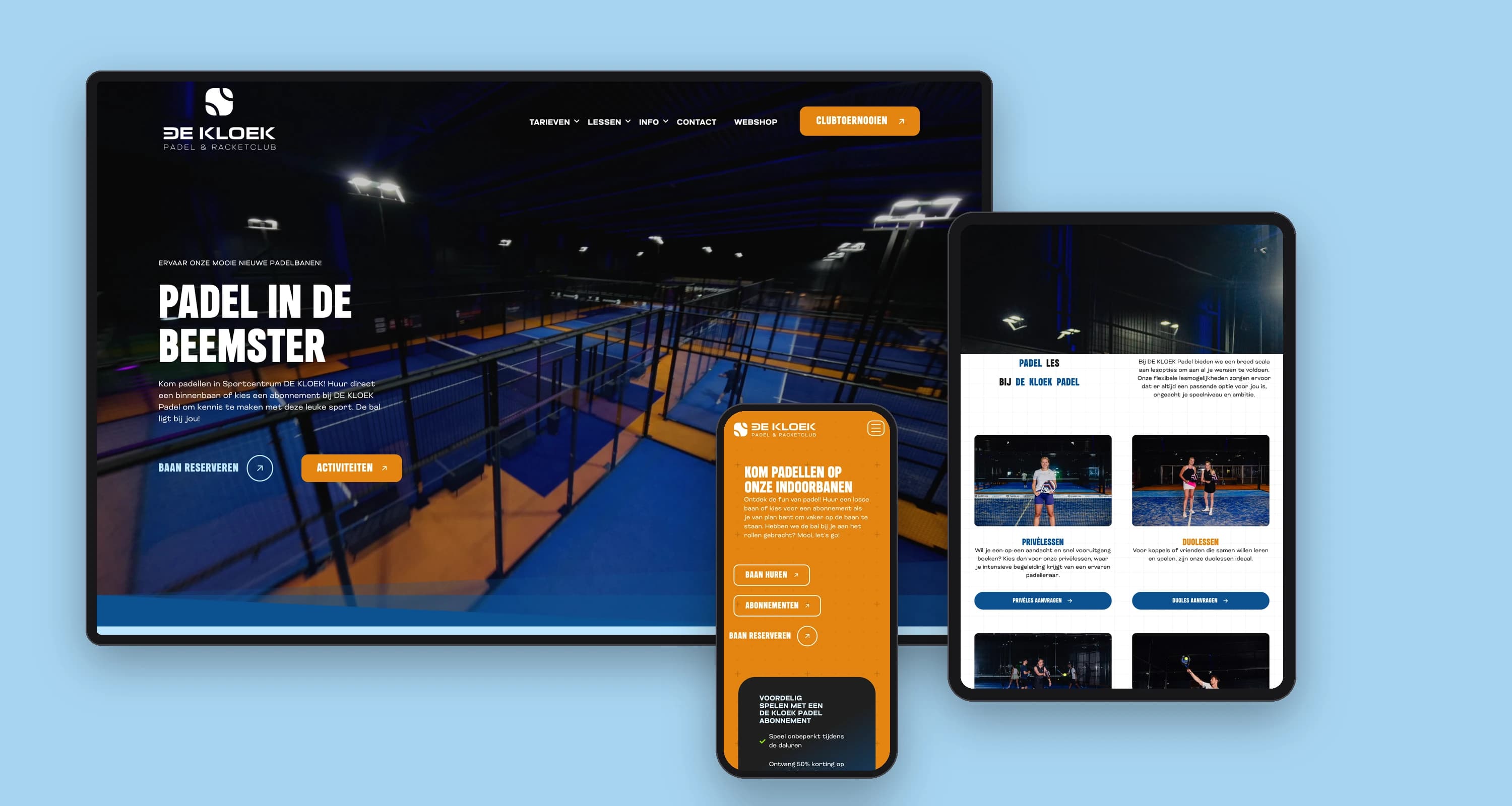
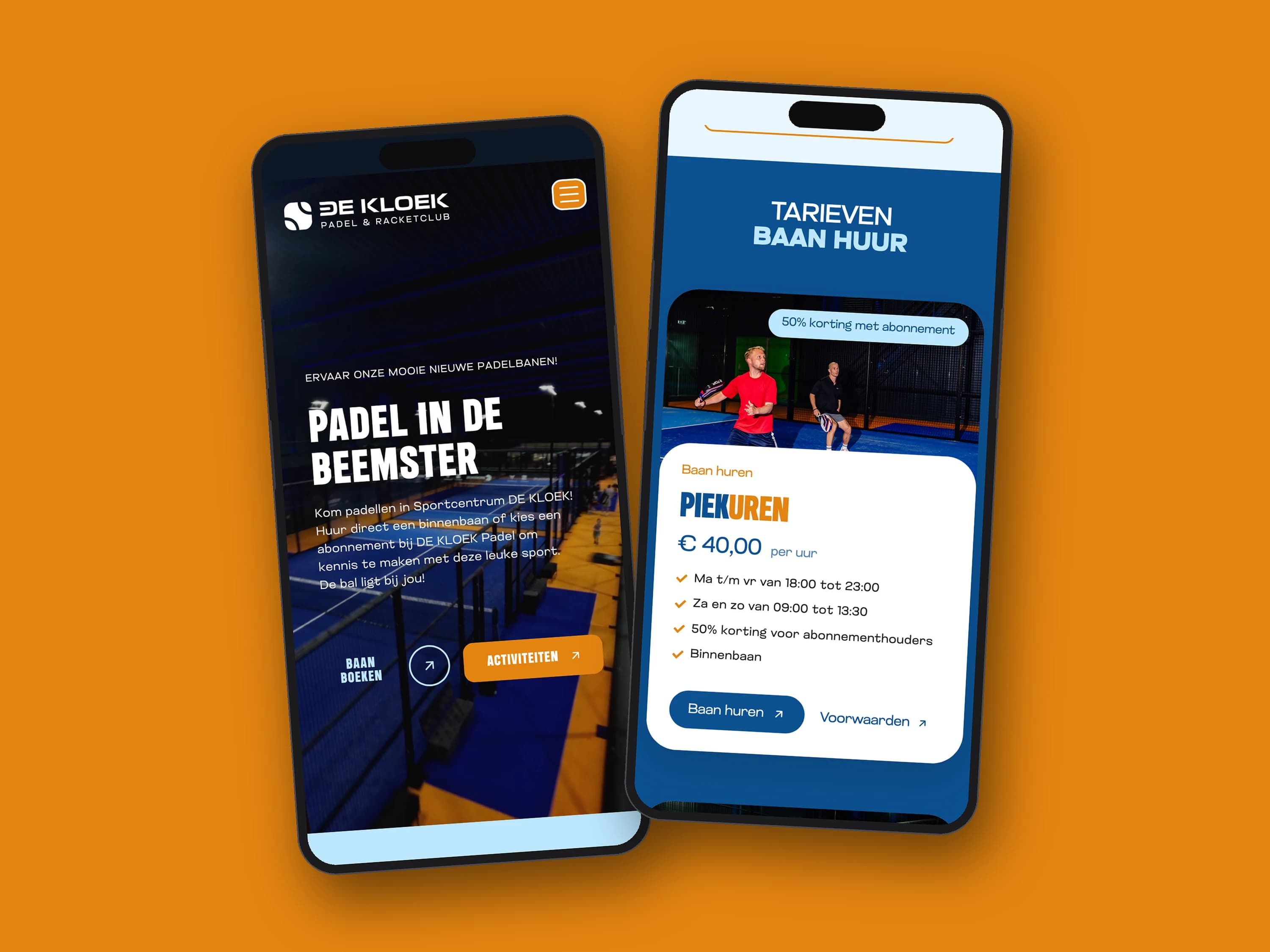
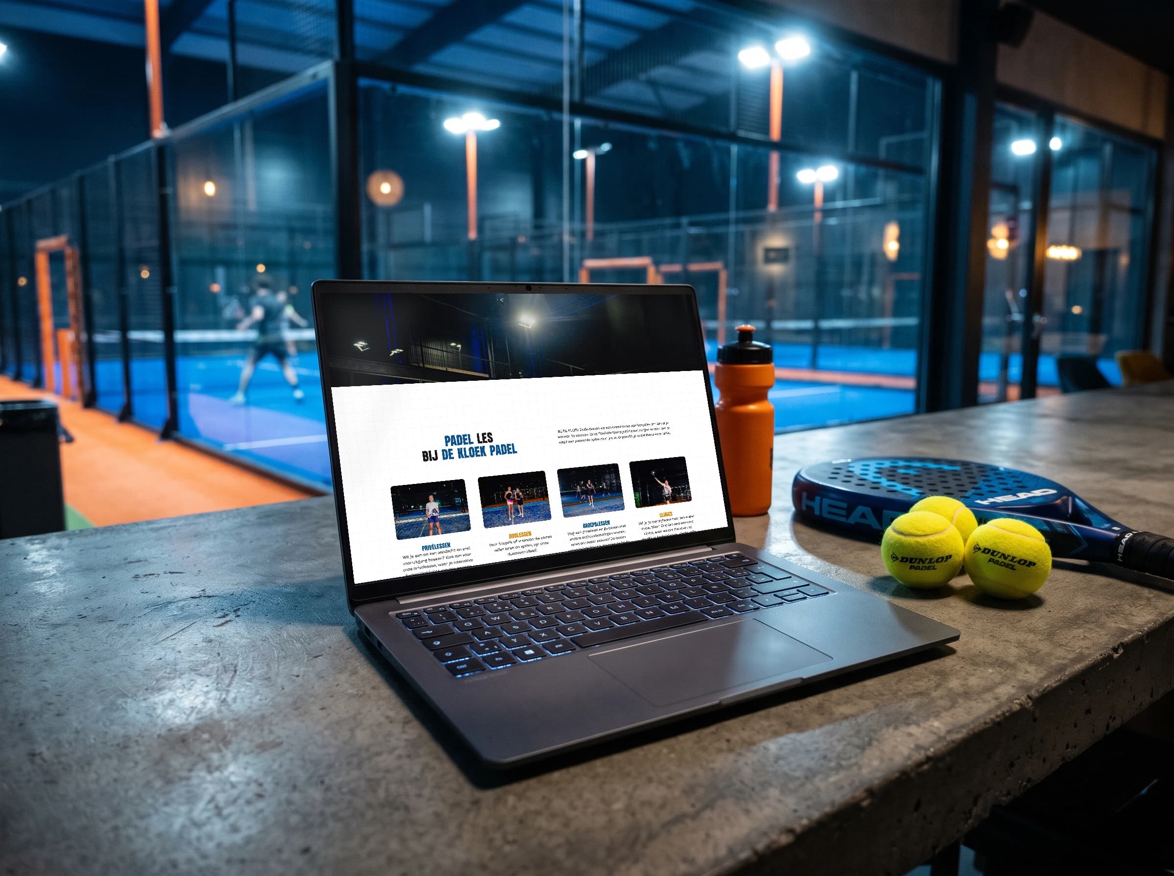
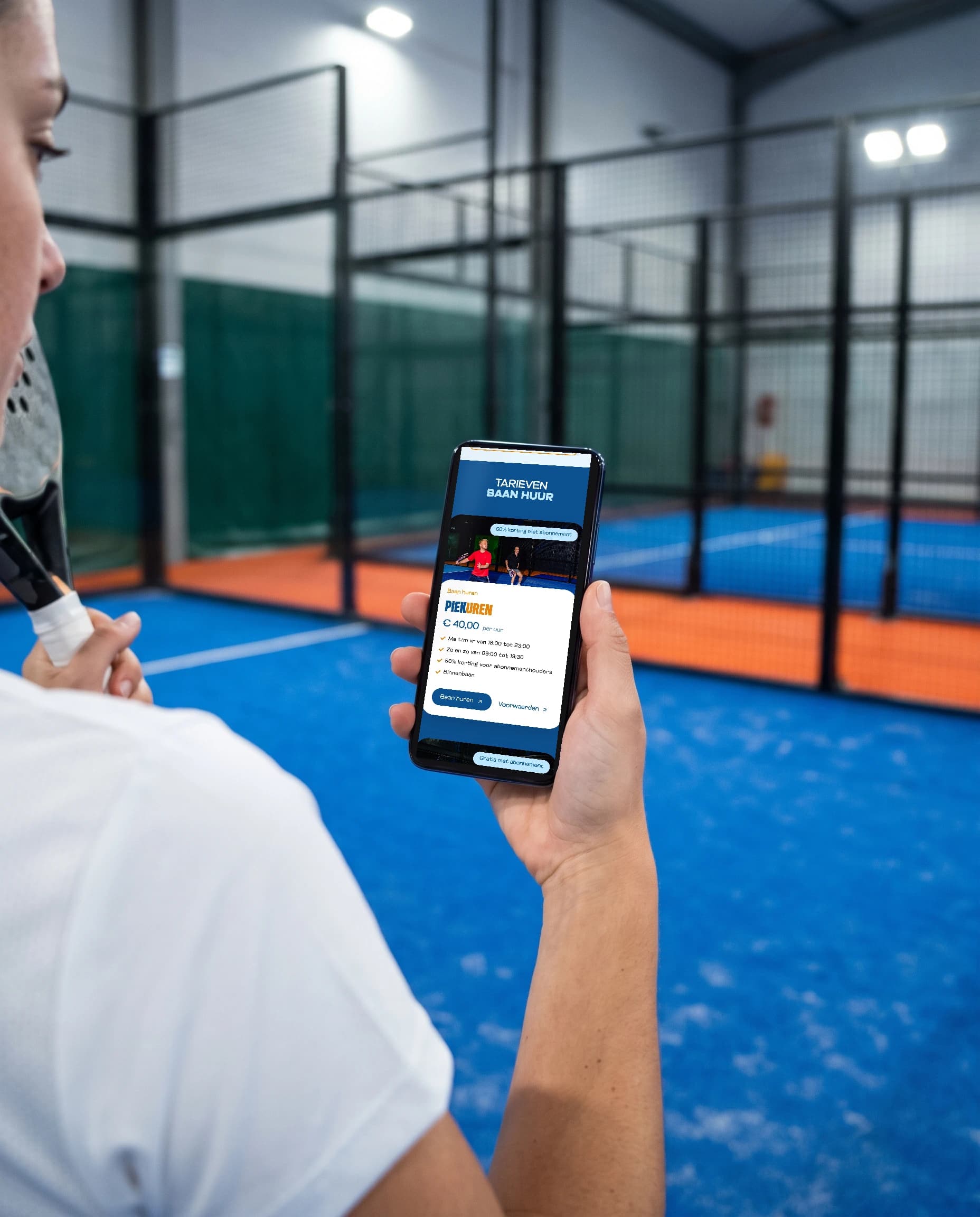
The website follows the same style. Court hire, lessons and competition sit right at the top, and everything works well on a phone, because that is where most players book their court.
Something like this for your brand?
01How does a project like this start?
With a message. We plan a meddling session, where you tell me where you stand and I honestly say what I see. After that you get a proposal with a fixed price, and once you approve, we get going.
02What does a project like this cost?
Every project is custom, so it really depends on the question: from a few hundred to a few thousand euros. That's impossible to say up front. Once I have all the information, you get a fixed price, and it doesn't change after that. If an extra assignment comes up that falls outside what we agreed, I charge an hourly rate for it.
03My industry looks nothing like this. Does that matter?
No. I dig into your brand and know what it takes to reach an audience, and that works in any industry. In fact, a fresh look from outside your industry can be a real advantage.
04Can I have just one part of this done?
Yes, you step in where you are now. If you already have a logo, I first take a quick look at whether the foundation is right, and then we move on to the website or the imagery. It doesn't all have to happen at once.
Next project
PGS HousingView the project