De Kloek FitnessReformer Pilates with a mood of its own
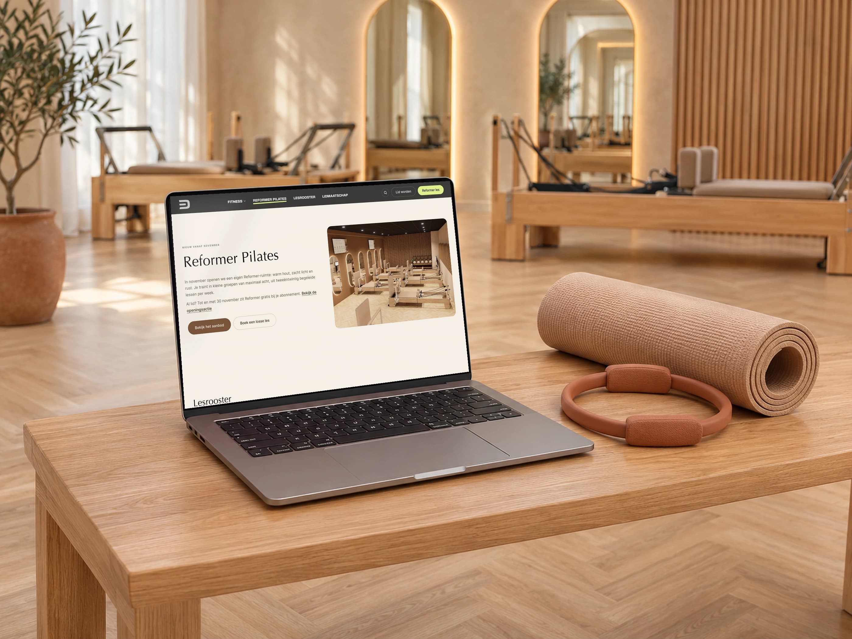
For De Kloek Fitness I had already made the logo, the brand identity and the website: deep blue, lime and bold block letters, because it's a gym. In November a room of its own opened for Reformer Pilates, with warm wood, arched mirrors and groups of no more than eight people. That's where you go for calm. My task was to give that room a page that feels just as calm, but clearly belongs to De Kloek.
Two moods under one roof
If you train on the gym floor, you're looking for energy: music, weights, a solid plan. If you're on a reformer, you're looking for the opposite. In deep blue and lime, the Reformer page would have been just another class among the rest. A whole new brand identity then? That makes it look like a different business, while most members take Reformer as an extra on top of their membership. My insight: the page should feel like the room itself, and the rest of the site simply stays De Kloek.
The colours of the room
So I took the colours from the room: sand, light oak and terracotta. That way you know how it feels before you walk in. The headings are set in Optima, a typeface with a soft, classic shape. It suits training calmly and with attention. Basement Grotesque, the bold typeface of the brand identity, belongs to the training on the floor, not to this class.
Still recognisably De Kloek
The menu, the word band and the lime for what really needs to stand out stayed in the brand identity. Click through from the homepage to Reformer and the mood changes, but you notice you're still on the same site. That matters, because you take Reformer at De Kloek, not somewhere else.
A room that wasn't there yet
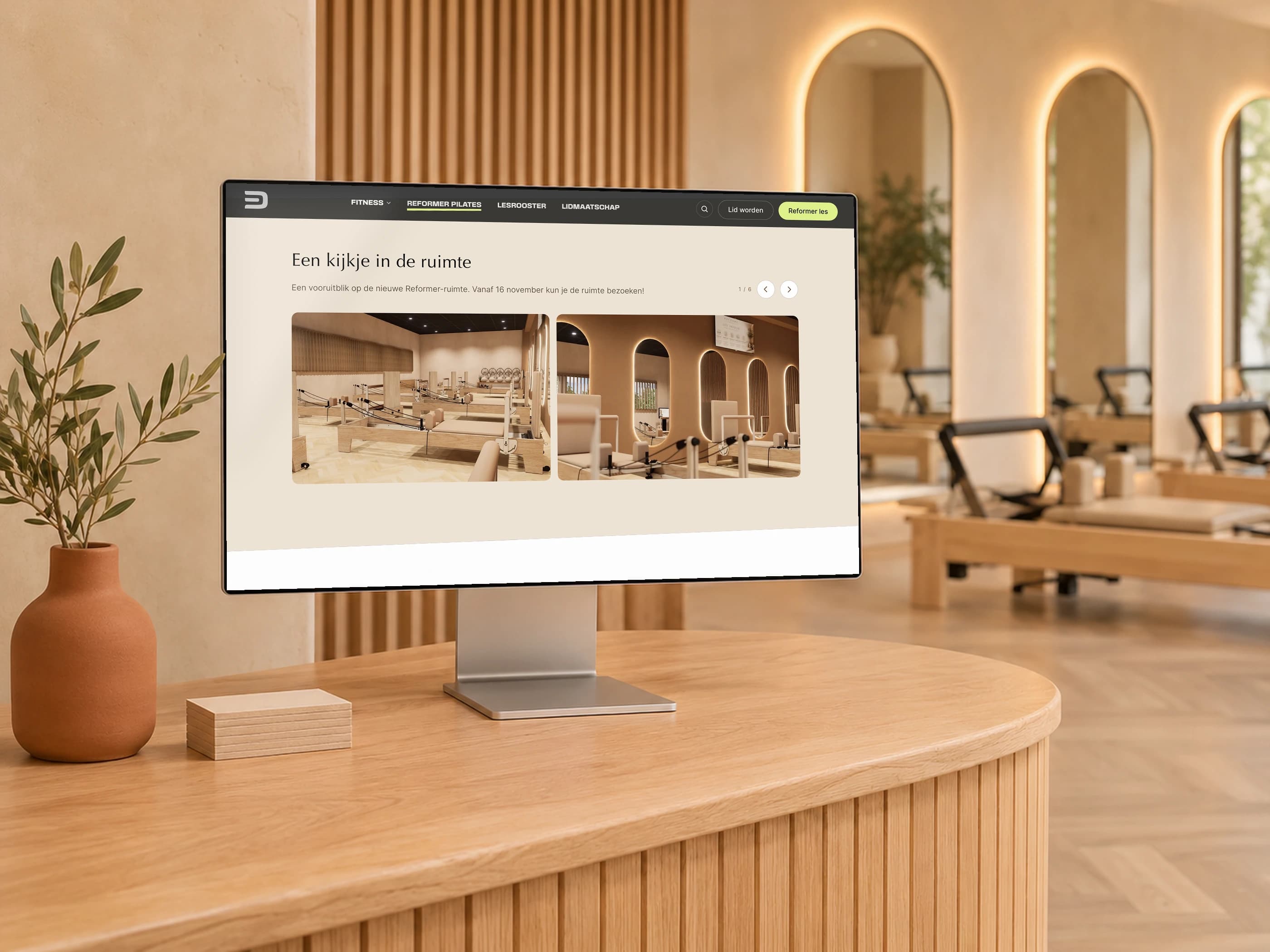
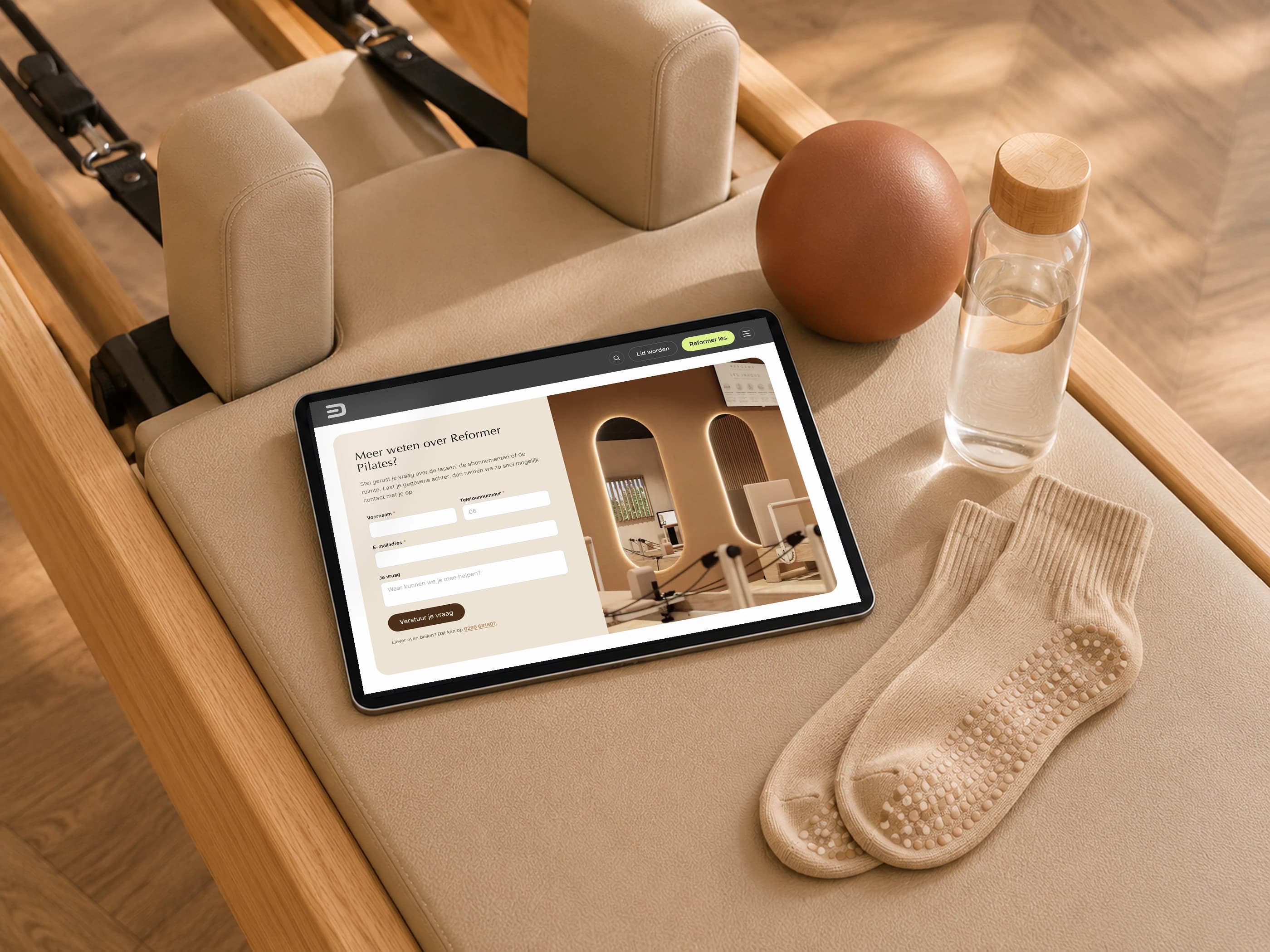
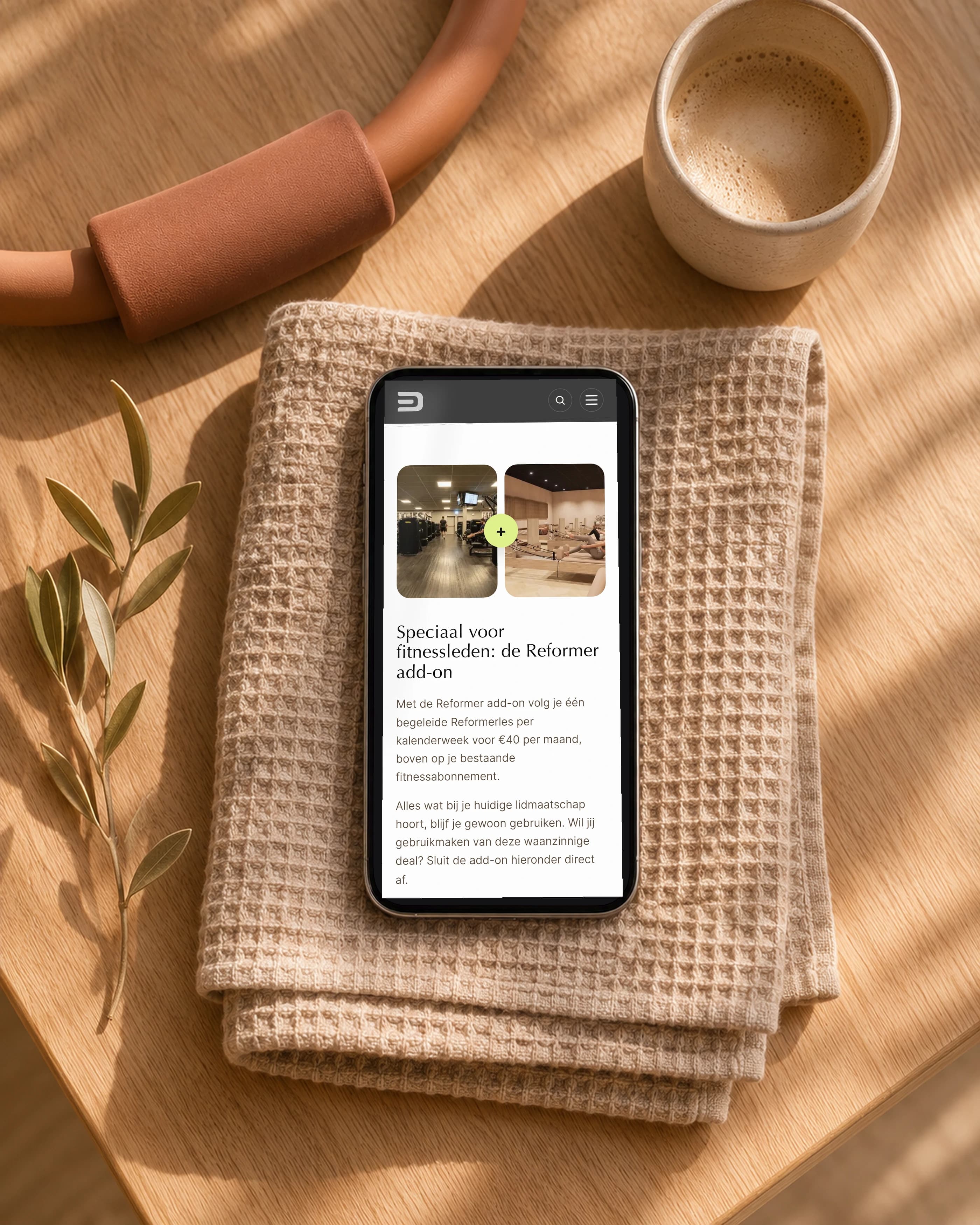
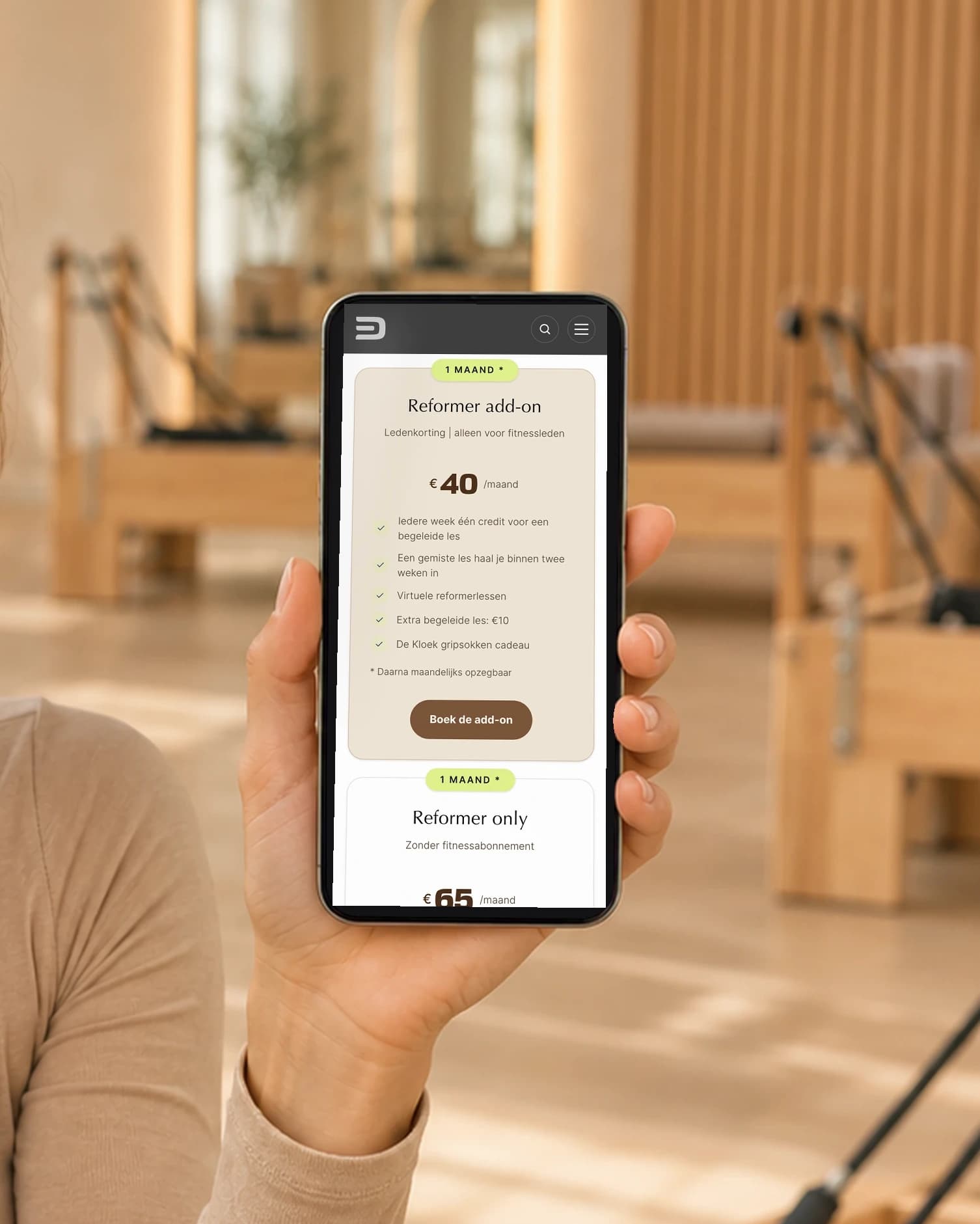
The page had to go live before the room was finished, so there were no photos yet. With the renders of the new room you can still see what it's going to be like. I made the mockups on this page with generative AI, in the same mood as the studio, with the real screens of the site placed in them.
Calm, but clear
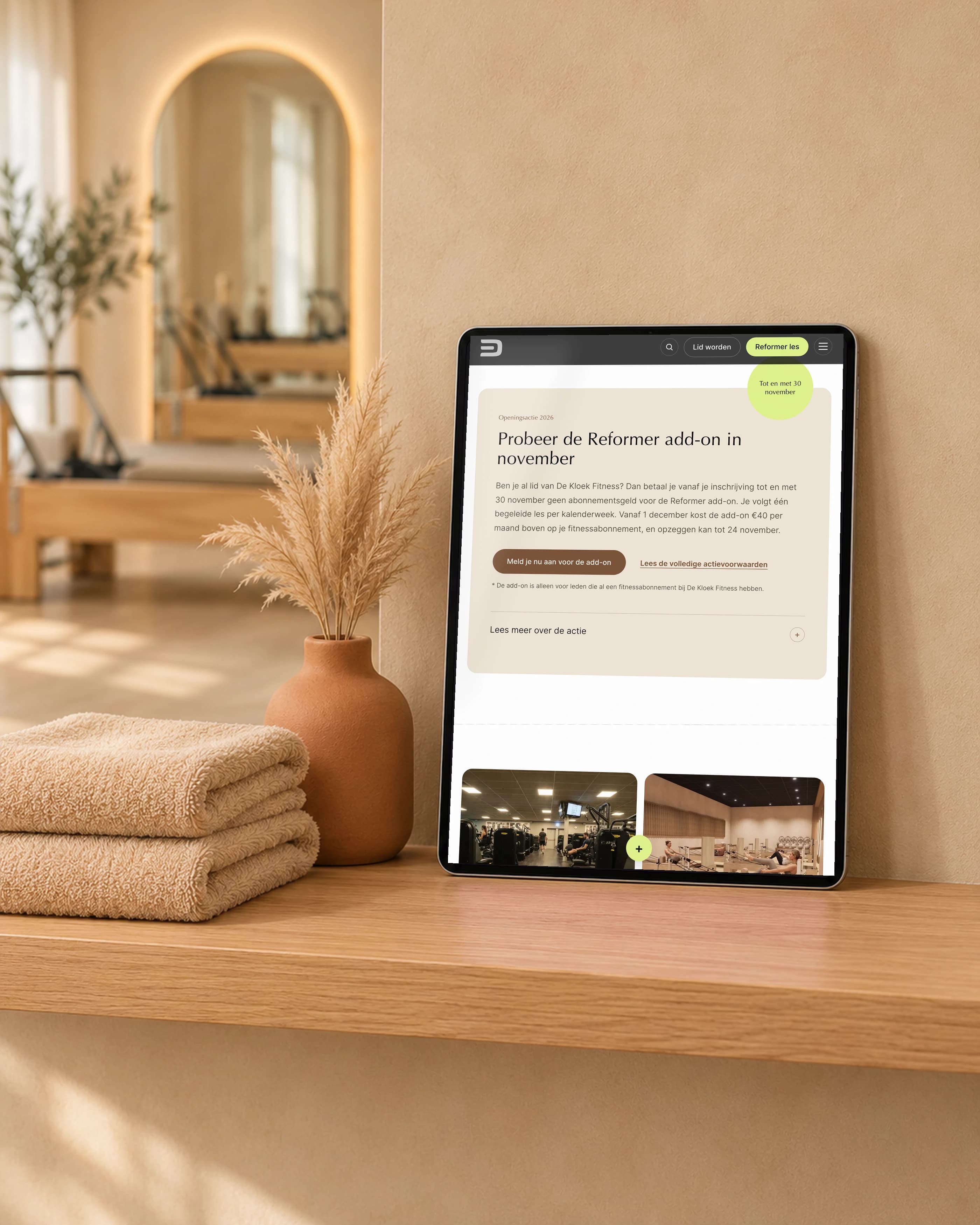
Calm doesn't mean you have to search. At the top there are two buttons: see the offer or book a single class. Below that the opening offer for members, the prices and the timetable. The rules about credits, booking and cancelling each got an icon of their own, so you see at a glance what a block is about. To be fair, nobody enjoys reading those rules, so at least you should be able to find them quickly.
The result
The result: De Kloek has a Reformer page that feels like the room itself, without a separate website next to it. Members see right away that they can try Reformer for free in November, and anyone who wants to stay takes the add-on or books a single class in YogiBit.
Services in this case
- Web design
- Colour palette
- Typography
- Copywriting
- Mockups with generative AI
Built withAstro, YogiBit, ChatGPT
Something like this for your brand?
01How does a project like this start?
With a message. We plan a meddling session, where you tell me where you stand and I honestly say what I see. After that you get a proposal with a fixed price, and once you approve, we get going.
02What does a project like this cost?
Every project is custom, so it really depends on the question: from a few hundred to a few thousand euros. That's impossible to say up front. Once I have all the information, you get a fixed price, and it doesn't change after that. If an extra assignment comes up that falls outside what we agreed, I charge an hourly rate for it.
03My industry looks nothing like this. Does that matter?
No. I dig into your brand and know what it takes to reach an audience, and that works in any industry. In fact, a fresh look from outside your industry can be a real advantage.
04Can I have something added later on?
Yes, it doesn't all have to happen at once. If your website is already there, something can simply be added later, like a second language, an integration or a custom newsletter tool.
Next project
TypTalkView the project