TypTalkBrand identity, website and app that fit together
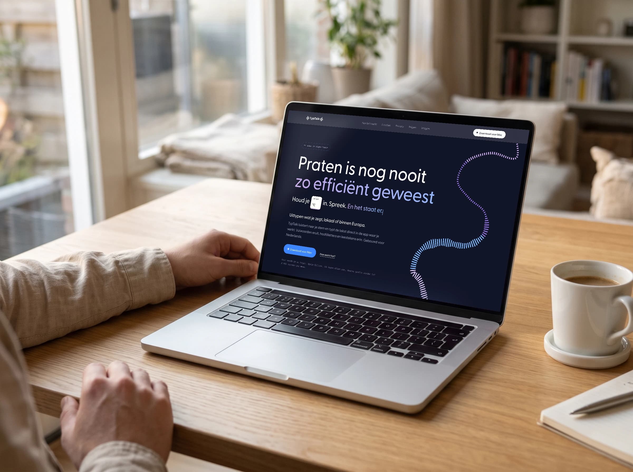
TypTalk is a dictation and meeting app for the Mac: you hold the Option key, talk, and TypTalk types it out for you. I build the app in Swift, the website in Astro and the brand identity in Illustrator. Three places where colours and fonts are set, and in October all three looked slightly different. My task: turn it into one brand, so you recognise on the site what you're about to put on your Mac.
Three places, three styles
In October TypTalk had a lavender palette with pastels and lime. The site looked slightly different from the app, and the posters had their own shades again. To be fair, that happens quickly when you make everything yourself and keep adding bits. My insight: as long as the colours live in three places separately, they drift apart by themselves. They need to come from one source.
The colours from the logo mark
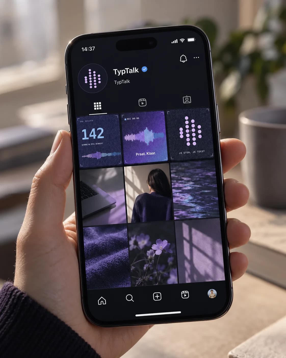
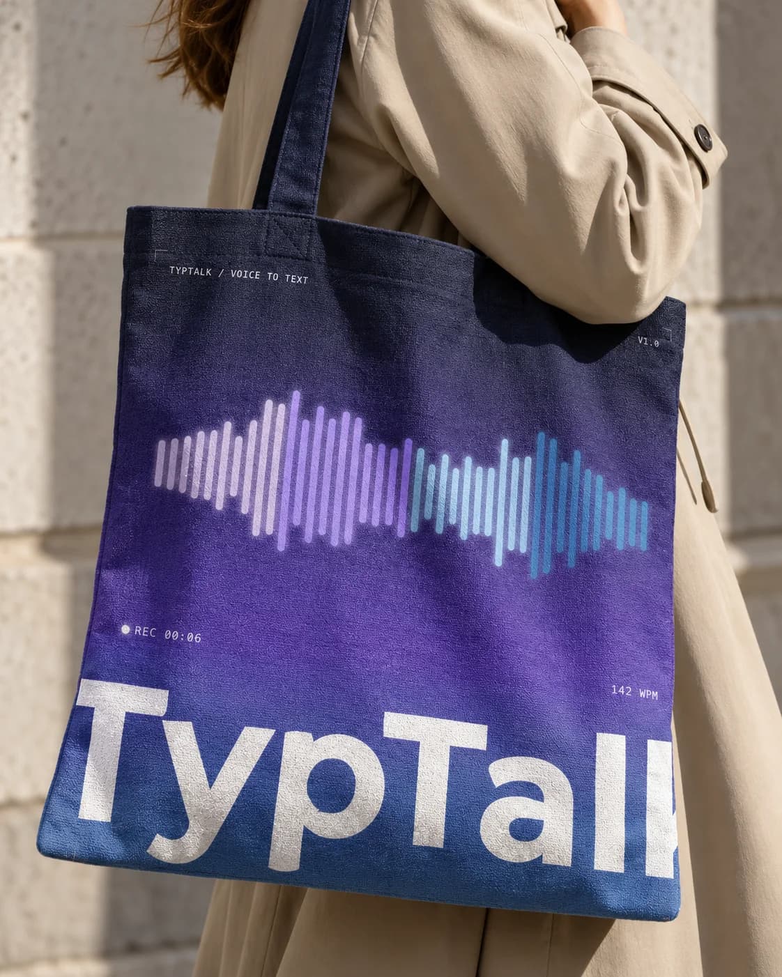
The logo mark is a sound wave of four bars. In early November I chose exactly those colours as the fixed brand identity: lilac, ice blue and blue, with night as the canvas. Lilac is the brand, blue is the voice, so buttons and everything that does something. All other shades are variations of those. That way I never have to doubt which colour belongs where, because the answer is already in the logo.
One list, twice in the code
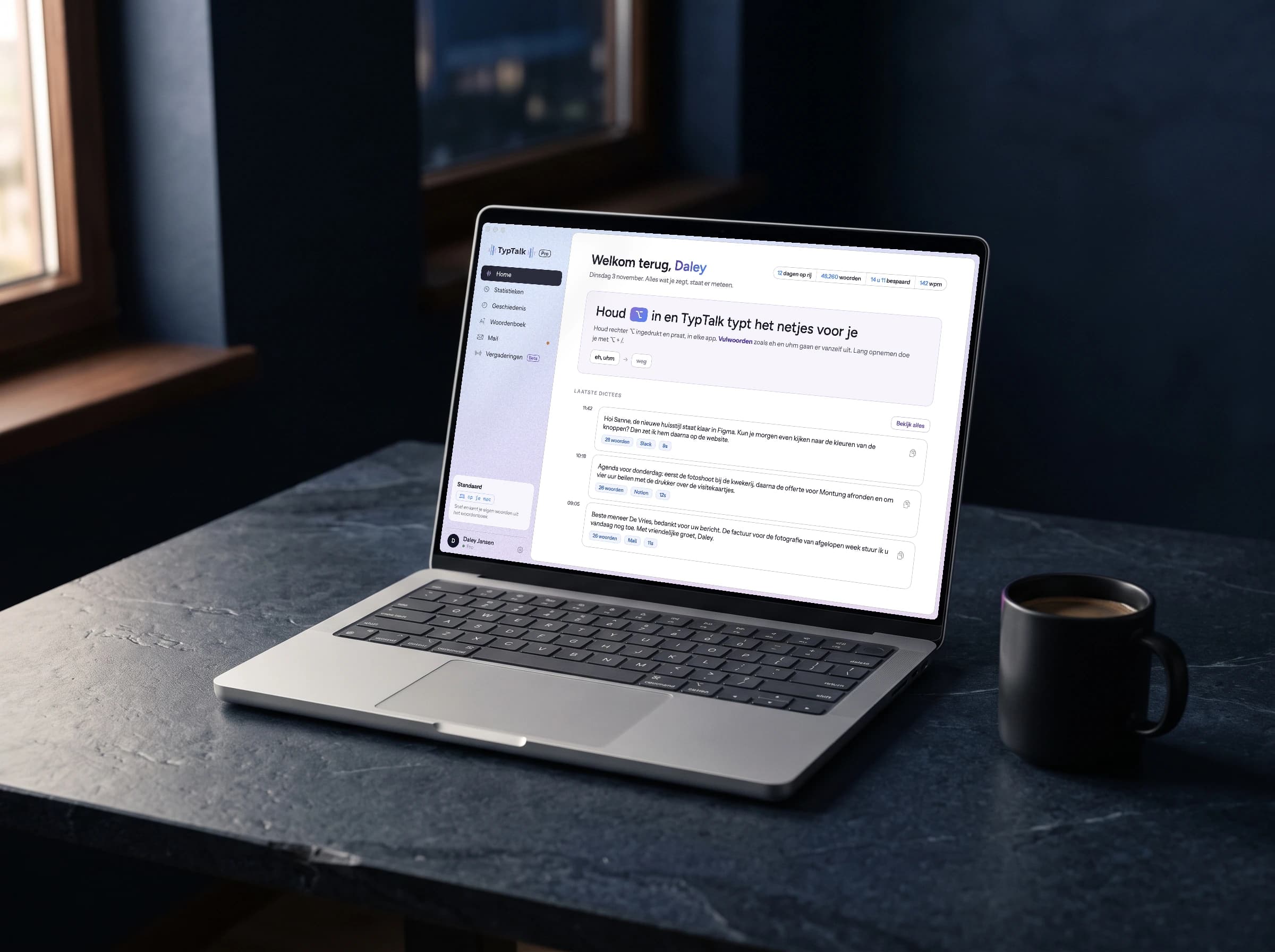
The fixed colours sit with the same names and the same values in the code of the website and in the code of the app. If I change a shade, I know exactly where. The logo, the app icon and the favicon also come from the same files. It sounds boring, but it's exactly what keeps the brand right a year from now.
Matching, not identical
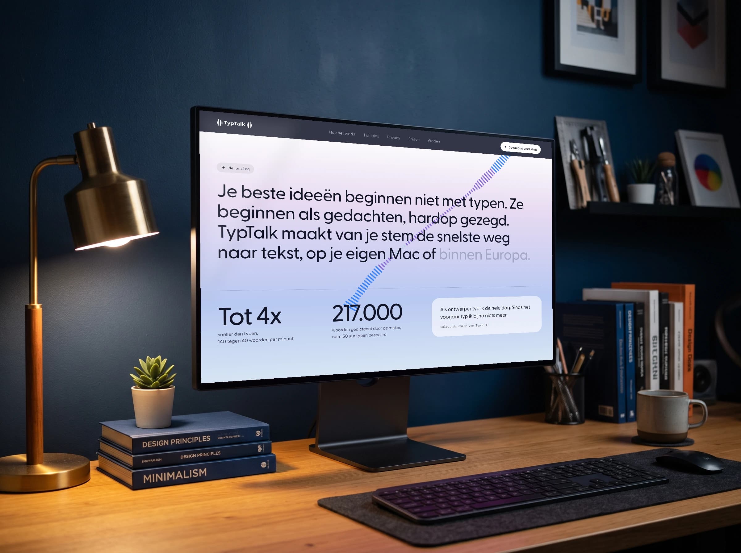
The site alternates dark and light sections, because that's where you want to keep scrolling. The app is always light, with a soft gradient from ice blue to lilac, because you work next to it all day. Only the recording bar is dark, with a wave from lilac to blue: the moment TypTalk listens is allowed to stand out. Headings on the site are set in Greycliff CF and in the app in Figtree, because Greycliff needs a separate licence for an app. Figtree has the same open, friendly shape.
The result
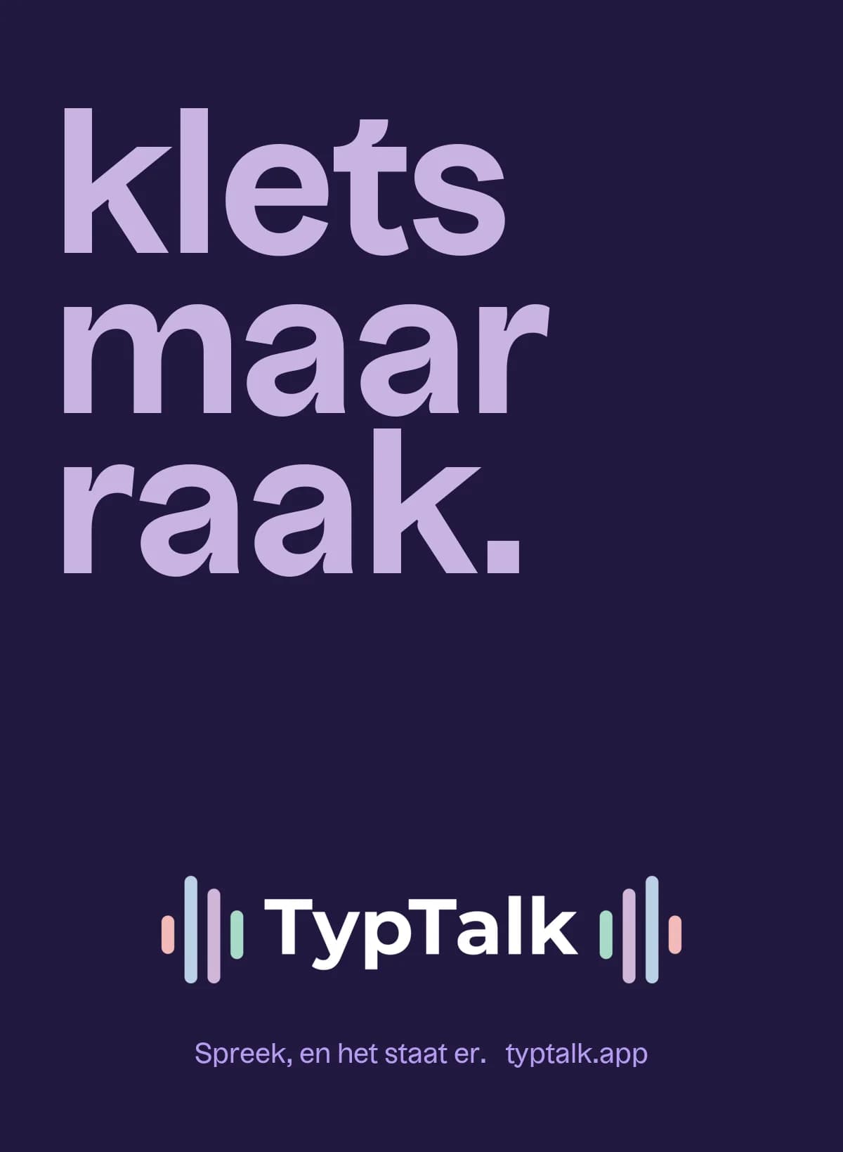
The result: anyone who looks around typtalk.app and then opens the app sees the same brand. The same wave, the same colours, the same calm type. And when I add something, I take the colours from one list instead of by eye.
Services in this case
- Branding
- Colour palette
- Logo and app icon
- Web design
- App design
- App development
Built withSwift, SwiftUI, Astro, Claude
Something like this for your brand?
01How does a project like this start?
With a message. We plan a meddling session, where you tell me where you stand and I honestly say what I see. After that you get a proposal with a fixed price, and once you approve, we get going.
02What does a project like this cost?
Every project is custom, so it really depends on the question: from a few hundred to a few thousand euros. That's impossible to say up front. Once I have all the information, you get a fixed price, and it doesn't change after that. If an extra assignment comes up that falls outside what we agreed, I charge an hourly rate for it.
03My industry looks nothing like this. Does that matter?
No. I dig into your brand and know what it takes to reach an audience, and that works in any industry. In fact, a fresh look from outside your industry can be a real advantage.
04Can I have something added later on?
Yes, it doesn't all have to happen at once. If your website is already there, something can simply be added later, like a second language, an integration or a custom newsletter tool.

Next project
Dokter RichardView the project