The Daley Edit
The complete brand identity of my own studio. A brand that shows what I do for others, and fits from start to finish.
Overview
The Daley Edit is my own studio for branding, websites, marketing and photography. I help business owners show how good their business really is. In 2026 it was high time to give my own brand the same strength. It had to show what I do for others: a brand that fits, from start to finish.
- Client
- The Daley Edit
- What I did
- Complete brand identityLogo and markColour paletteTypographyAnimations
- Year
- 2026
The mark
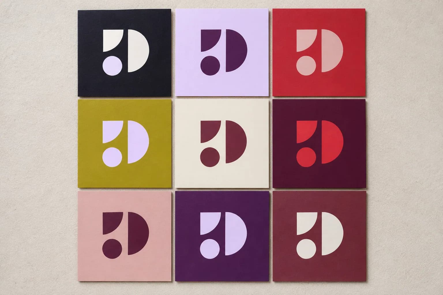
The mark is a D, the D of Daley. I wanted a creative, organic shape for my brand, because that suits me. I don't think in straight lines or fixed steps. I follow my feeling, see connections and let an idea grow while I work on it. Organic, flexible and creative: that's how I would describe myself.
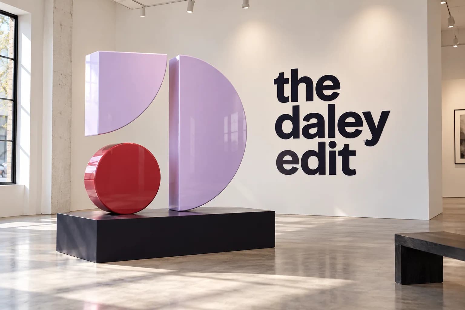
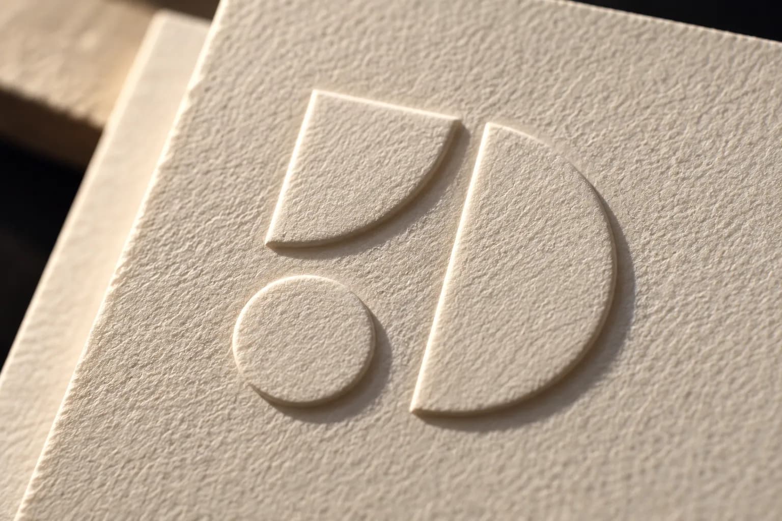
Colour
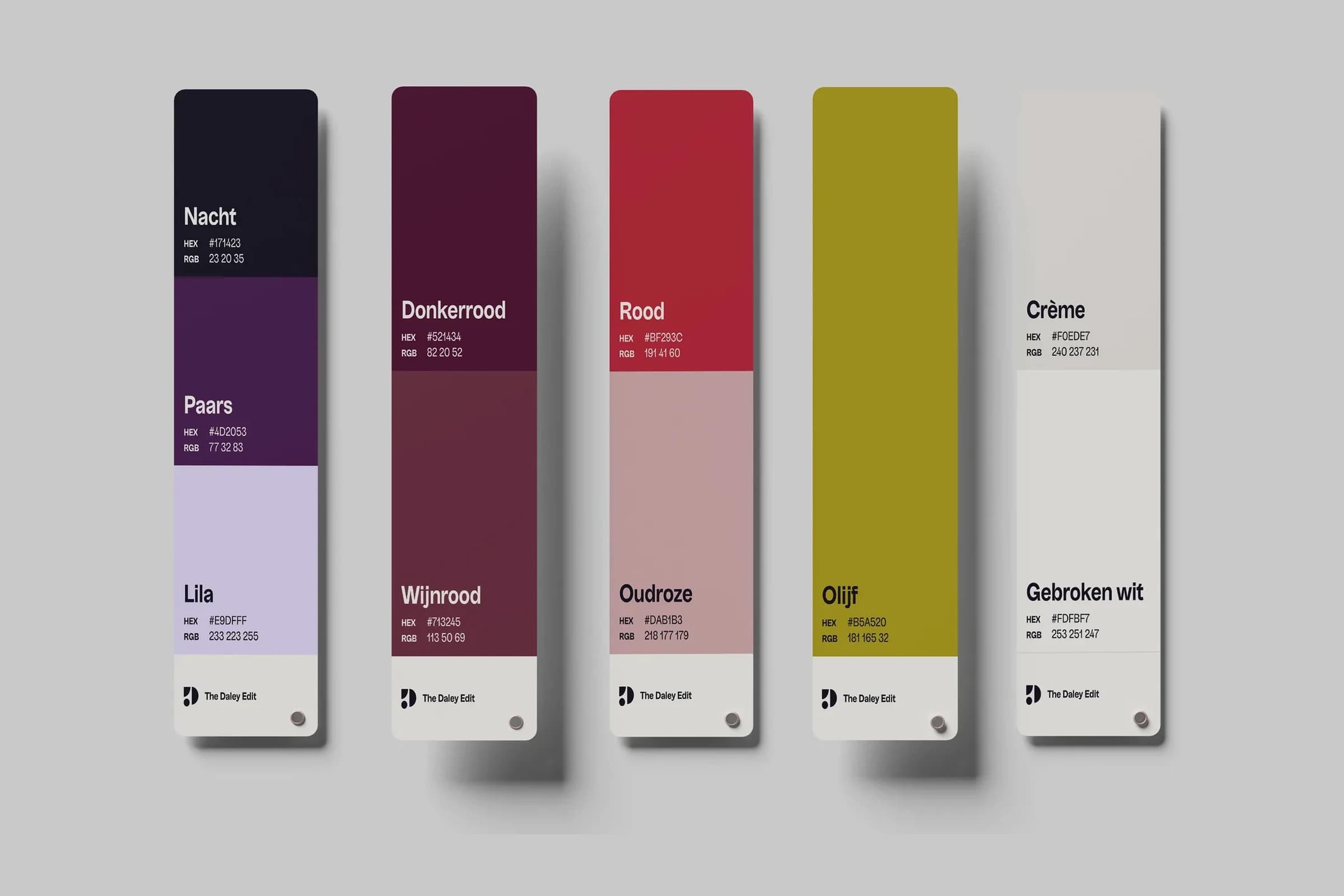
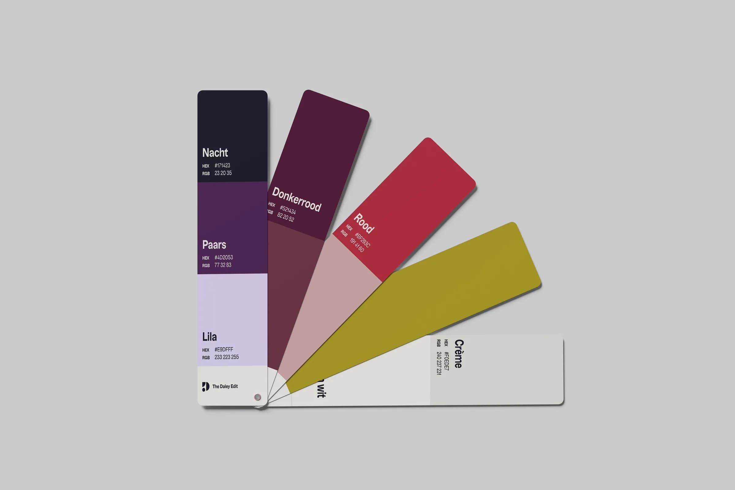
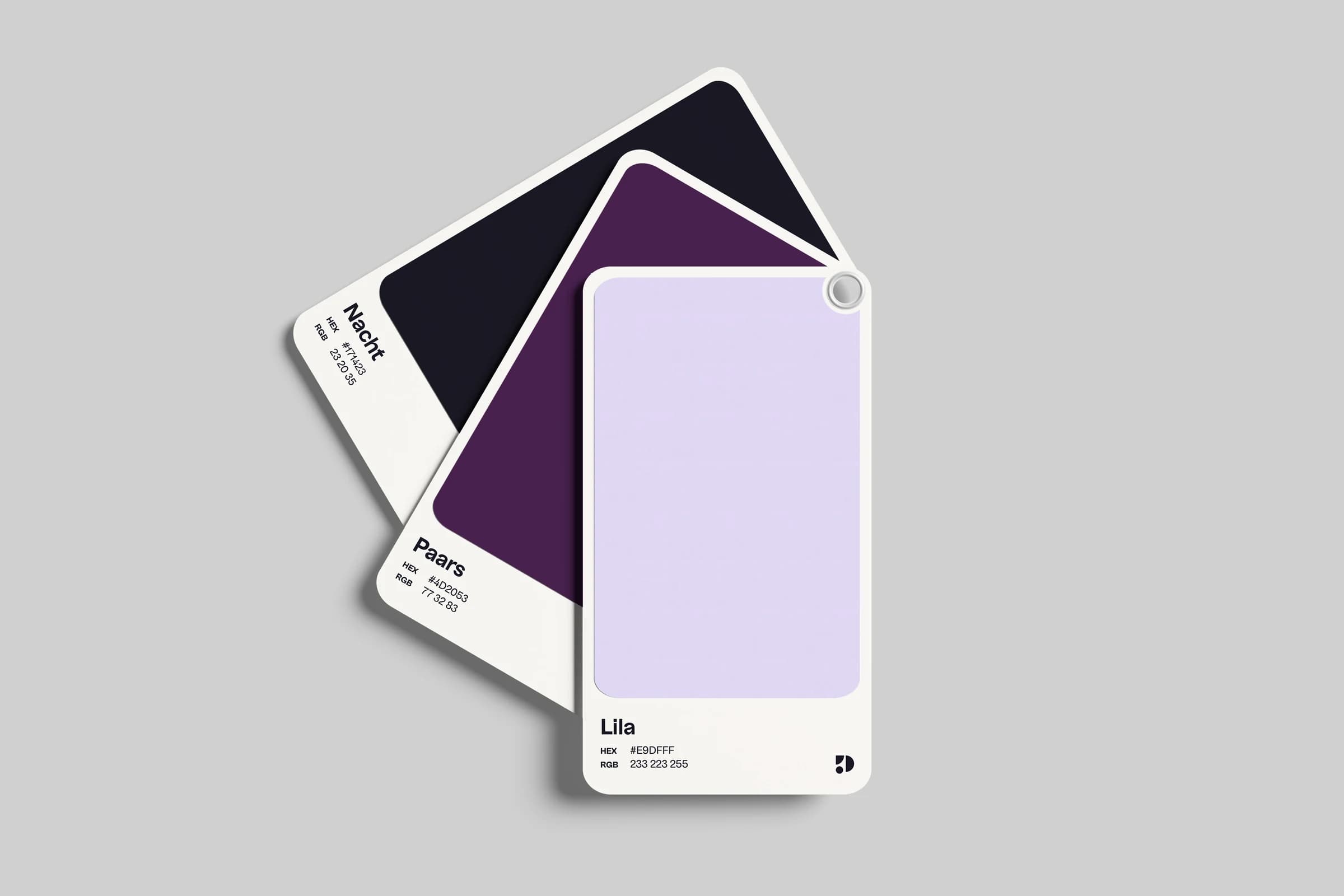
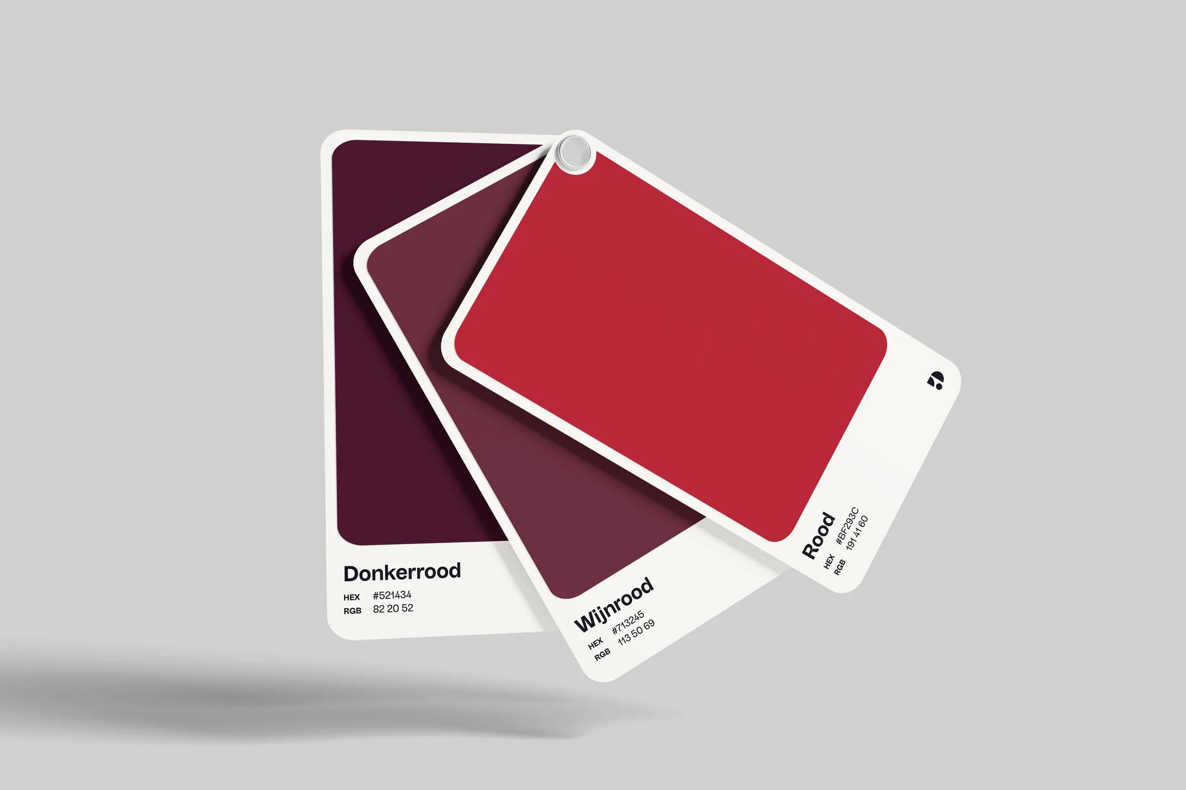
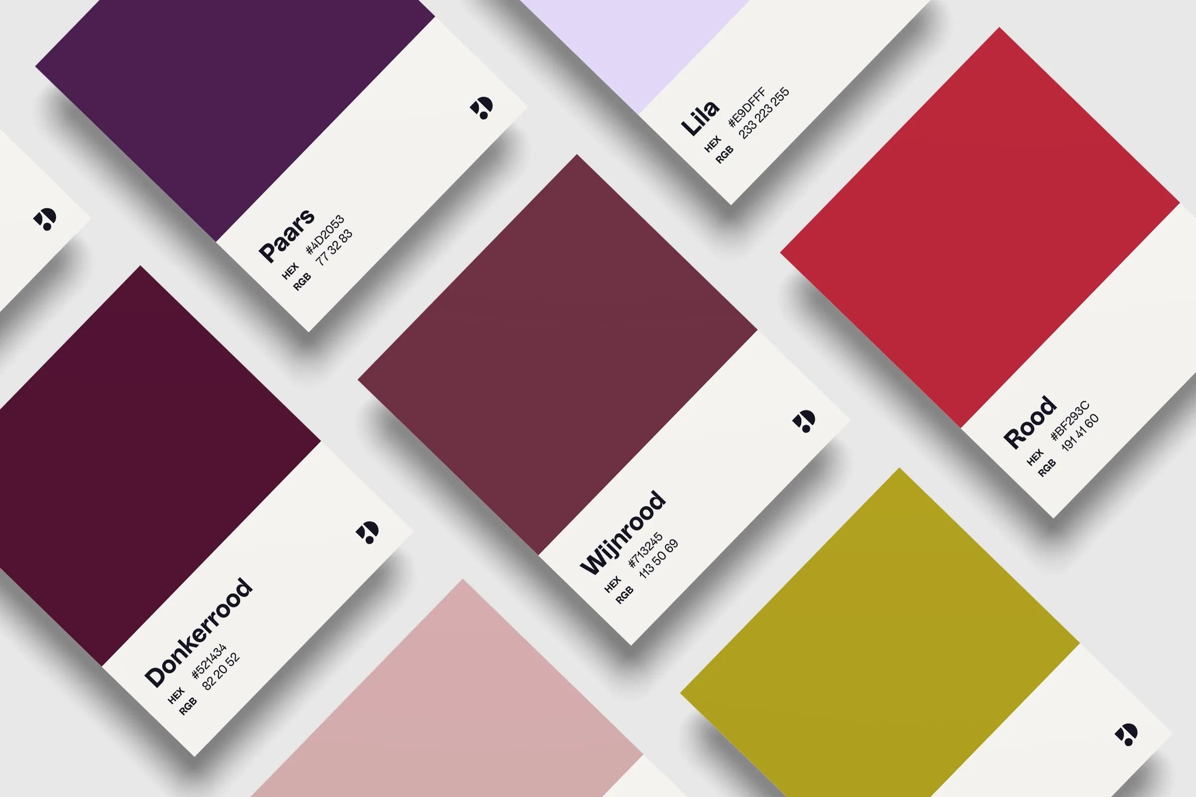
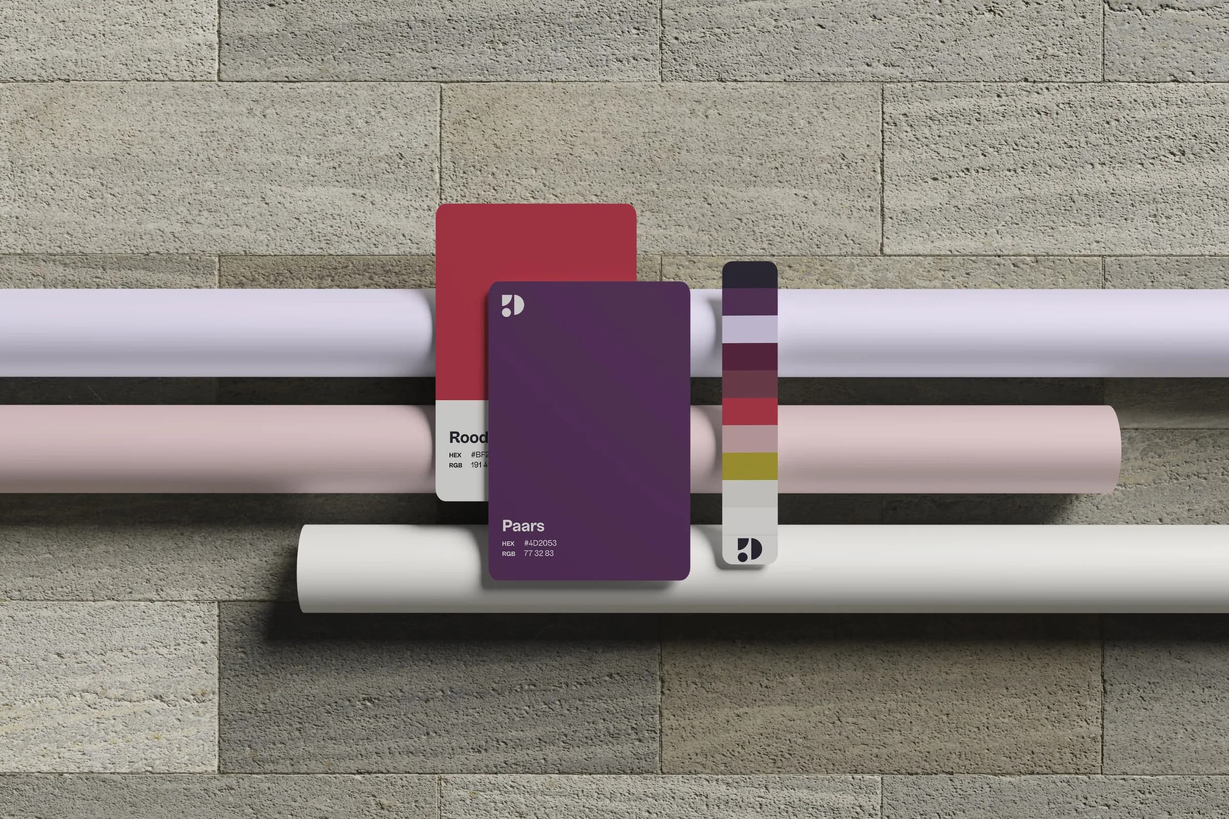
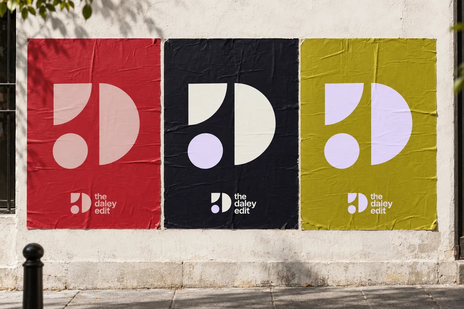
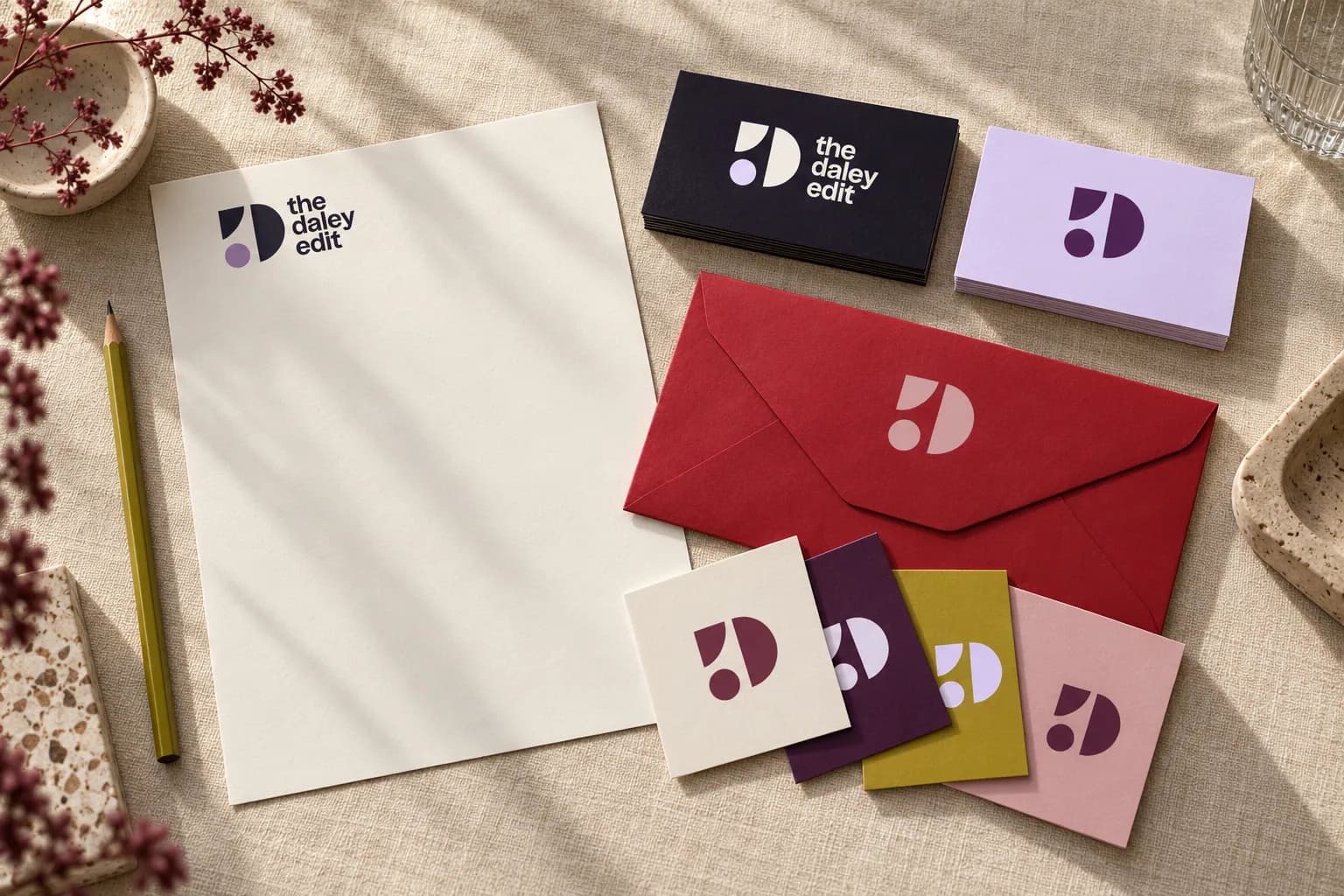
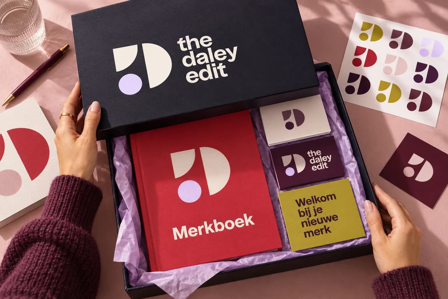
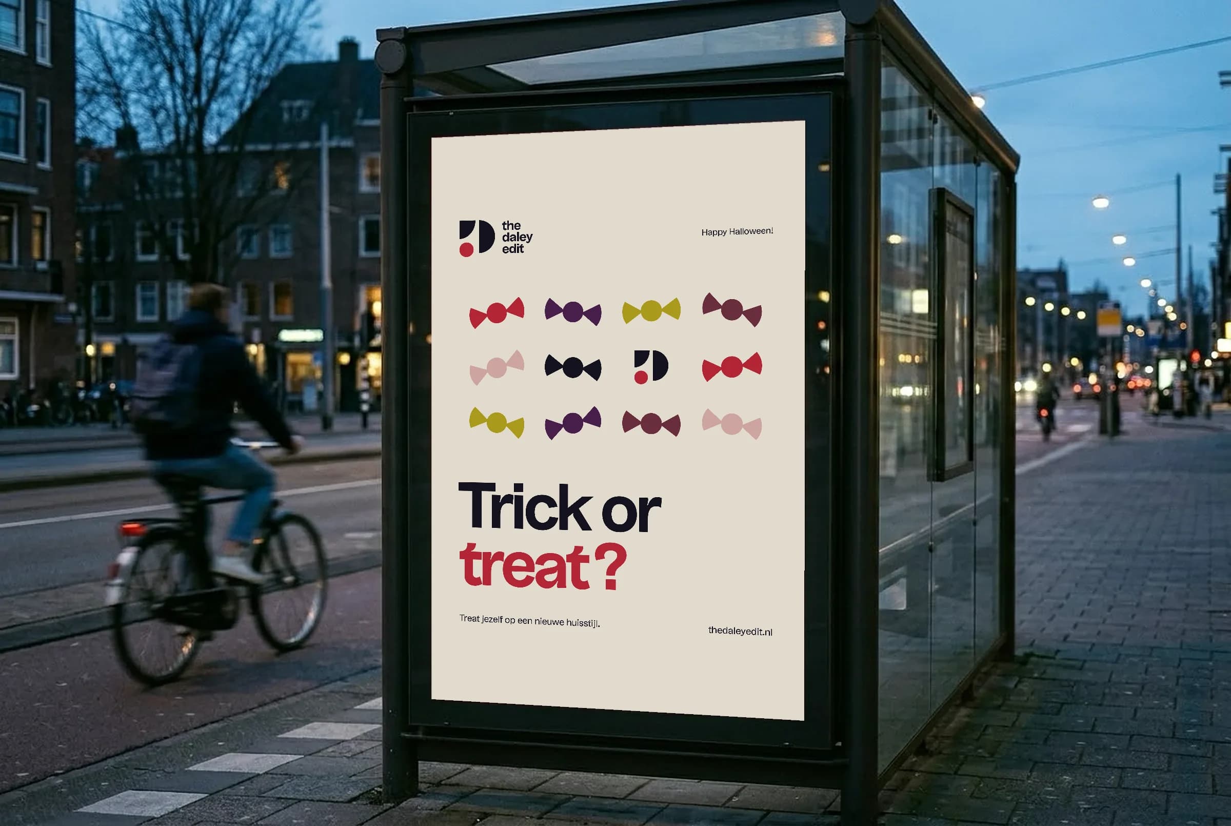
With me you get a lot, and I show that in my brand identity too: lots of colour, lots of creativity, lots of enthusiasm and lots of involvement. My brand identity has to suit me, and I'm not a one colour person. I love colour, and my brand was allowed to show that. I spent several days on it, but this is the result: a combination of my favourite colours. Night blue and lilac are the main colours, red and olive green the accents, and in between sit shades of red and purple that lie close together. Together they form a palette that suits me completely. To keep it clear I set fixed colour combinations, for the mark as well. Those combinations are exactly what make the brand recognisable.
Typography
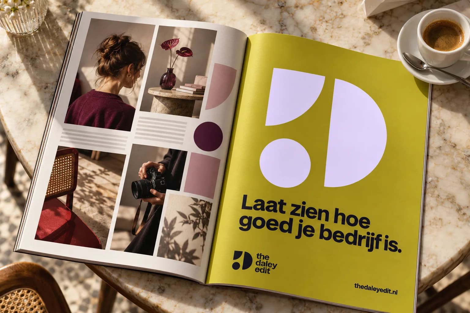
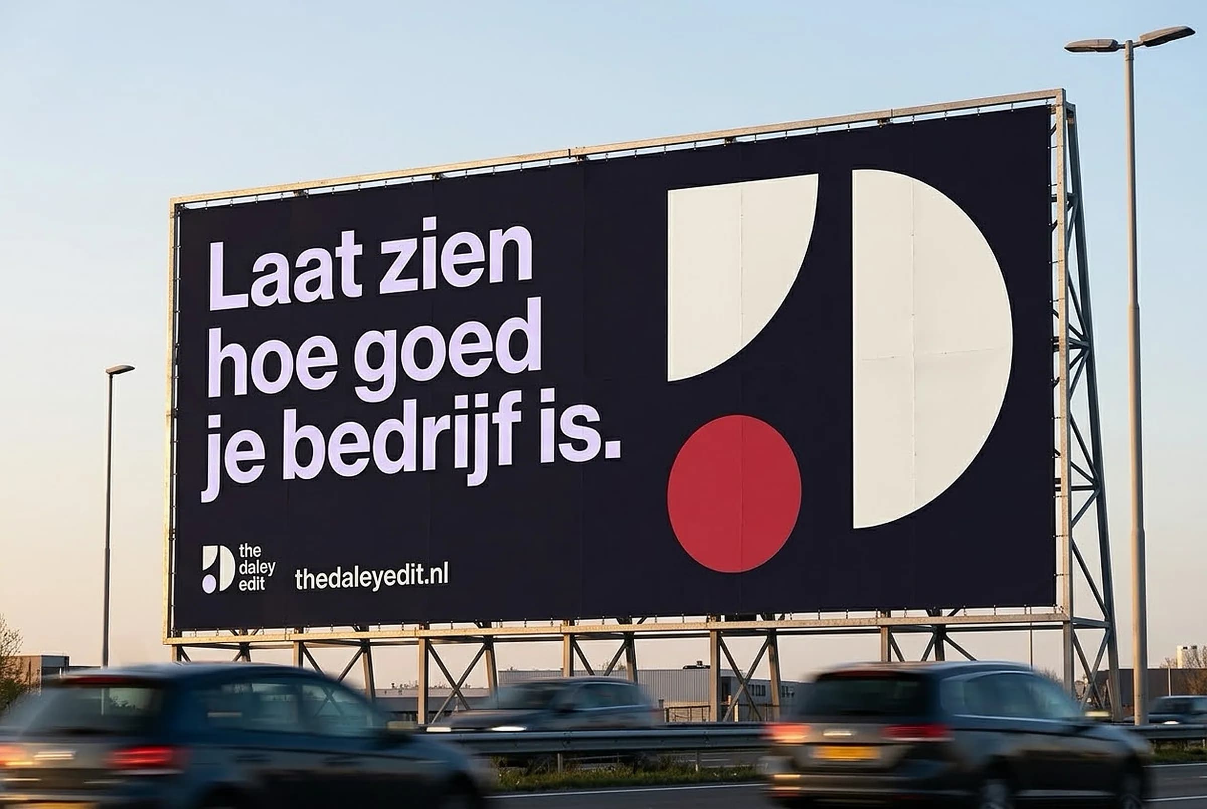
For the headlines I chose Uxum, an organic typeface that isn't entirely clean cut. It has an edge that shows creativity and a touch of stubbornness. That fits the way I work: I focus on people, I'm creative and not coldly businesslike. The body text is set in the tighter, calmer Schibsted Grotesk instead, to keep everything in balance. Together they show what you get with me: professionalism and high quality, with a warm and creative atmosphere throughout.
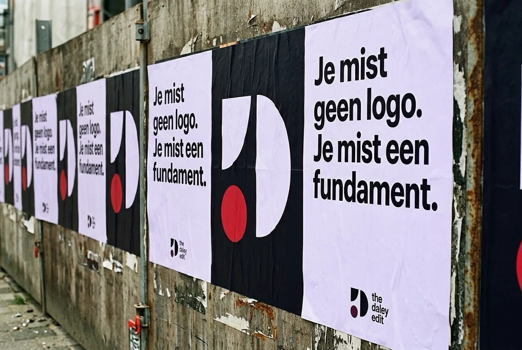
The brand in use
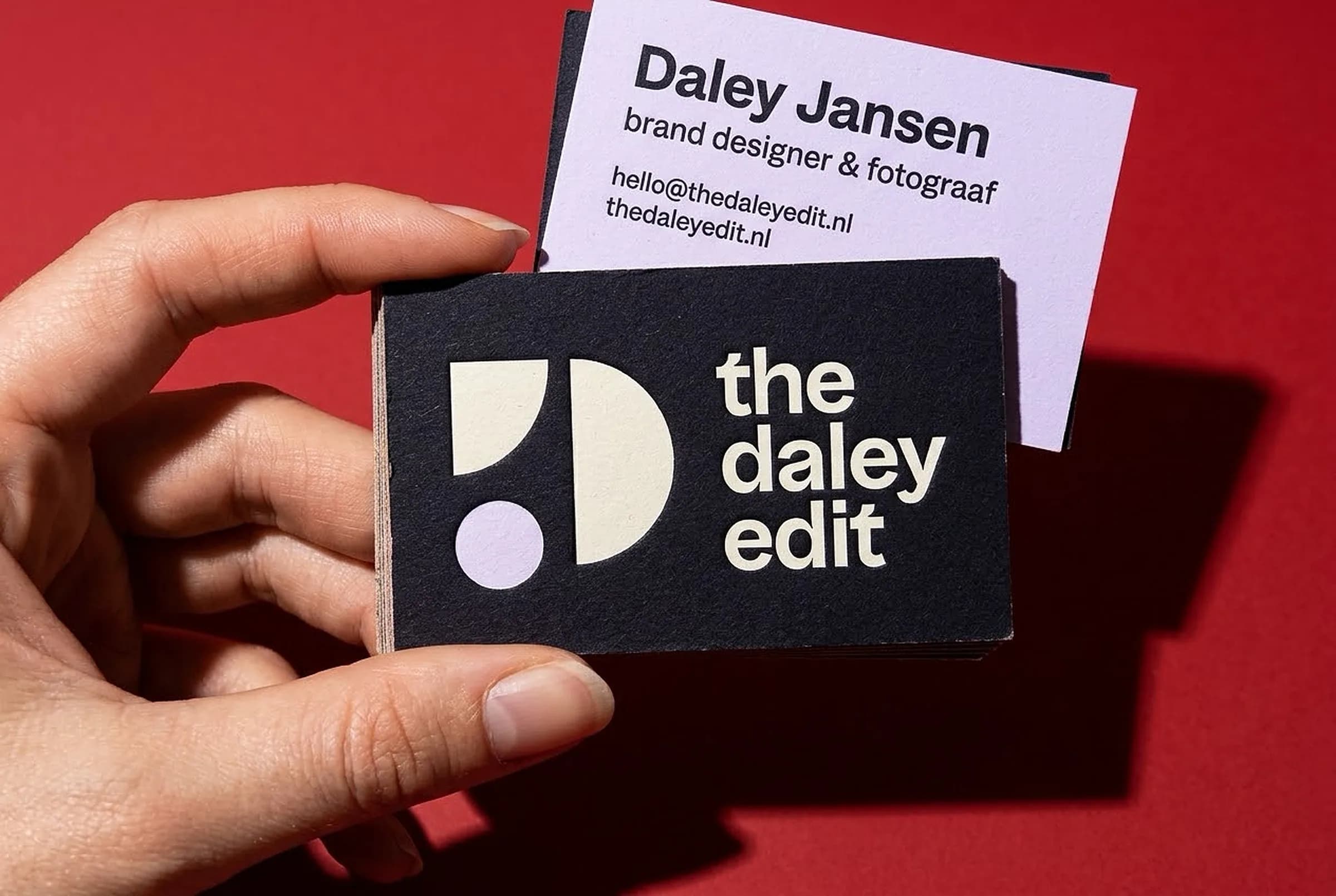
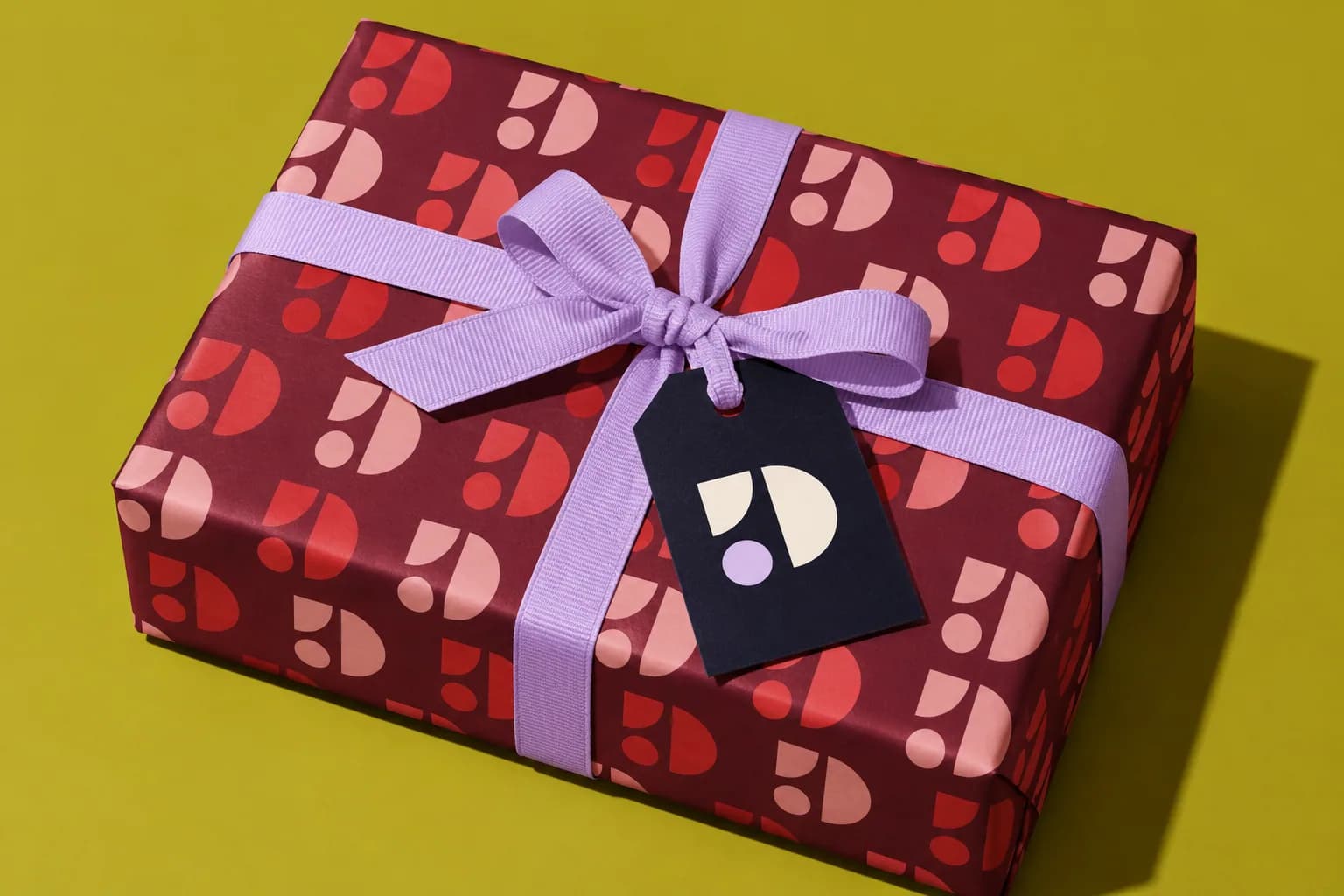
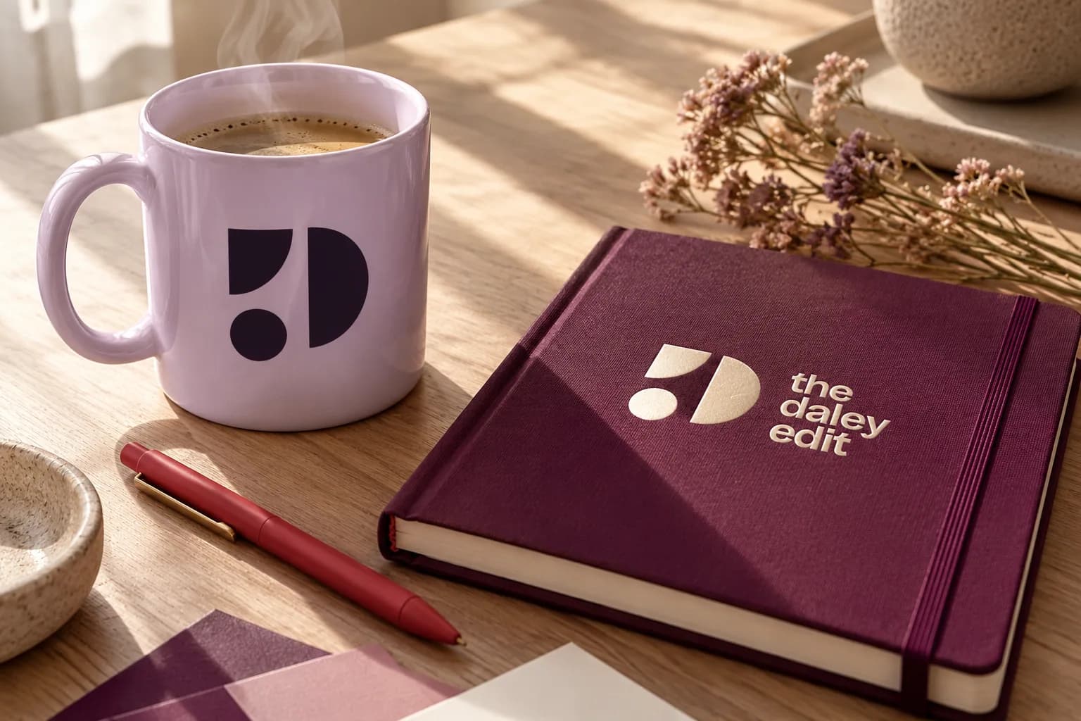
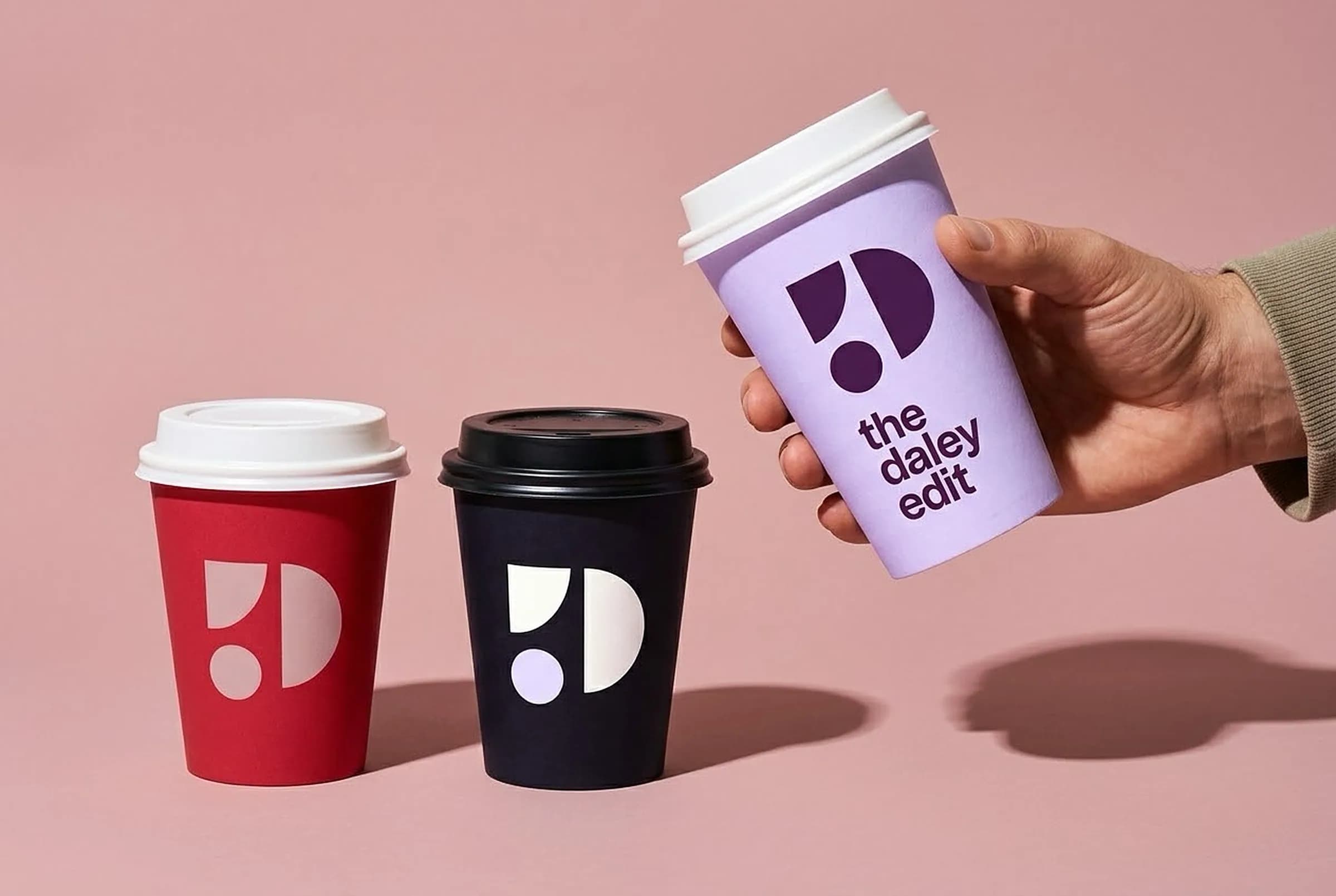
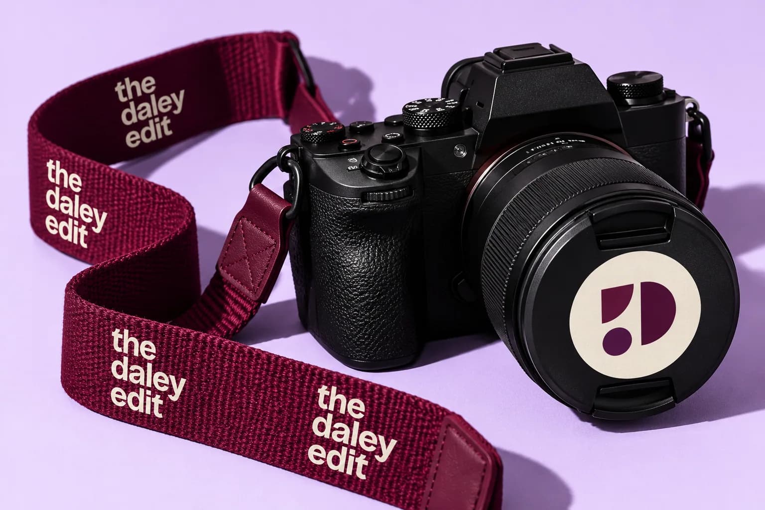
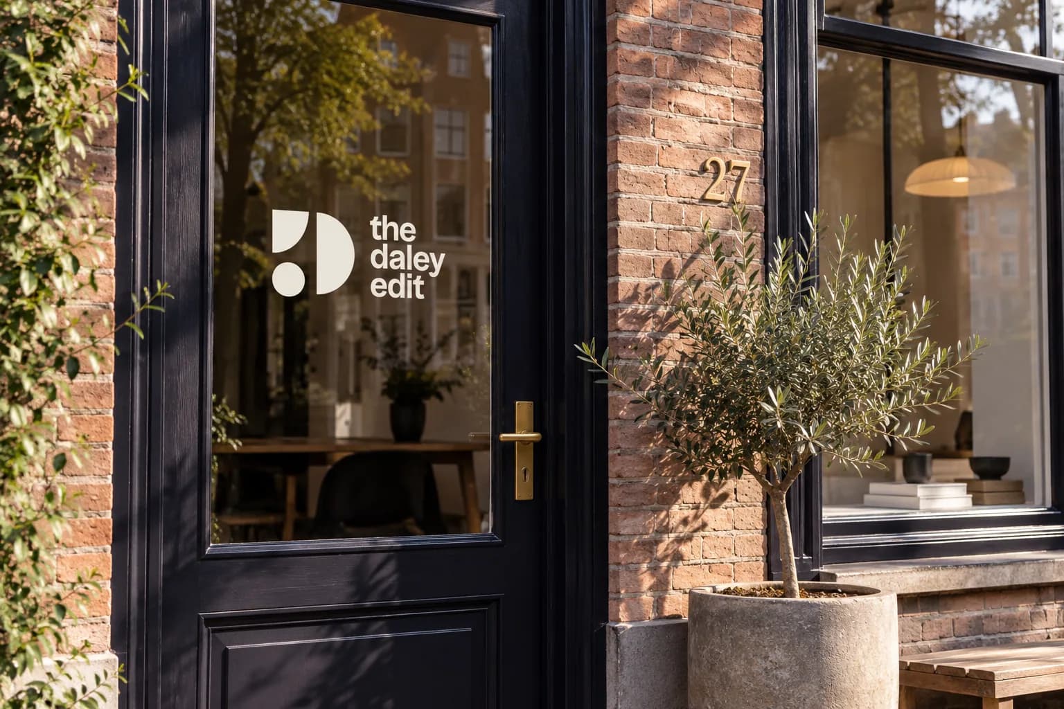
The best part of developing a brand identity is seeing it in use. Before that really happens, I make mockups for every brand, so you can see how it will actually look. For my own brand I let it come back everywhere: from business cards and a welcome box to a mug, a sweater, wrapping paper, the website and Instagram. Always the same shapes and colours, always recognisable.
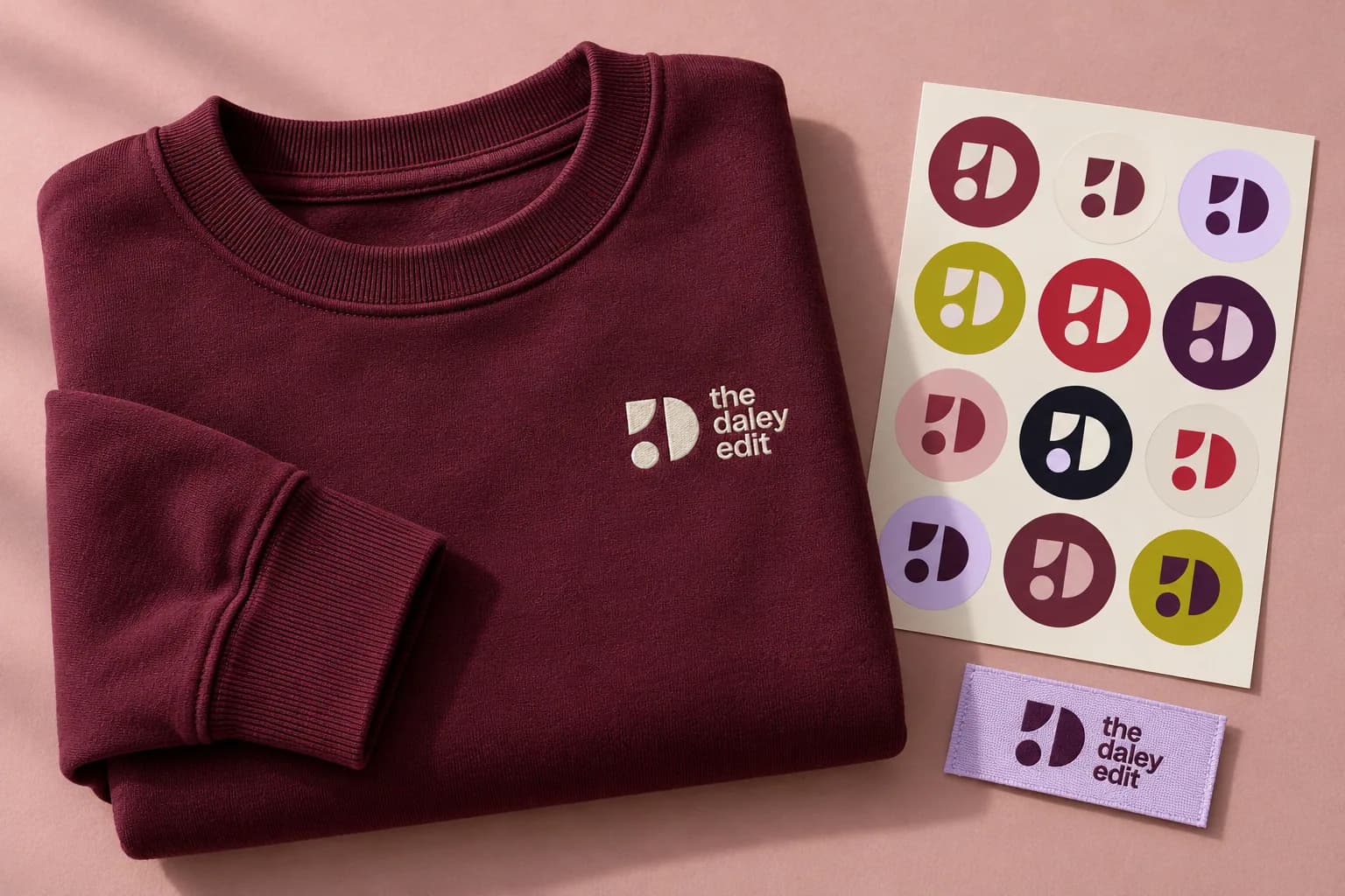
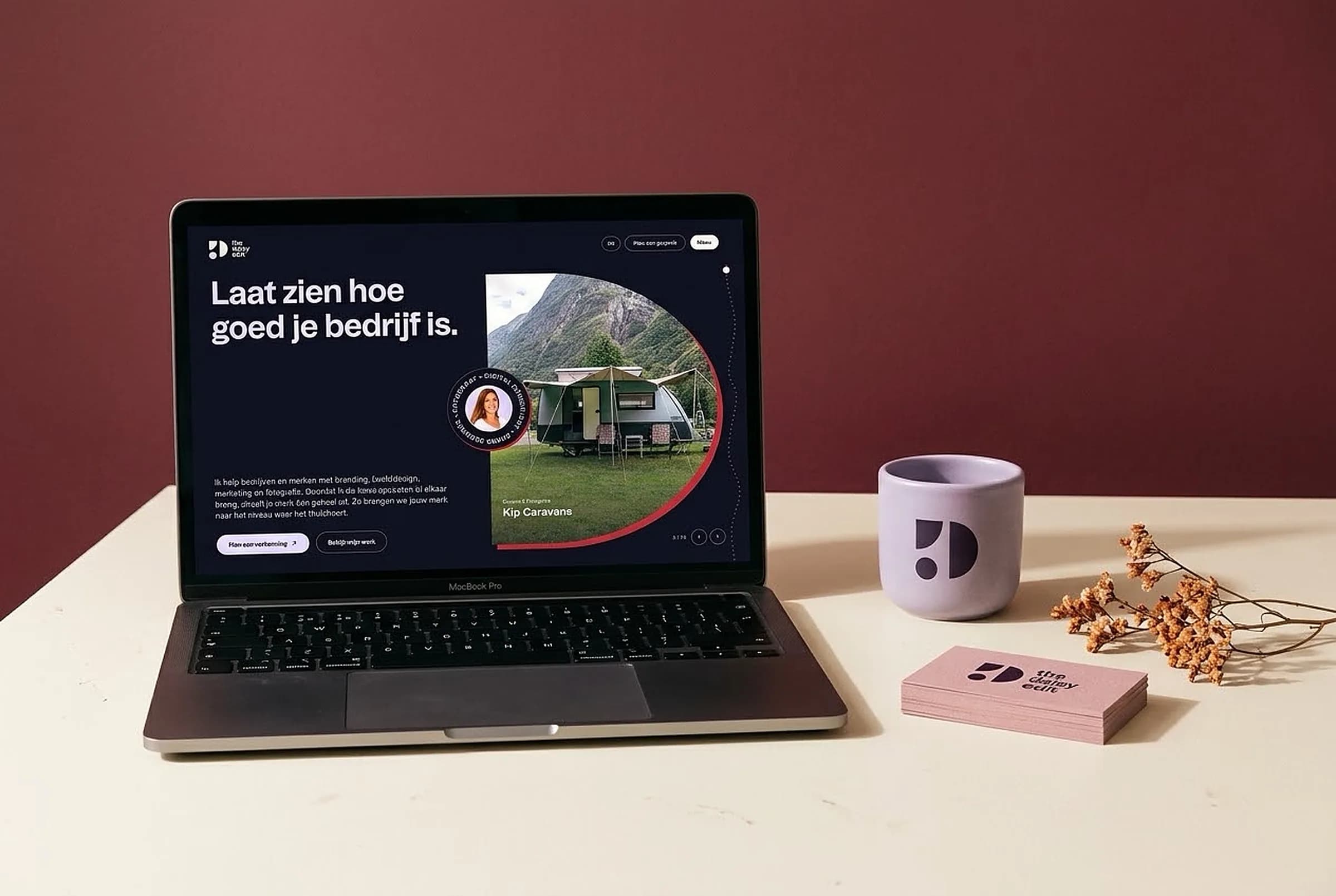
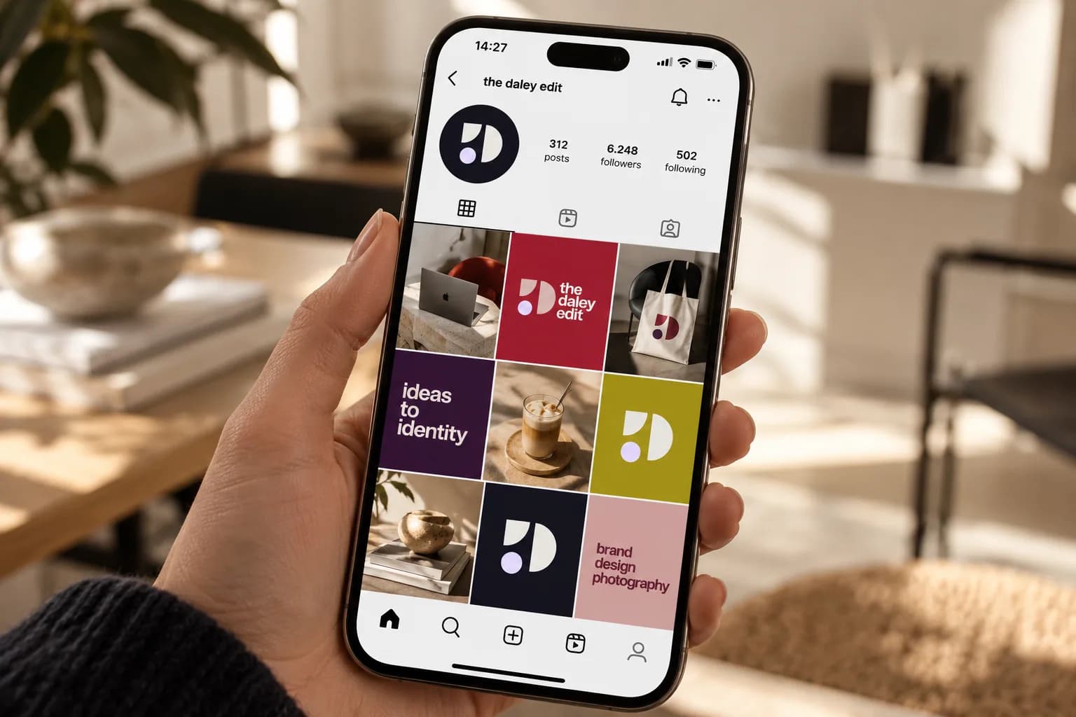
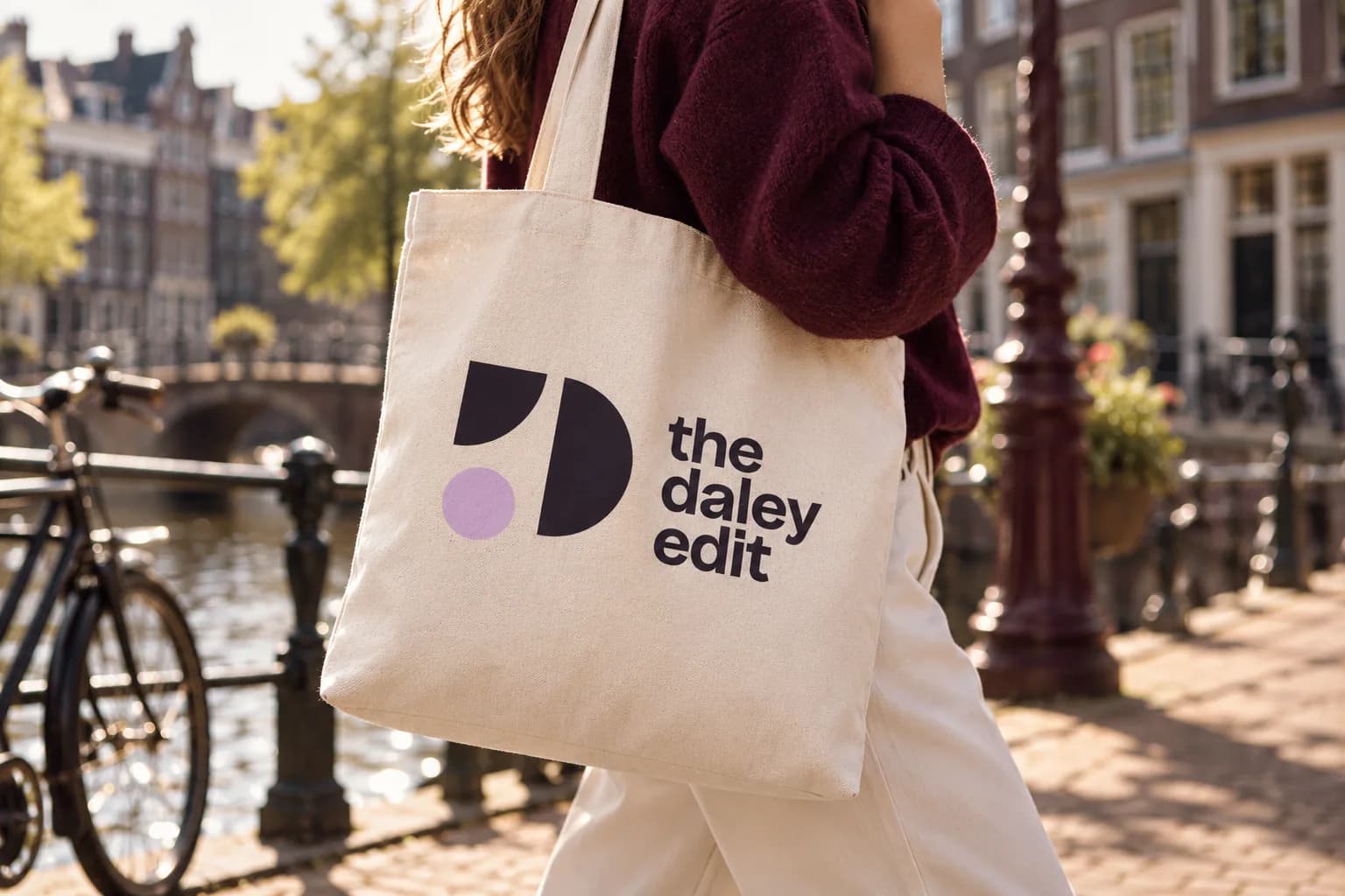
Something like this for your brand?
01How does a project like this start?
With a message. We plan a meddling session, where you tell me where you stand and I honestly say what I see. After that you get a proposal with a fixed price, and once you approve, we get going.
02What does a project like this cost?
Every project is custom, so it really depends on the question: from a few hundred to a few thousand euros. That's impossible to say up front. Once I have all the information, you get a fixed price, and it doesn't change after that. If an extra assignment comes up that falls outside what we agreed, I charge an hourly rate for it.
03My industry looks nothing like this. Does that matter?
No. I dig into your brand and know what it takes to reach an audience, and that works in any industry. In fact, a fresh look from outside your industry can be a real advantage.
04Can I have just one part of this done?
Yes, you step in where you are now. If you already have a logo, I first take a quick look at whether the foundation is right, and then we move on to the website or the imagery. It doesn't all have to happen at once.
Next project
De Kloek FitnessView the project